
Redesigning a Local Business the UX way—
The creation of a local bike shop brand and site!
Project Overview
Redesigning the branding and creation of a responsive website for a local bike company
Deliverables
Responsive site, Branding
Design Lab
UX Academy Zapf Cohort
UX/UI/Design Lead
Spencer Goldberg
Written by:
Spencer Goldberg
2 weeks/80 hrs.
DesignLab
The Cleveland Bicycle Co.
*Please note, This is a speculative case study. The Cleveland Bike Company is fictitious.
Since 1992, The Cleveland Bicycle Company has been pleased to serve Northeast Ohio bicyclists of all ages and abilities. They are not just a store, but a part of the community in the Cleveland and Akron area. The Cleveland Bicycle Company is a locally-owned, full-service bike shop, open year-round with sales, service, repairs, rentals, and a wide selection of clothing, accessories, and parts.
Changing Landscape
Independent bicycle shops are typically a low-margin business, making significantly better profits from repairs, accessories, and custom work than the selling of bikes. Traditionally, bike shops operated a bit like car dealerships — they had relationships with big brands like Cannondale — while authorized dealers often had geographic monopolies.
As the world of e-commerce grows, it’s been a little tricky for brick and mortar bike shops. They’ve been hesitant about putting their catalog’s online due to constant web maintenance and changes in inventory. (It’s harder for smaller shops with constantly evolving inventory) Also, innovations like the mobile mechanic have made going to your local bike seem like an unnecessary exercise.
I felt The Cleveland Bike Co. needed to adapt to a faster-paced, and digital culture, while still maintaining all the amenities of a physical bike shop.
I had two goals as UX researcher and designer for Cleveland Bike Co. The first is to integrate more of the shop online and to elevate its digital presence; Creating a smooth way for the user to buy bikes and book appointments online. The second goal is to reshape the Cleveland Bicycle Company’s outdated brand to reflect a more modern bike culture. I plan to do this with a fresh and modern visual reboot. This will appeal to today’s fast-paced and digital culture.
Problem Statements
How might we: Design a responsive e-commerce website that makes bike buying and appointment booking a seamless experience for the user?
We will also be addressing:
How might we: Create a logo and brand that has a modern feel and conveys our expertise in this business?
Project KPI
Before we get started, I think it’s wise to identify some Key Performance Indicators (KPI) that can tangibly measure The Cleveland Bike Company's online success. Here are a few:
Online Appointment Booking: First measurable would be the tracking is how many people are booking appointments online. We can also monitor the steps they are following to do this.
Bike Purchases: We can also keep tabs on how our online bike sales are shaping up. As with appointment booking, we will monitor the steps users are taking to complete these purchases.
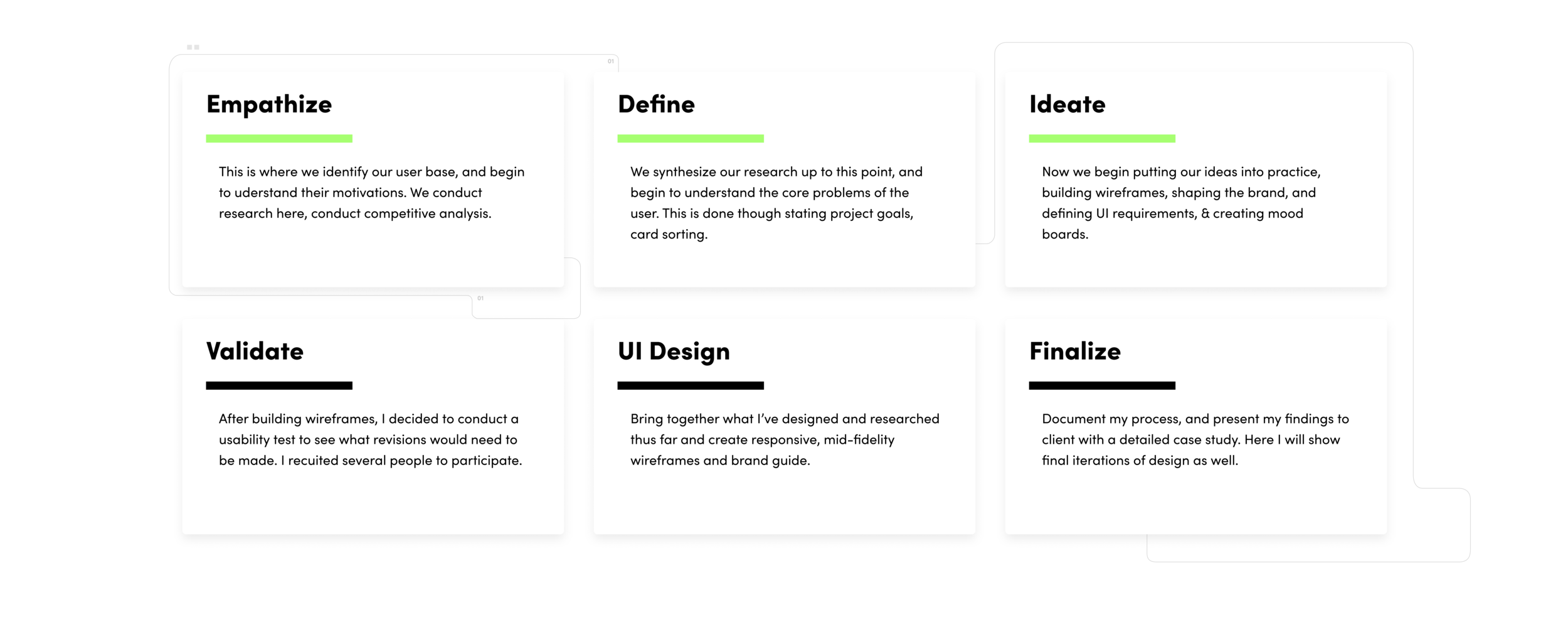
Stage one: Empathize. Know the market
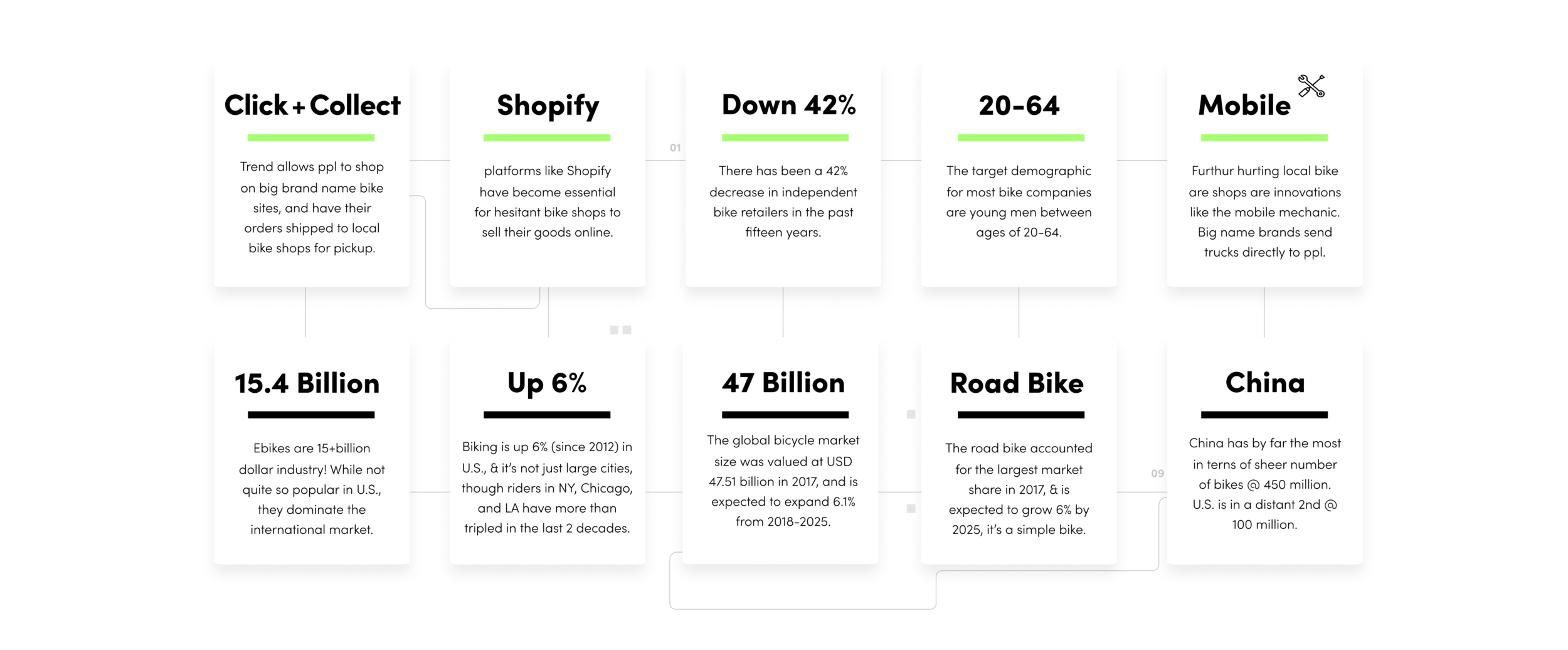
First on our agenda is to understand how the bike market works, both on and offline. By conducting secondary research, we get a better idea as to who our target demographic is—their needs, wants and expectations, numbers, data, and the scope of the biking industry as a whole. I really wanted to understand our potential user's difficulties when buying or maintaining their bikes.
Here are some key takeaways I’ve listed through secondary research:
Analyzing Competitors
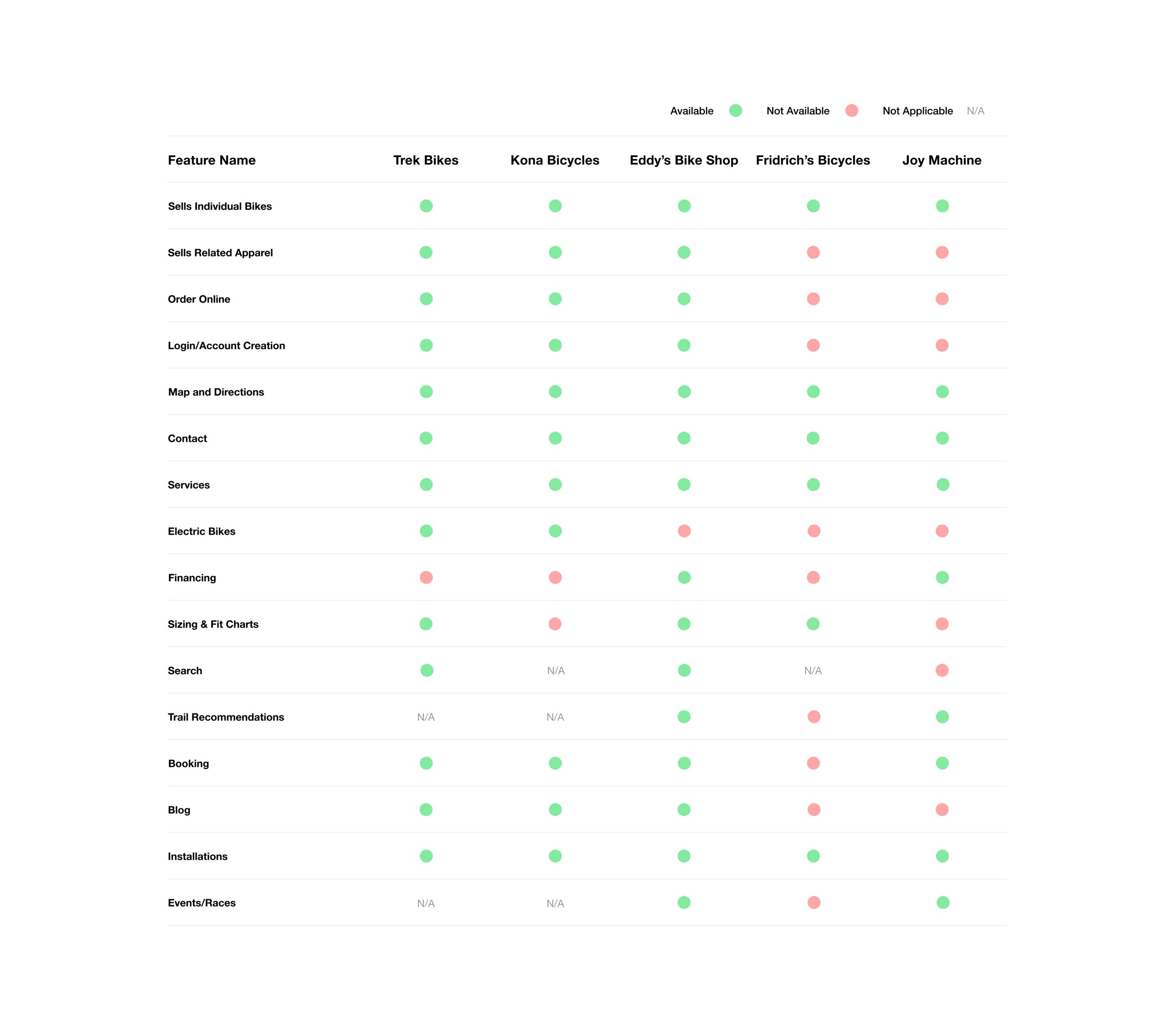
Another important of our early research was to perform a detailed competitive analysis. This consisted of studying the habits and successes of other bike shops so that we can perhaps incorporate some of these findings into our own company.
I also detailed five other bike shop’s websites and compared their features in the graphic below:
1 on 1 Interviews
The next part of my research included interviewing handpicked friends, family, and colleagues who have bike buying experience (on and offline) for a 1 on 1 discussion. I wanted to determine their “pains and gains”, and really understand what difficulties they might have when purchasing or repairing their bike. These interviews also helped me to start shaping my site, and seeing what items are necessary to include (or exclude). Below you’ll see a breakdown of who I interviewed:
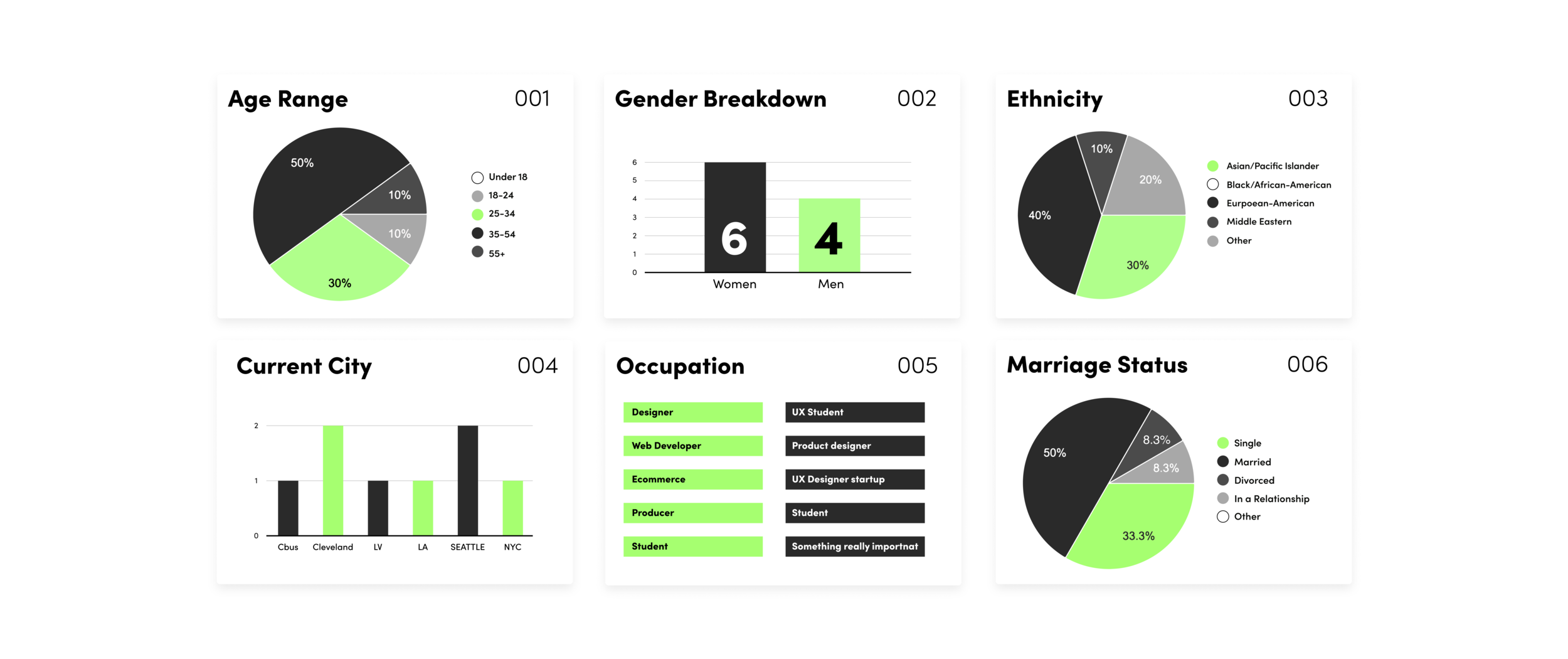
Interviews Breakdown
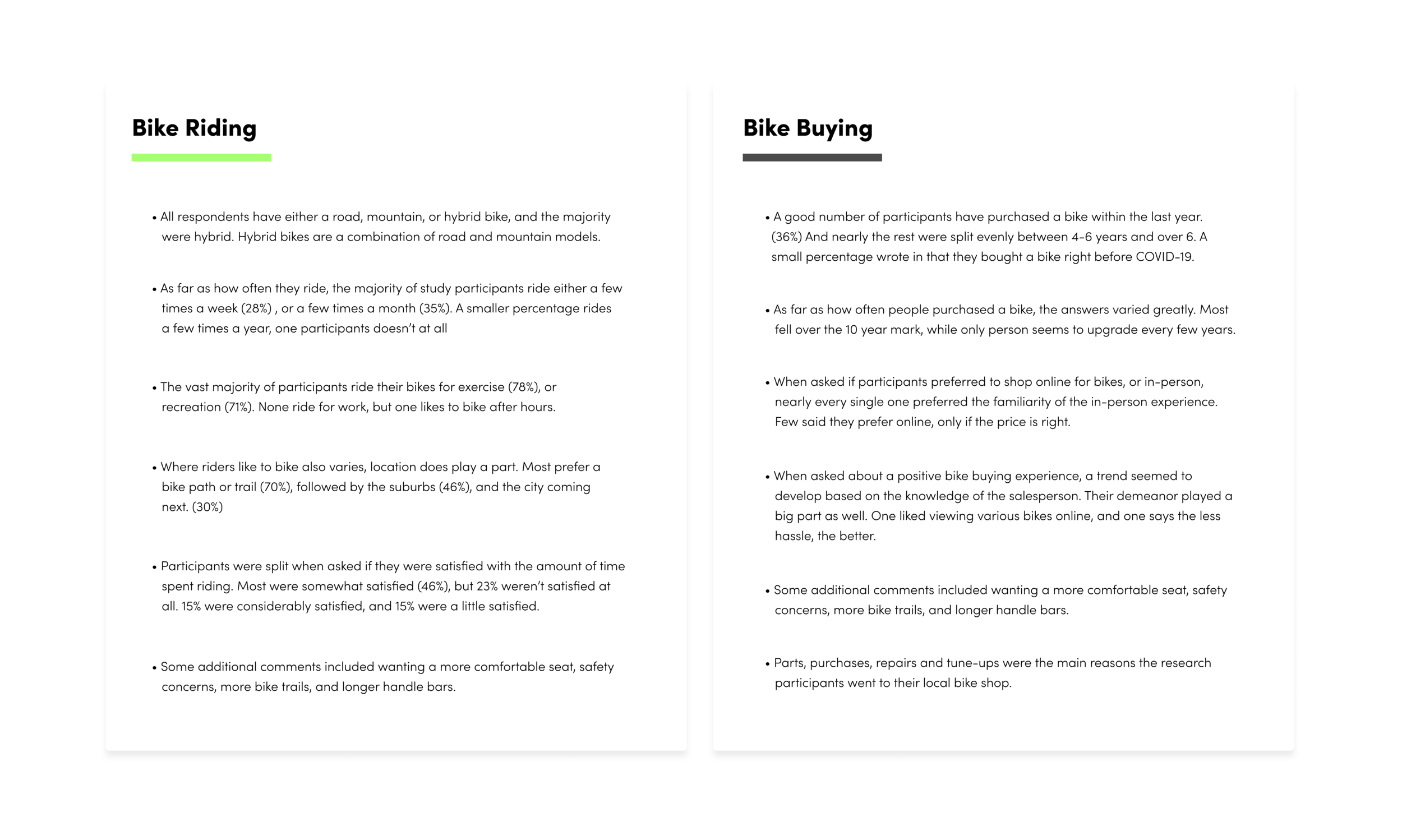
And a summary of the results, which I broke up into two categories: bike riding and bike buying habits:
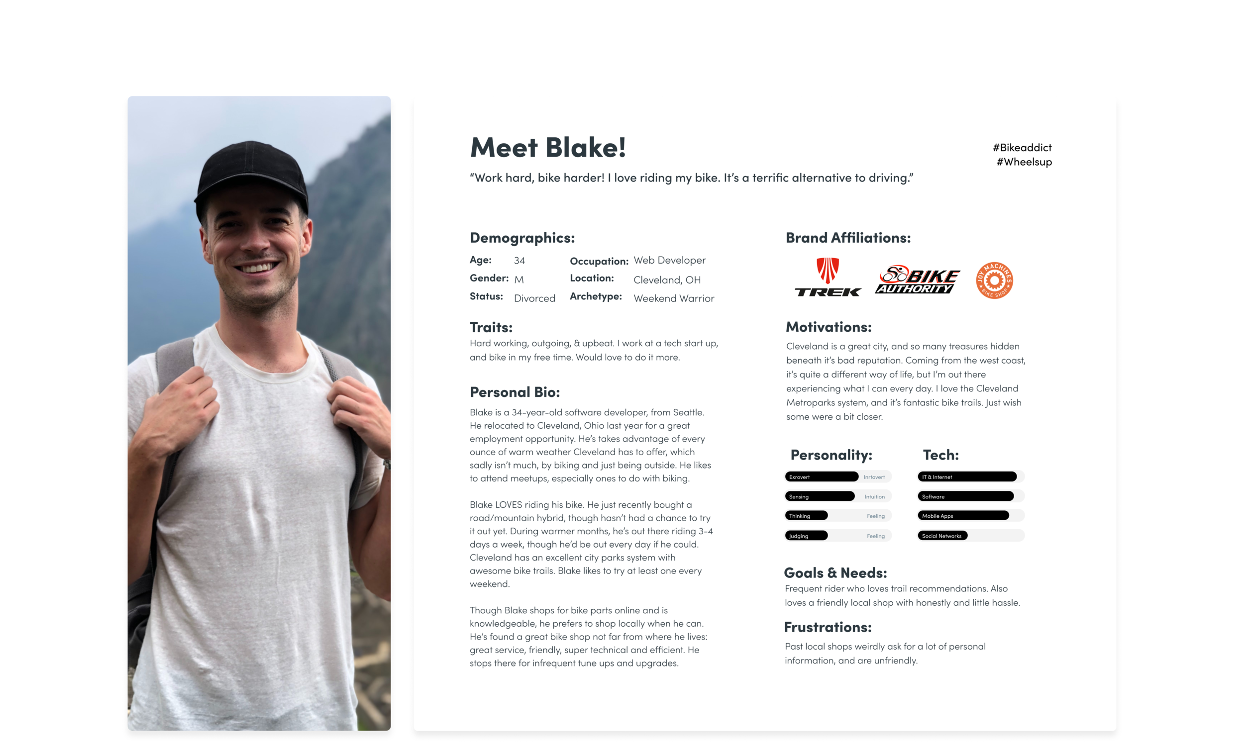
Creating a Persona
The next step was to take all the data we’ve gathered thus far and create something called a persona–Someone with the shared characteristics of my interviewees. Developing this persona also helped in the design process, and really gave me a better idea as to the type of person I’d be designing for:
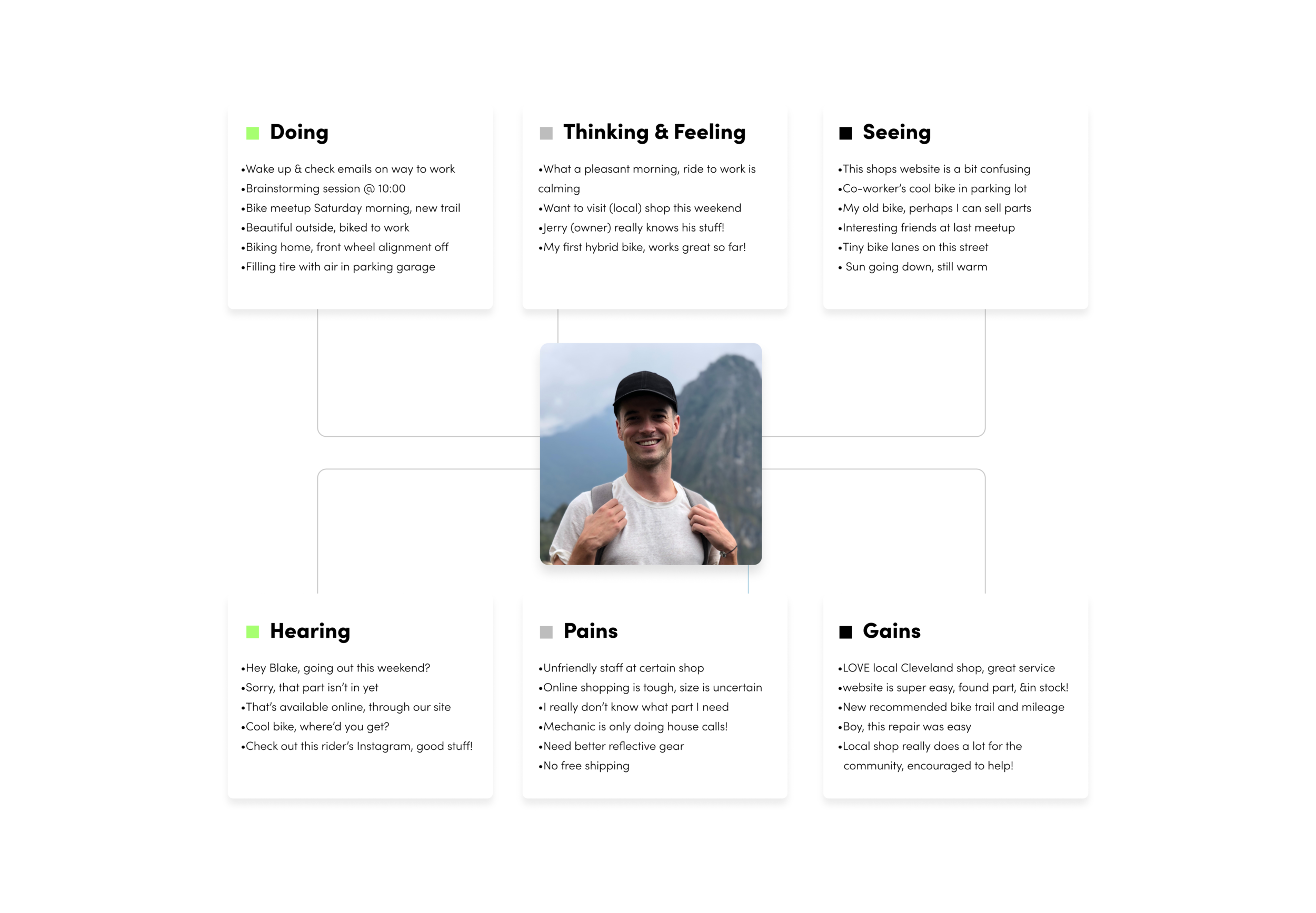
Creating an empathy map was another step in developing my persona. Here is a look at how we synthesized the research so far to map out a typical day for “Blake”. It was another building block in understanding our user base, and what might be going through their minds on a daily basis. In the end, I also tried to identify certain obstacles Blake might face regarding shopping for a bike. All of which I address down the line:
Stage Two, Define
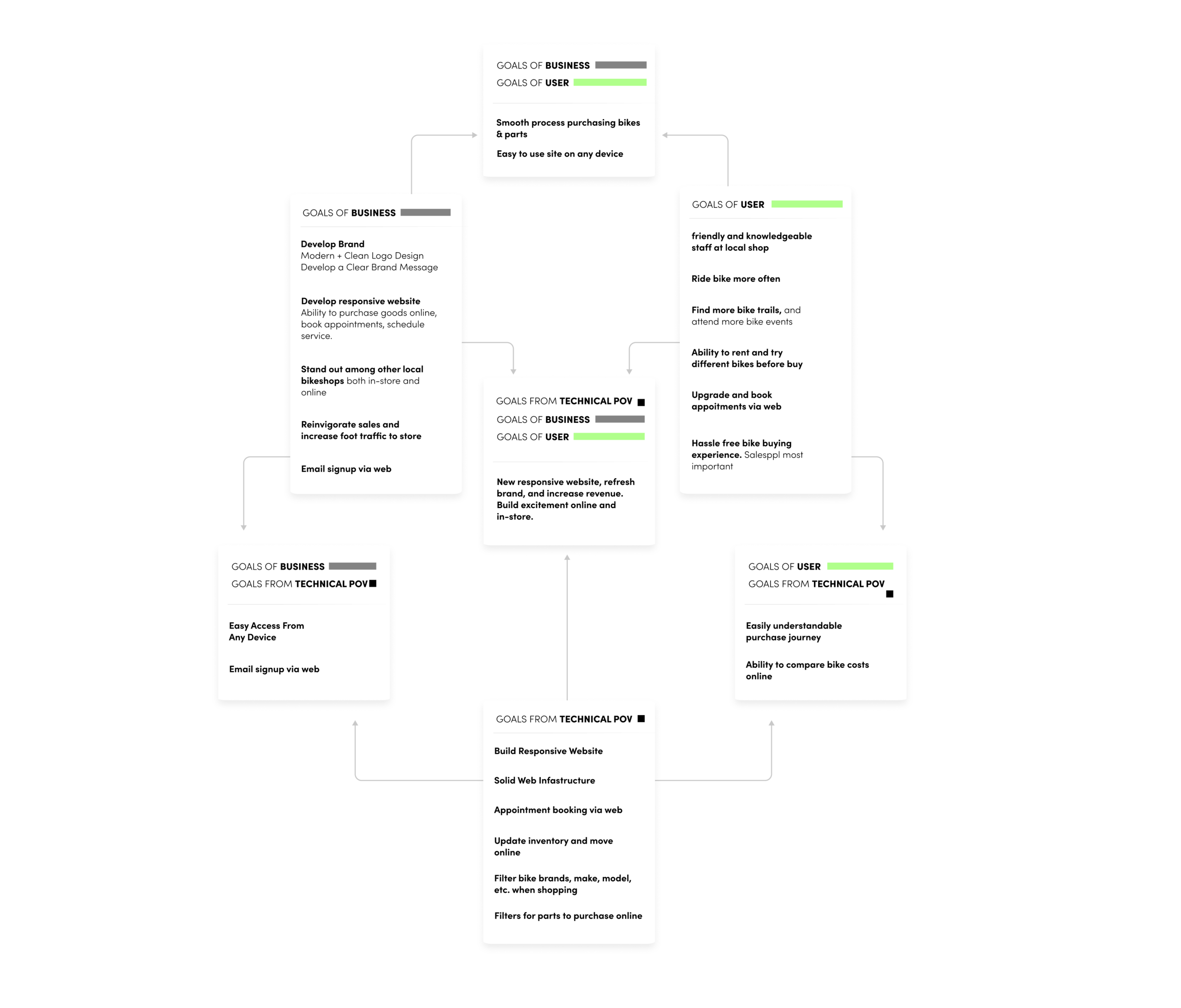
This is where we look at our research and begin to synthesize it. We start to understand the framework of our site with things like a feature roadmap and define the goals we’d like to achieve from a business and technical standpoint. I also detailed the goals potential users would have. The graphic below lists them out, as well as pointing to certain area’s overlapped. Defining these goals allowed me to see what’s possible going forward:
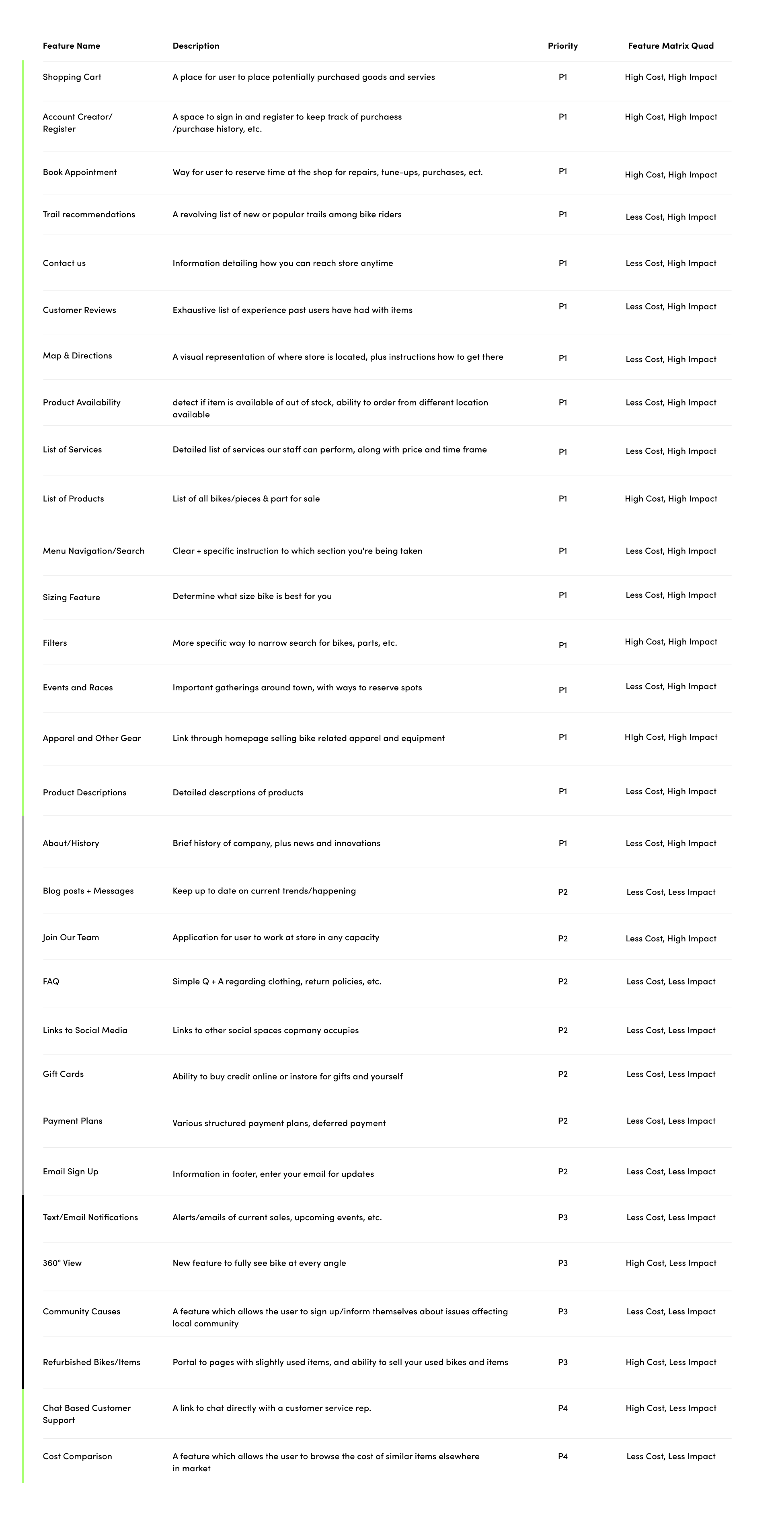
From here, we were able to create what’s called a feature roadmap, which is a checklist of features The Cleveland Bike Company’s website will have. We’ve also ranked them in their order of importance.
Another facet to this list is estimating the man-power each feature will ultimately use—i.e. time and cost—and label each feature accordingly, P1, P2, etc. (Priority 1, Priority 2, 3…)
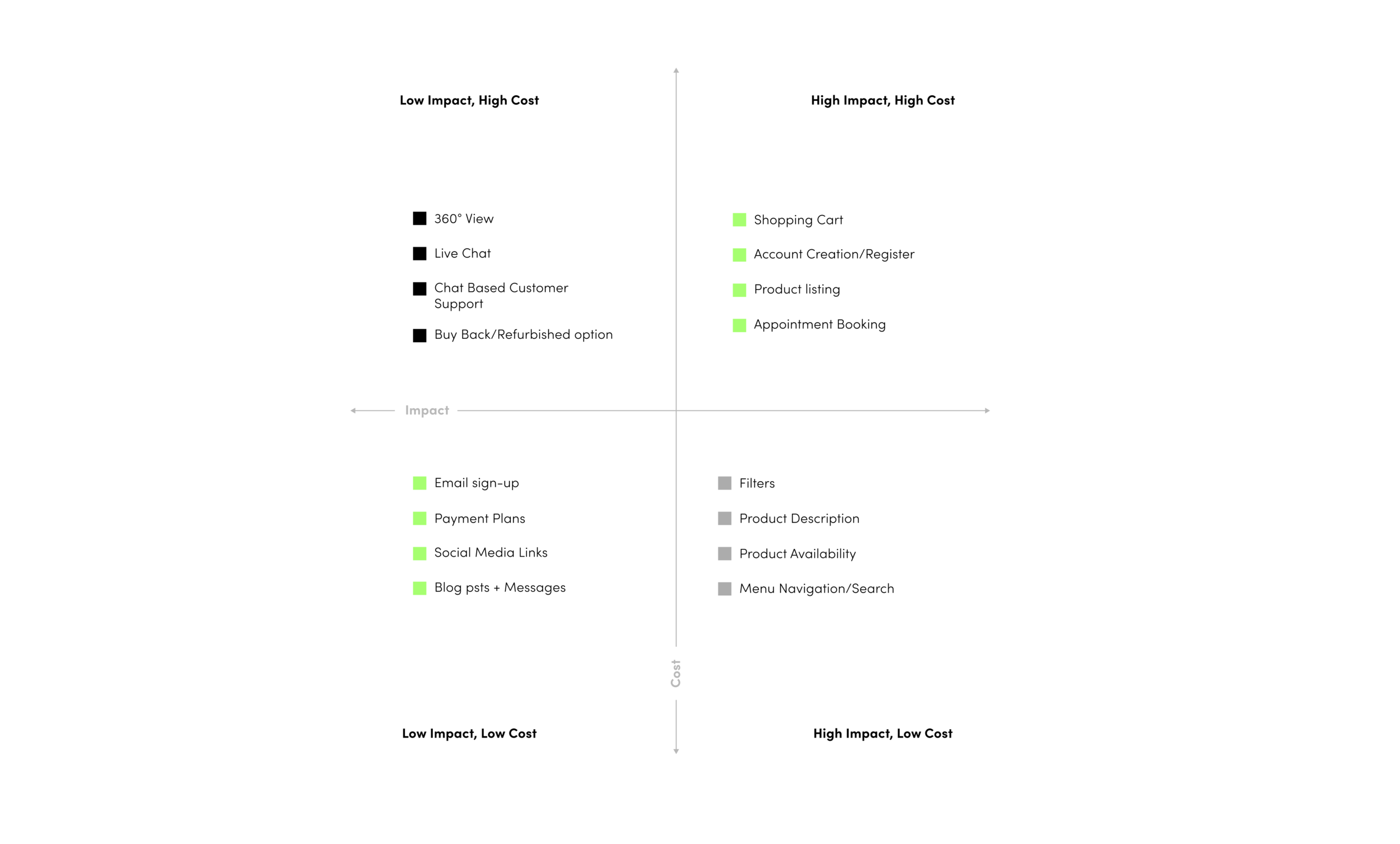
Piggybacking the feature roadmap is the feature matrix. Which is a graphic used to illustrate how important (or of lesser importance) website features place in relation to cost. You can see this in the graphic below:
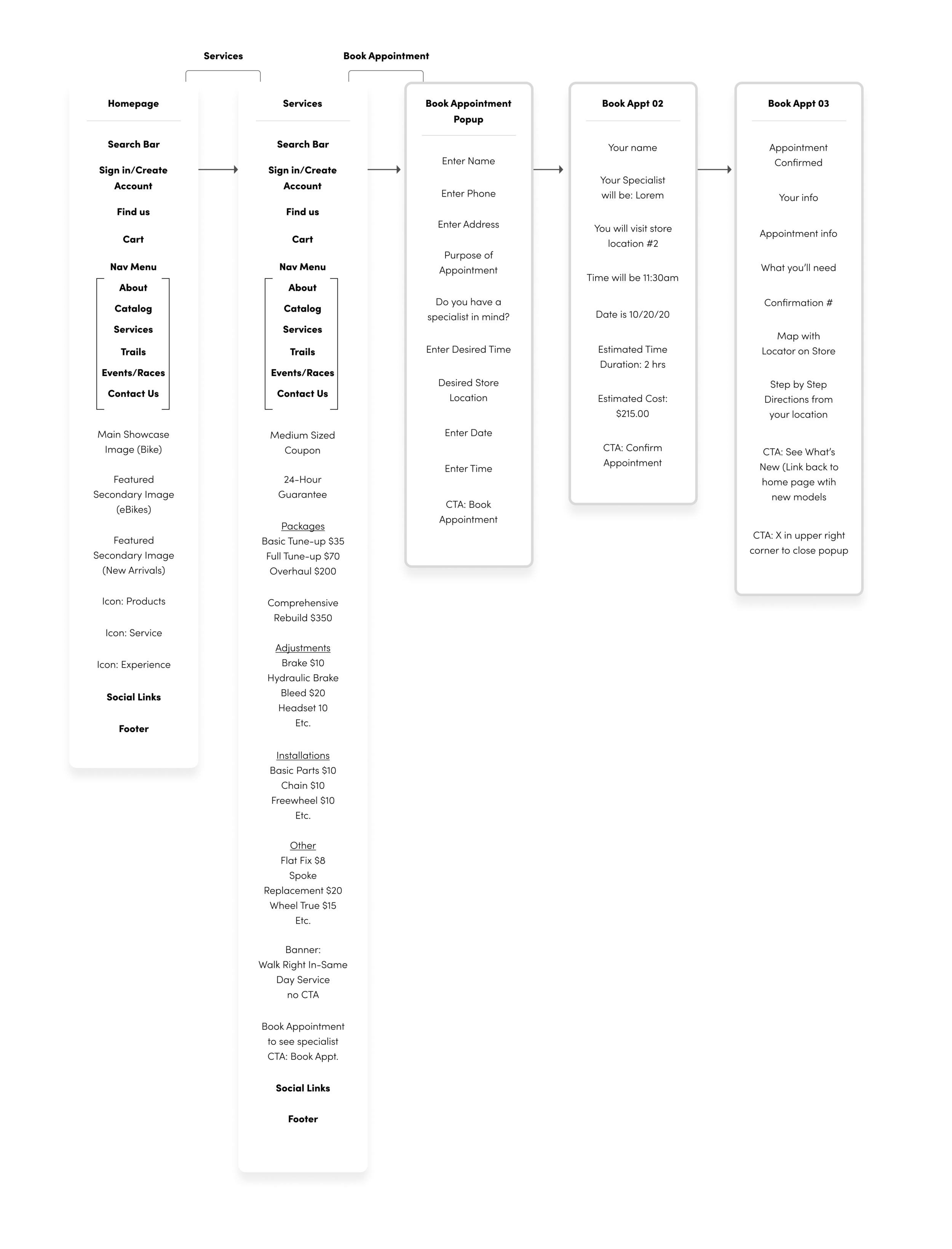
Culminating the definition stage was our sitemap. This is how we organize our site structurally, labeling each page and where it exists in relation to others, we develop information architecture at this point:
Information architecture (IA) is the structural design of shared environments; the art and science of organizing and labelling websites, intranets, online communities and software to support usability and findability.
My method was to identify all of the items you’d see on a specific page, and indicate a clear call to actions. The two sitemaps below represent two different journeys a user can take when visiting the site. The first is the journey a user would make when purchasing a bike:
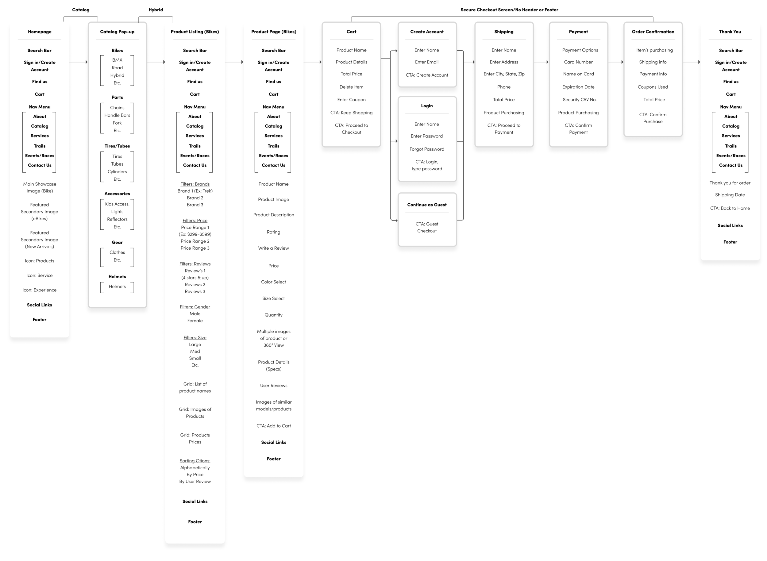
The second is a journey catered more to appointment booking:
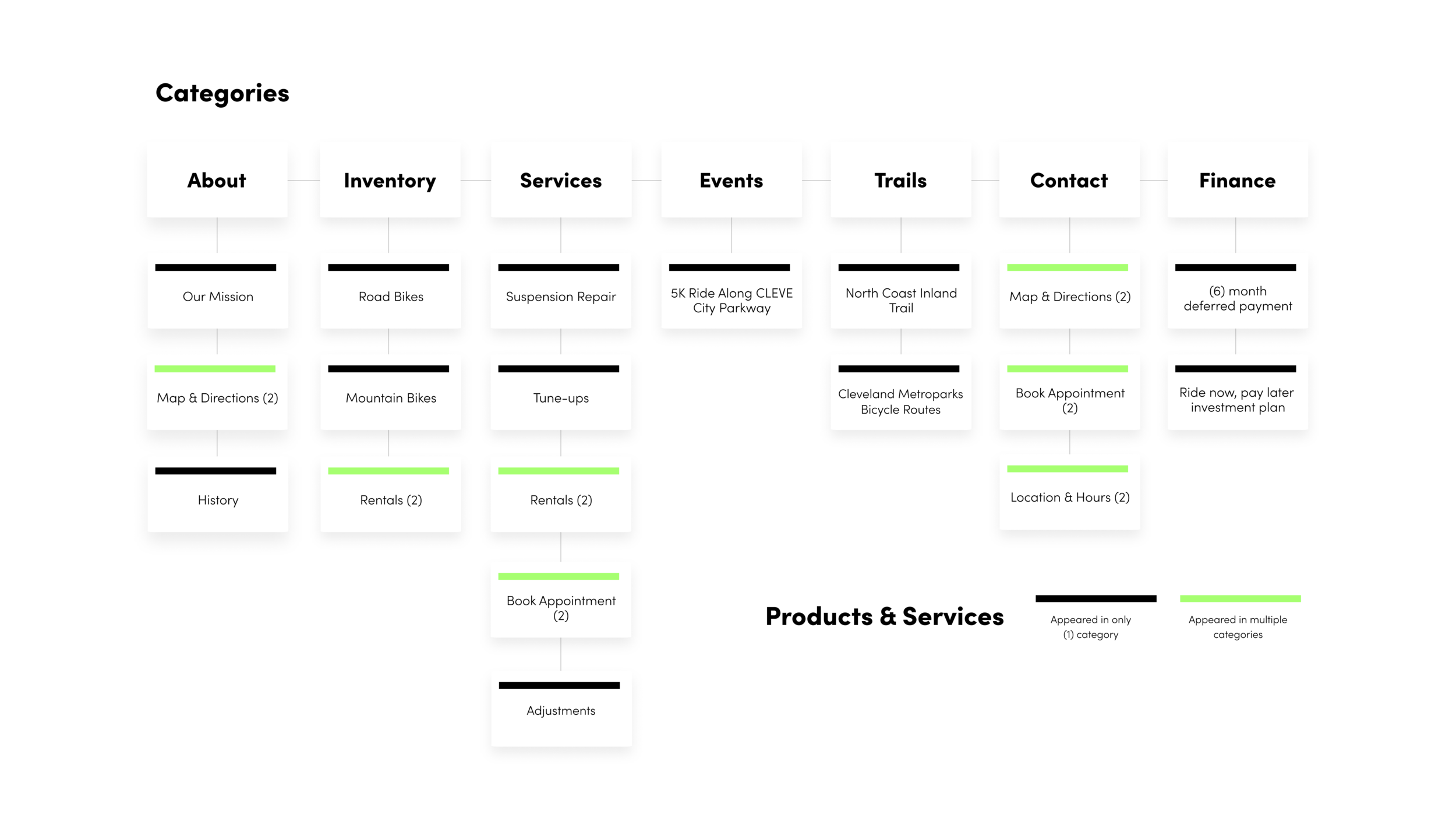
After creating two sitemaps, it was then time to do a card sorting exercise. I had volunteer users participate in a closed card sort. Their task was to take items/cards I provided them with (ex: mountain bikes, suspension repair, Phone number and email, etc.), and then sort them into the appropriate categories, which I also provided. (About us, Bikes, Services, etc.)
You can see it further explained in the graphic below:
Card Sorting Results:
State Three: Ideate
At this stage, we develop our product even further by introducing lo-fidelity wireframes. (Pencil and paper) Our plan here is to give us a couple of solutions based on our research thus far and our IA (information architecture).
Below you can see paper sketches:
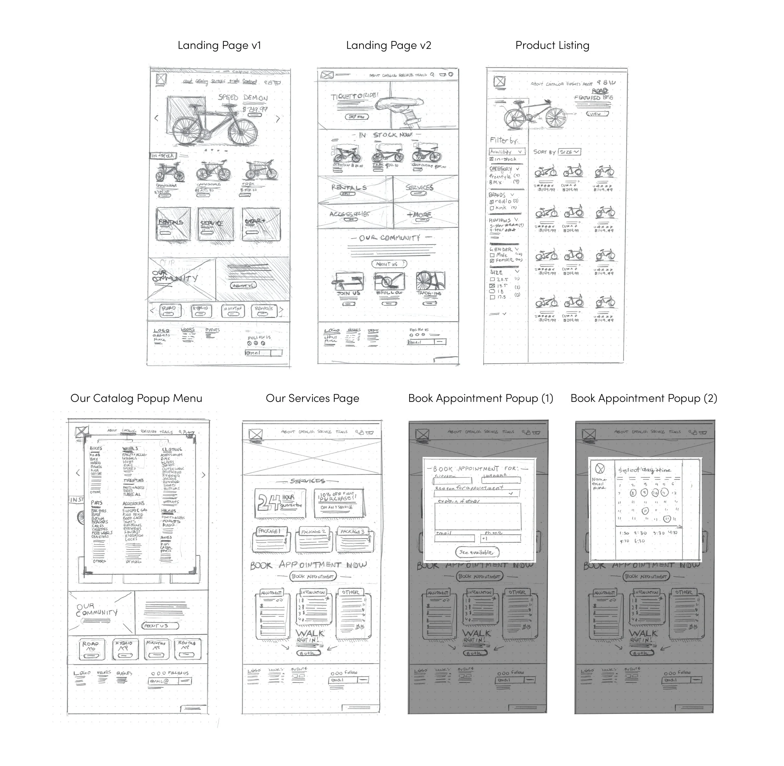
Wireframes
From here, I developed lo-fidelity wireframes, which were completely responsive. This was to further map out all of The Cleveland Bike Company’s pages on their site. I also began to develop some User Interface elements during this process.
The idea was to create enough pages for users to go on two proper journeys. One journey was purchasing an entire bike, the other was booking a service appointment.
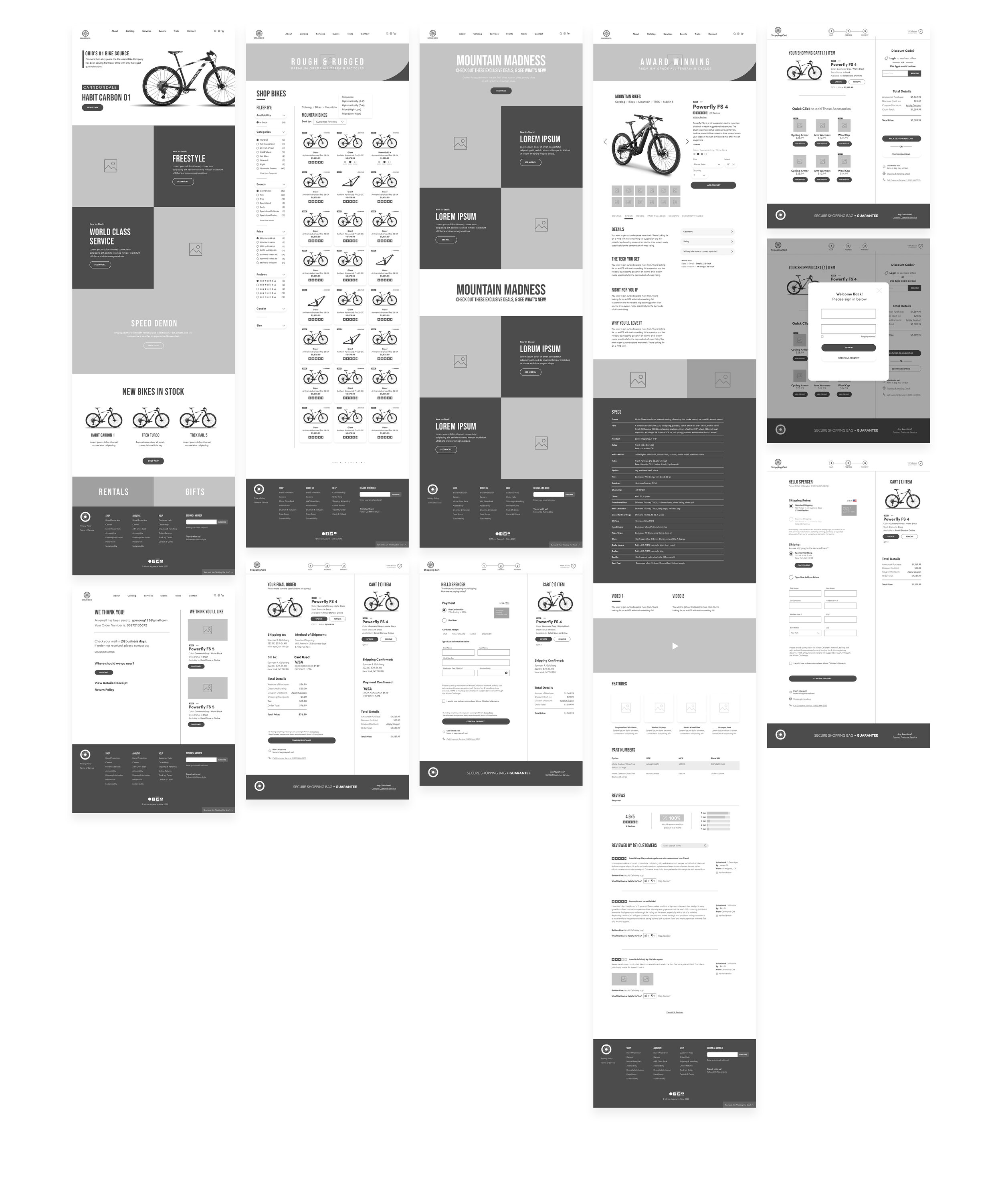
Journey for booking an appointment:
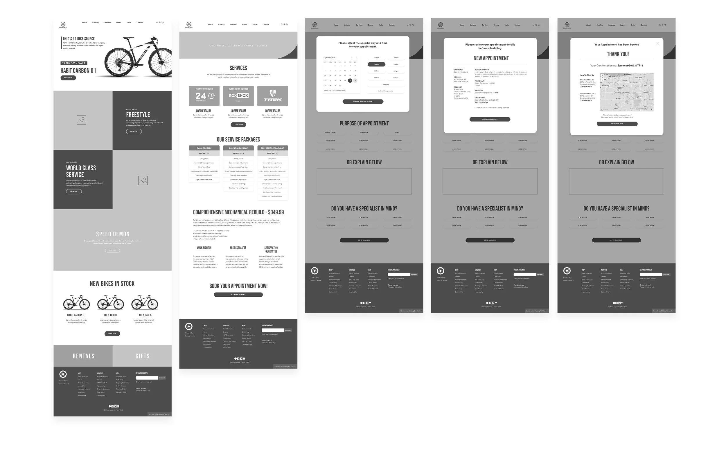
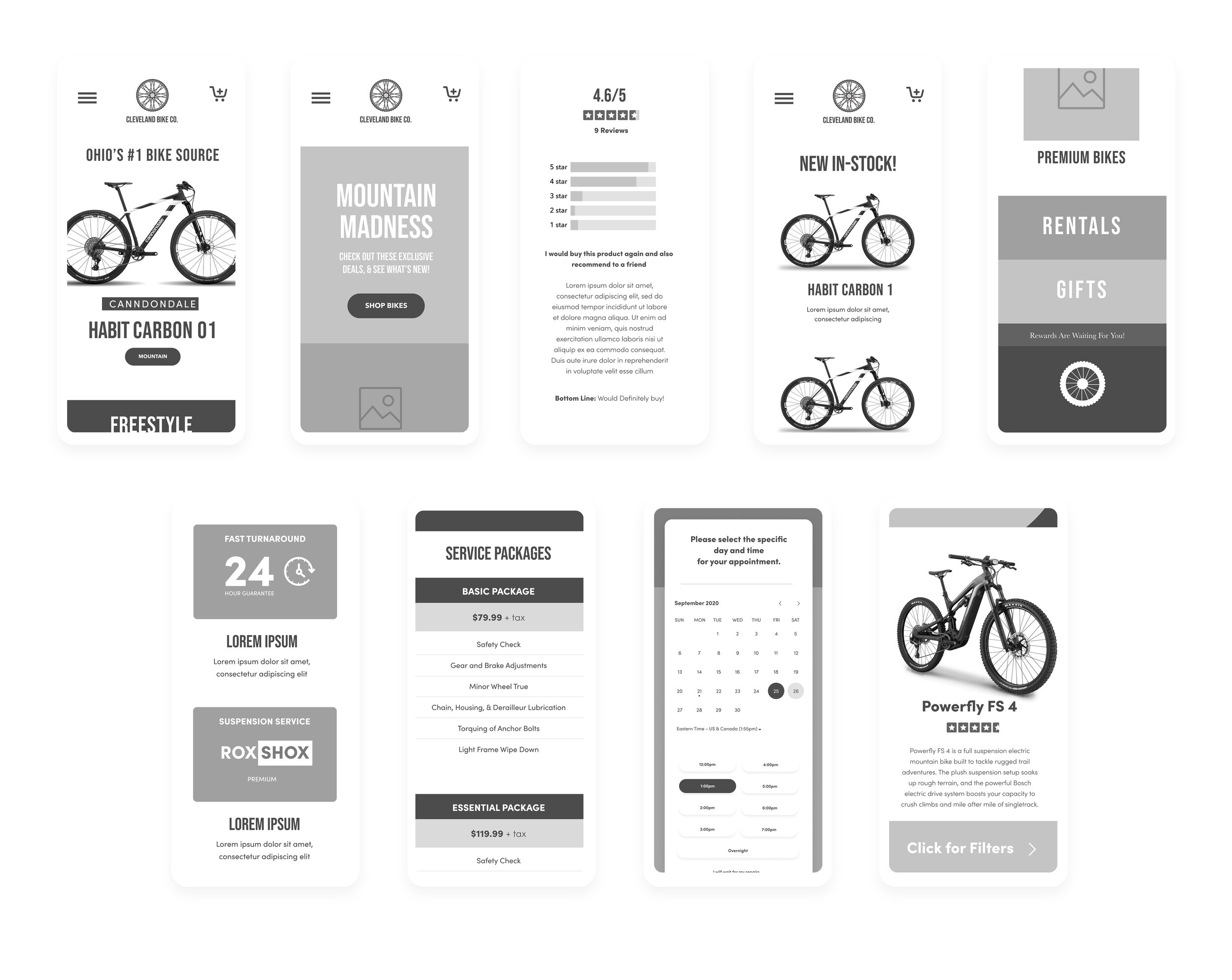
After establishing our desktop wireframes, we were then tasked to create them for mobile platforms. Responsive wireframes are a must:
Stage four: Validate & Test
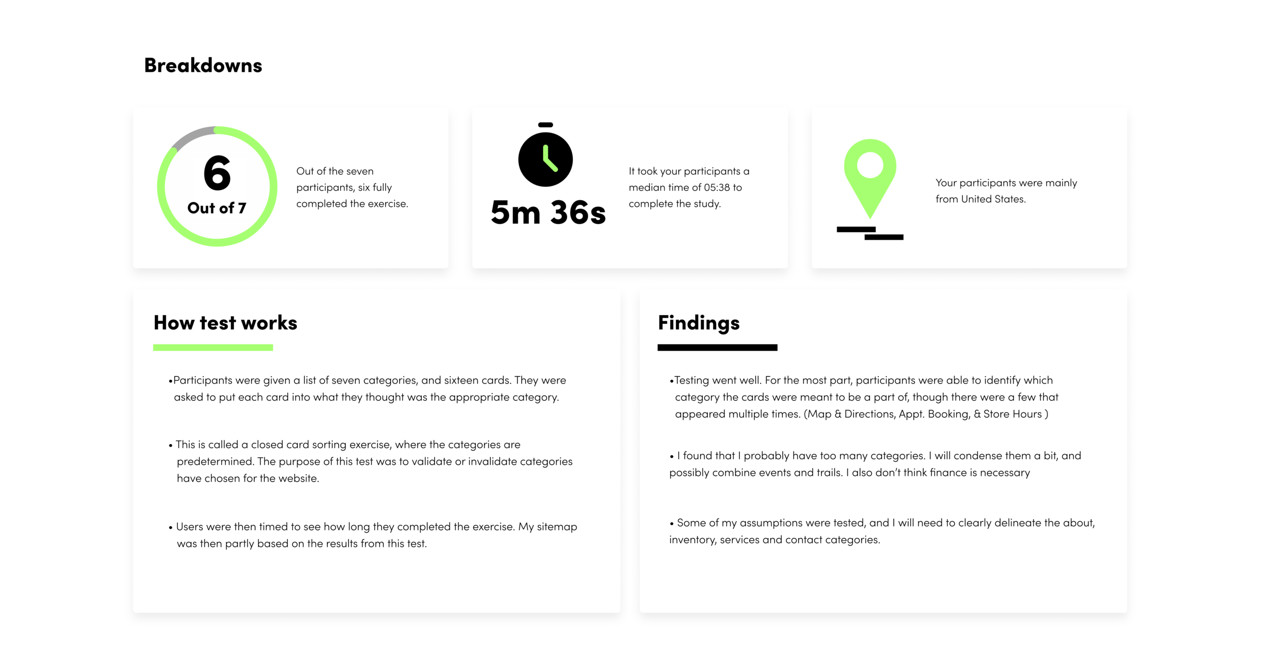
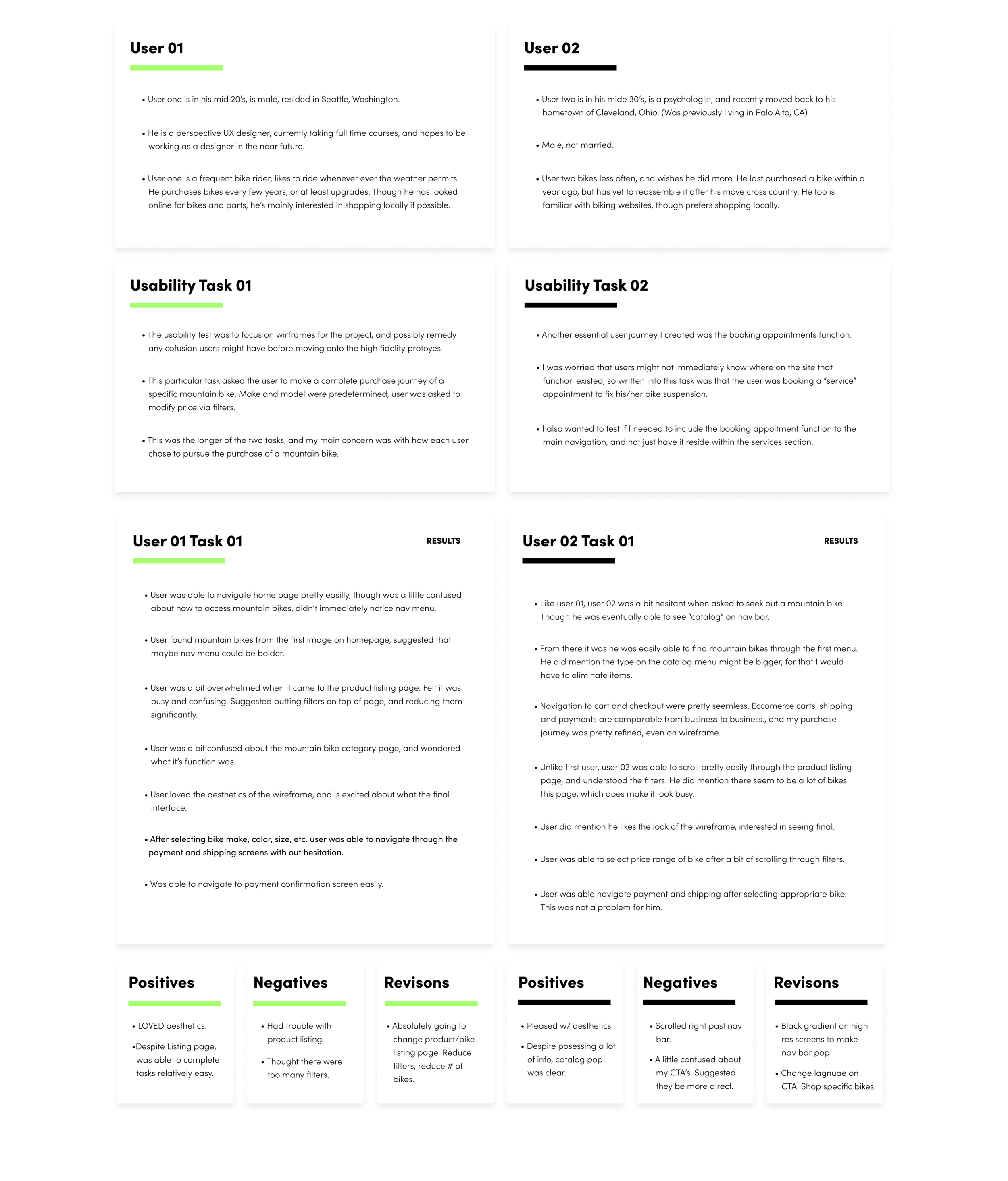
After creating wireframes, it was time to test how functional my designs were with a usability test. What I did was gather two volunteer users, and asked them to complete specific tasks in my prototype. These closely related to the problem statements I introduced at the beginning of case study.
One task was to complete the bike purchase journey, the other was to book an online appointment. Two simple tasks, given to gauge the revisions I would need to make to my design going forward. Below you’ll find the description of the study, some positive and negative results from users, and those revisions to complete. Note: results are only shown for task one.
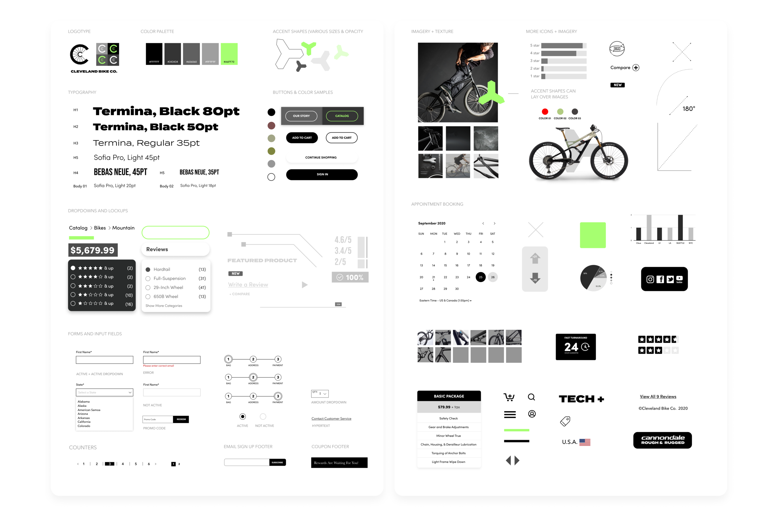
From here we had more fun and came up with a UI Kit, this included our logo, brand colors, typefaces, and all of the UI elements being used on our site. Active and inactive buttons, form fields, pop-ups, etc:
After developing a UI kit, it was time to create high-fidelity prototypes. I created all the screens necessary to go through a bike purchase, as well as booking a service appointment.
See below for desktop and mobile high-fidelity mock-ups:
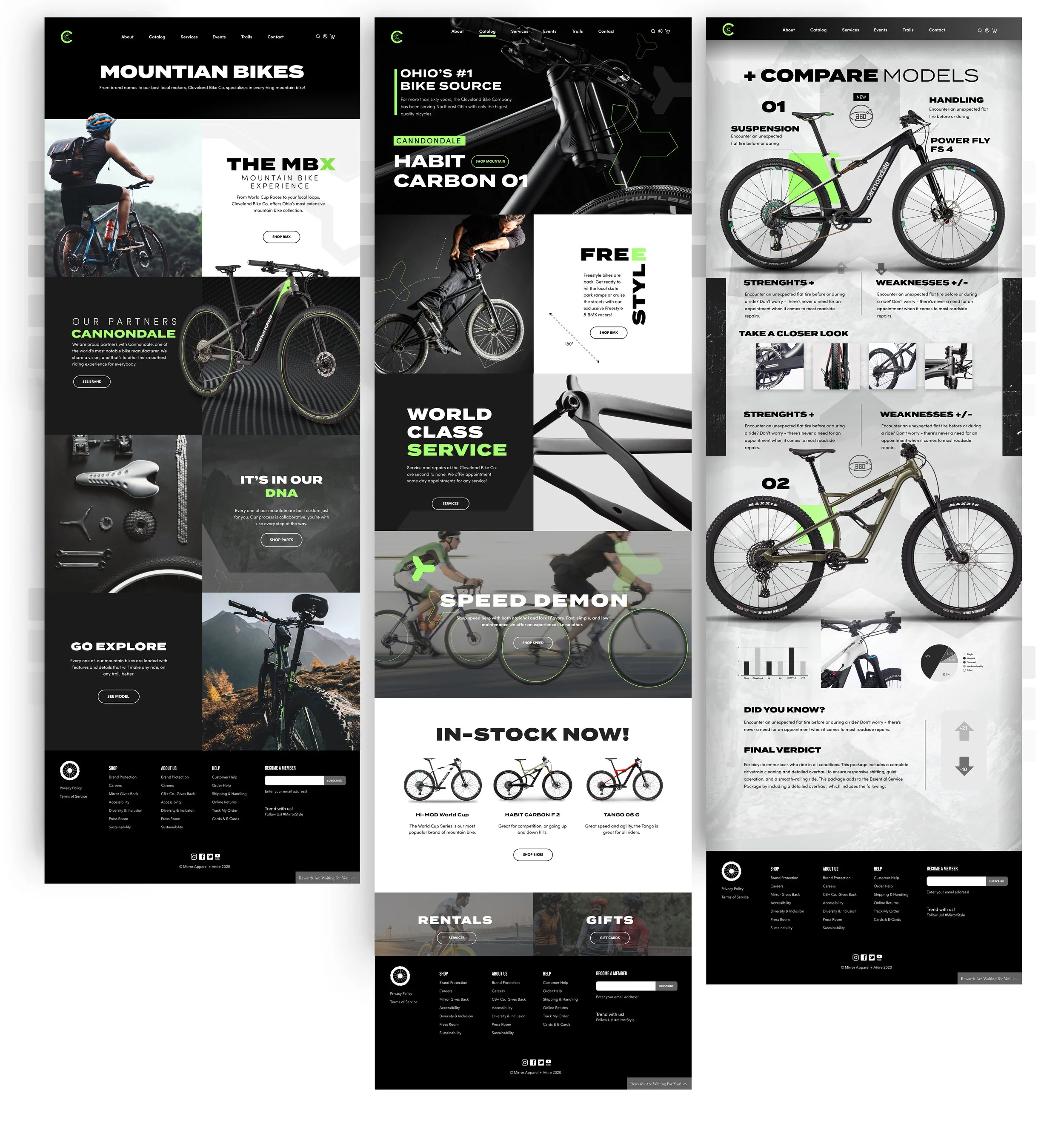
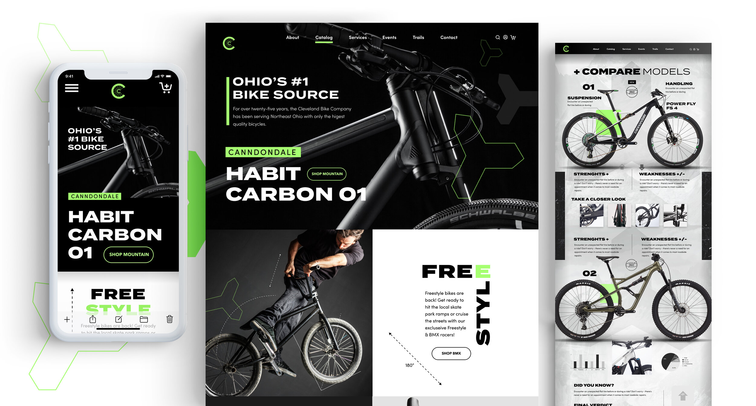
Home to Mountain Bike Category Page to purchase journey:

360° True View and Compare Model Pages

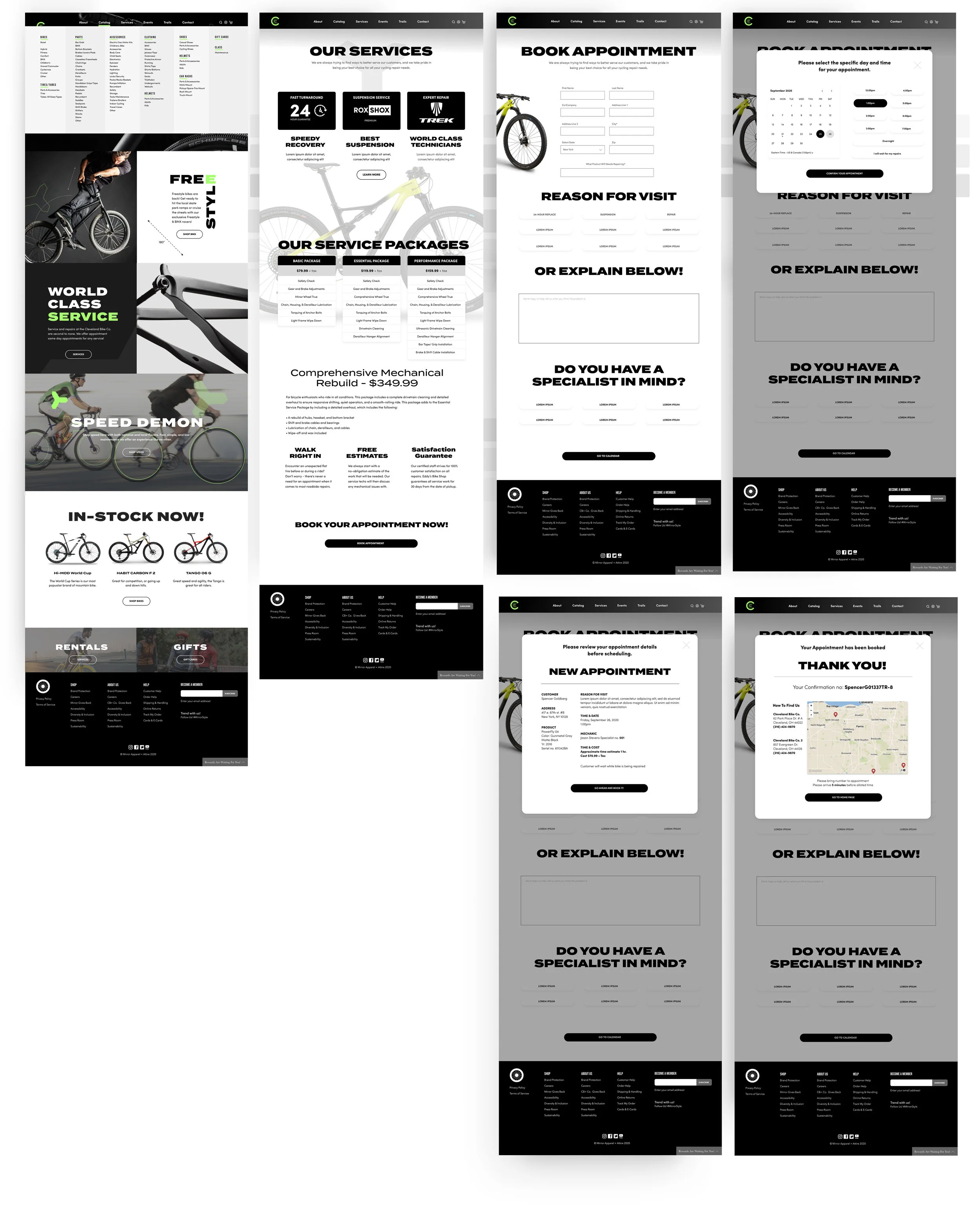
Appointment Booking Journey:
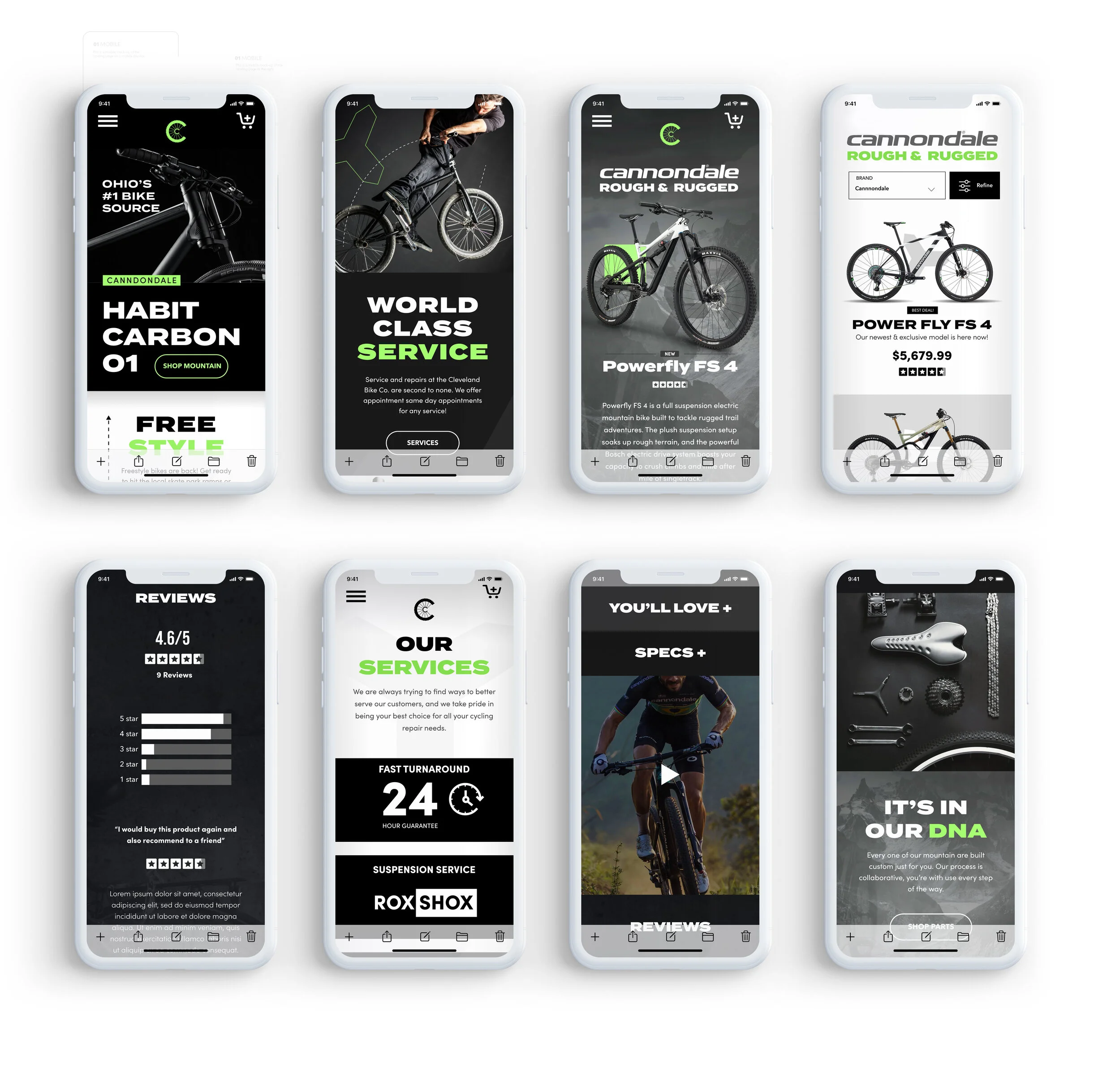
Mobile
Next Steps
My second case study and I’m happy I was able to design more screens and get a bit more detailed this time around. I would be anxious to build the rest of the product going forward; having more detailed user flows, purchase journeys for different products, and perhaps try some new aesthetic ideas for different sales in the future for The Cleveland Bike Company. I really hope you enjoyed exploring. It was a lot of hard work, and I appreciate your time.
Please feel free to reach out anytime,
Spencer