
Bringing Chase Bank up to speed—
A UX Makeover!
Project Overview
Adding an easy investment feature onto the existing Chase Mobile App
Deliverables
Chase app with new feature
Design Lab
UX Academy Zapf Cohort
UX/UI/Design Lead
Spencer Goldberg
Written by:
Spencer Goldberg
2 weeks/80 hrs.
DesignLab
Analog Banking in a Digital Age: Background
JPMorgan Chase is one of the largest banks in America and serves over half of this country’s households. They’ve been around for more than 200 years, starting with small banks in New York at the end of the 18th century as The Bank of Manhattan, and expanding during the mid-1900s when it merged with Chase National Bank (which existed separately from 1877 to 1954). Chase is still going strong today, with more than 5,100 branches and 16,000 ATMs nationwide. They have more than 250,355 employees (as of 2016) and operate in more than 100 counties. JPMorgan Chase has nearly $2.5 trillion in assets as of 2016 and is considered one of the Big Four banks of the United States.
So what’s the problem? Well, let’s hear what Microsoft founder and CEO Bill Gates had to say a quarter of a century ago:
Bill Gates famously said in a 1994 speech at a Bank Administration Institute conference that “Banks are dinosaurs, they can be bypassed.”
Banks are finding themselves less relevant in 2020. The financial landscape has changed drastically in the last two decades and large national banking institutions are struggling to keep up. We’ve shifted to a faster-paced, digital culture where banking is done on the go, and though the bigger legacy banks are adapting, they don’t seem to be doing it fast enough.
Banks Out, Fintech In!
FinTech (financial technology) is a somewhat recent innovation that is doing its best to disrupt the established financial management industry. It’s more personal than banks, quicker, and most importantly, mobile-friendly.
What are the FinTech Apps? Fintech is anything that leverages the power of technology to offer better financial services to customers. This could be a credit-based loan disbursing company, an online insurance policy vendor, a marketplace or an aggregator for it, a UPI service provider or more.
Specifically, Fintech offers easily downloadable apps for your mobile device that offer lightning-quick ways to budget your finances, save for a rainy day, match you to an appropriate IRA (retirement fund), and automatically round up your savings & invest in ways which are much easier and clearer than traditional banking apps.
Mission
What Chase wants me to do as lead UX is to find a clever way to introduce fintech accessibility to their mobile app. As it stands, their mobile app is as basic as it gets: take money out, put money in, check your balance, and move on. Any investment/insurance/budgeting information that is clickable will move you out the app and onto their main site. My first responsibility is to get right to the point and define the problem we wish to solve. We also need to ask important “how might we” questions:
How might we: Design a new personal finance management feature that embeds within the current Chase app, and flow naturally with its current branding?
My job is to thoroughly examine and answer this question through a specific UX design process. My goals and Chase’s have to align, and I’m excited to begin!
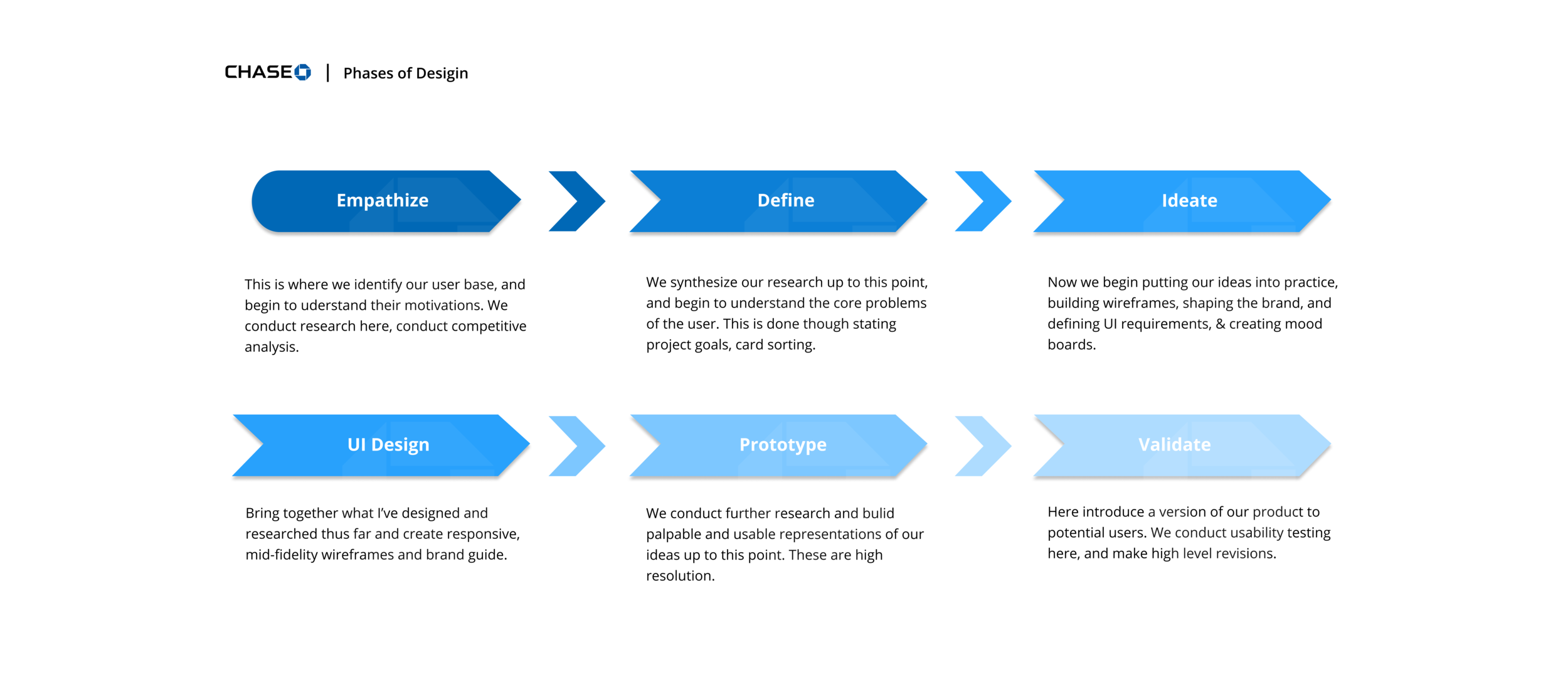
Let’s Get Started
What I’d like to do now is to identify the UX design process, and define each stage before going into more detail throughout the case study. Take a look at the graphic below to get an idea of the outline I followed throughout this process:
Empathize: Secondary Research
At the very beginning of our quest, perhaps the most VITAL first part of the process is researching. During this stage, we begin to understand our user base (hence empathize) and validate (or invalidate) some of the assumptions I have as UX researcher. Along with creating a detailed research plan, we’ll study available materials online, conduct interviews, create empathy maps, and more.
I first wanted to understand the relationship between millennials and banking. There seems to be a growing dissatisfaction among millennials when it comes to traditional banking. I want to know where and how this began. If I can identify some key points in the relationship between millennials and banking institutions, I can then lay a really solid foundation to support this process going forward. Other points of interest included millennials investing and saving habits, as well as documenting the rise of fintech apps.
Some Research Insights on the Economic Environment of Millennials, and some of their financial anxieties in general:
Two life-altering situations have dictated how millennials spend and save: The Great Recession, and crippling student debt.
The net worth of millennials (18–35) has decreased by 34% since 1996. 25% lower Household wealth for those ppl 20–35 in 2016 compared to 2007.
46% of millennials feel they aren’t saving enough, and 39% say they believe they’ll work past retirement.
Millennials earn 20% less than parents did at their age.
Though their economic landscape is bleak, millennials saving outpaces every generation before them
On average, the study notes, millennials started saving for retirement at age 24, whereas Gen X began at age 30 and baby boomers began at age 33.
Nearly three-quarters (73%) of millennials are saving some sort of money. 48% are doing so monthly. Within that 48%, 75% are saving for retirement, 51% saving an emergency fund, and 32% are saving to buy a home.
Millennials are likely to invest in themselves and the world around them
Despite earning less, millennials are saving more. 3/5 millennials save over 5% of their income.
The last bit of research delves into the rise of fintech apps, and some issues millennials have with banks themselves:
Fintech companies acquired $135.7 billion globally in investments during the last year.
North America produces the most fintech startups (thank Silicon Valley), with Asia, particularly China, coming in at a close second.
Chime is a digital-first bank, and crushing the competition, adding far more customers per month than big branch banks. Legacy Banks like Wells Fargo of Citibank are reported to lose over $344 billion in deposits to smaller competitors.
Almost 90% of incumbent financial institutions believe that part of their business will be lost to standalone fintech companies in the next 5 years.
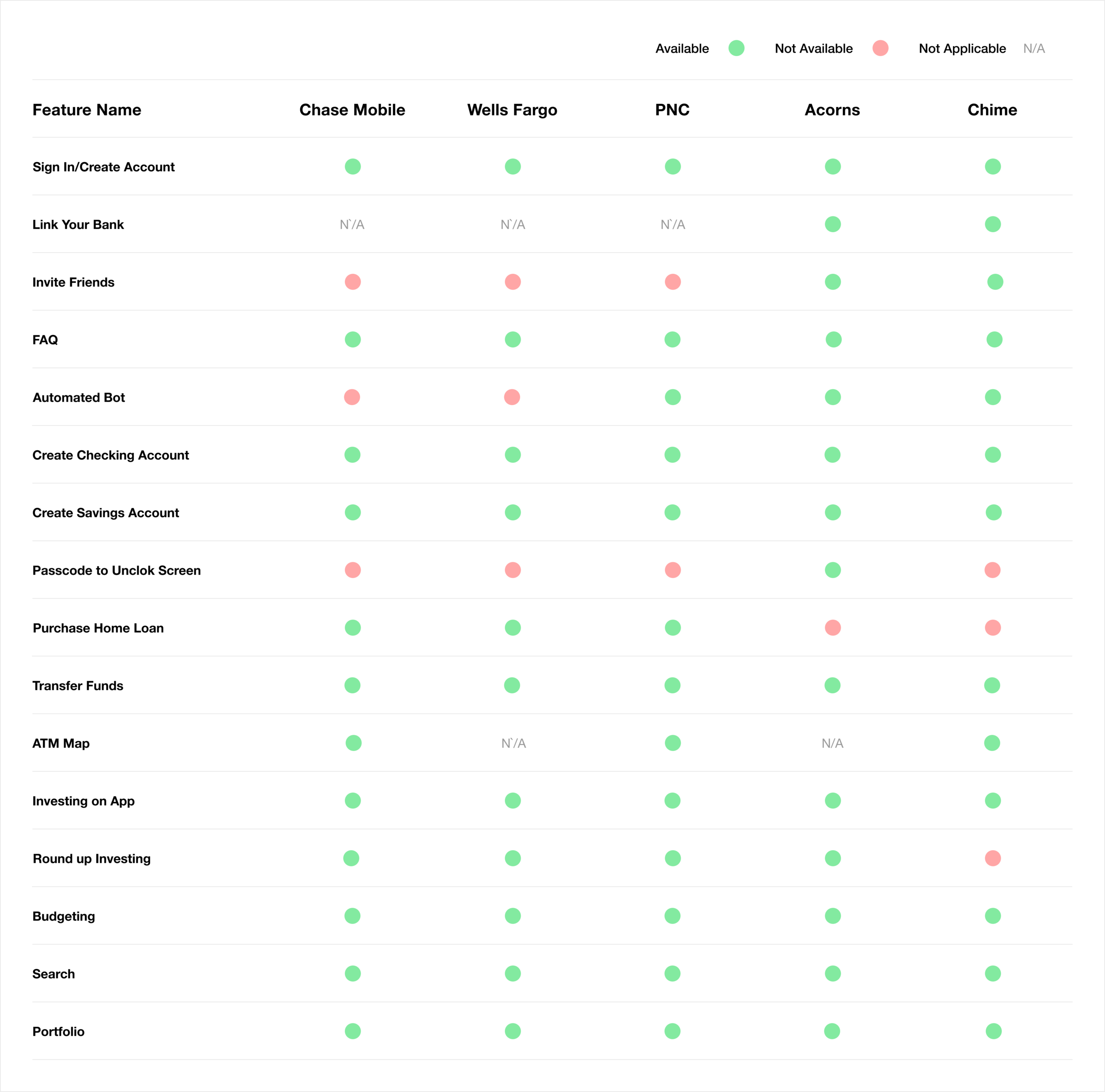
Competitive Analysis
Another important of our early research was to perform a detailed competitive analysis. I put together a checklist to compare Chase with other financial institutions. It’s important to study the habits and successes of other banks so that we can perhaps incorporate some of these findings into Chase’s new addition. I also wanted to learn some of the innovations of fintech apps and see where Chase can best improve (See Acorns & Chime). See below for a checklist:
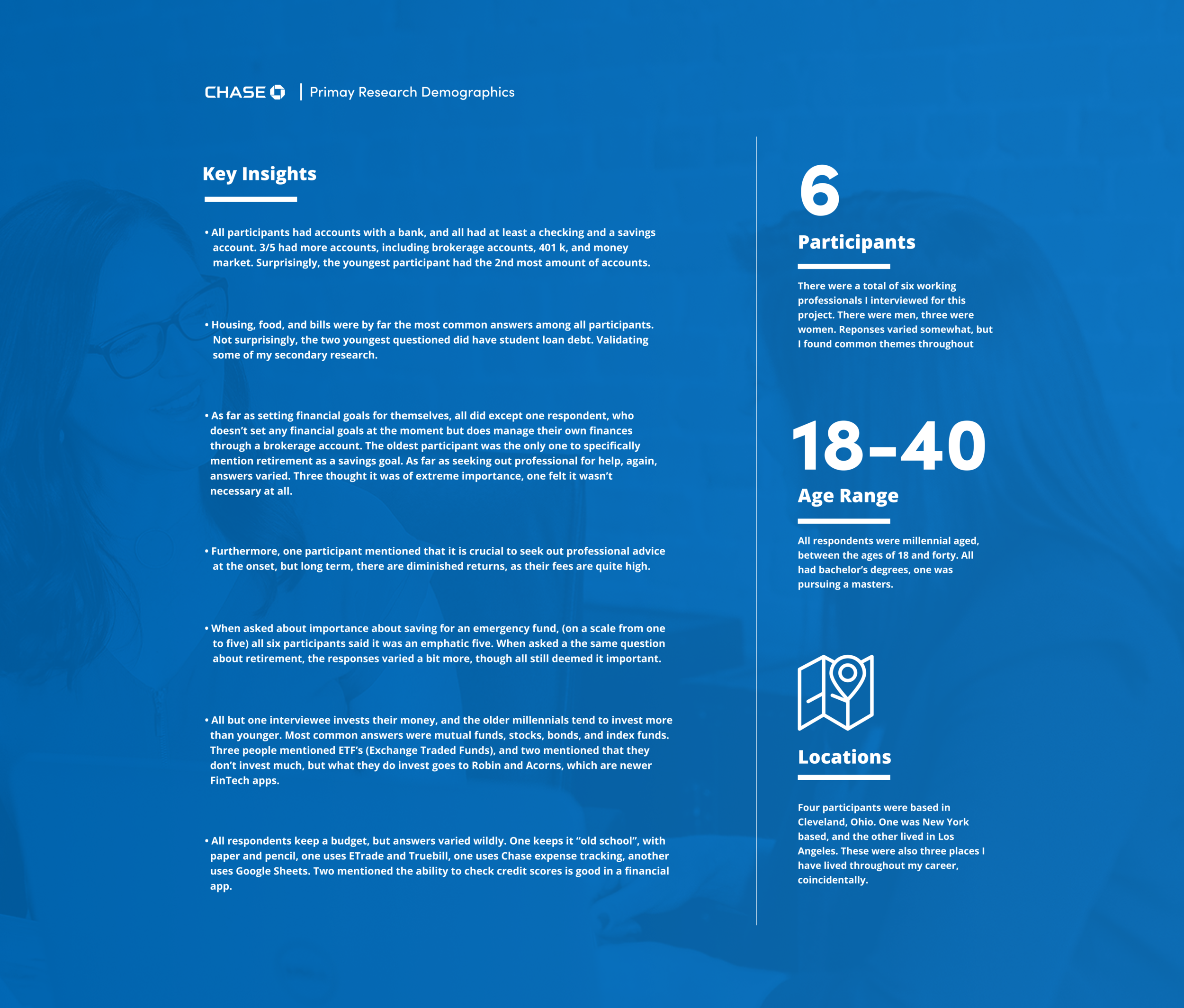
Primary Research (1 on 1 interview)
The next part of my research included interviewing a group of friends and colleagues (all millennials) about their banking habits: delving deep into what their financial goals and aspirations are, how they save and if they invest, what does their budgeting look like, and just a general sense of the overall millennial banking experience. I put together a short interview script and sat down with six participants. Results below:
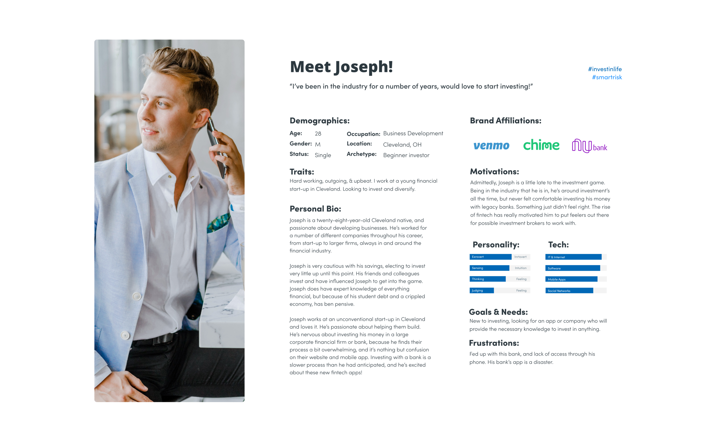
Persona
The last part of my research included creating a persona, which is creating an identity based on the information gathered from my interviewees, and sum total of my secondary research. This helps me zero in on the type of person I’m creating this feature for. All design decisions going forward were based around this persona. The person I created is “Joseph”: a 28-year-old single male, eager to begin investing some of his savings.
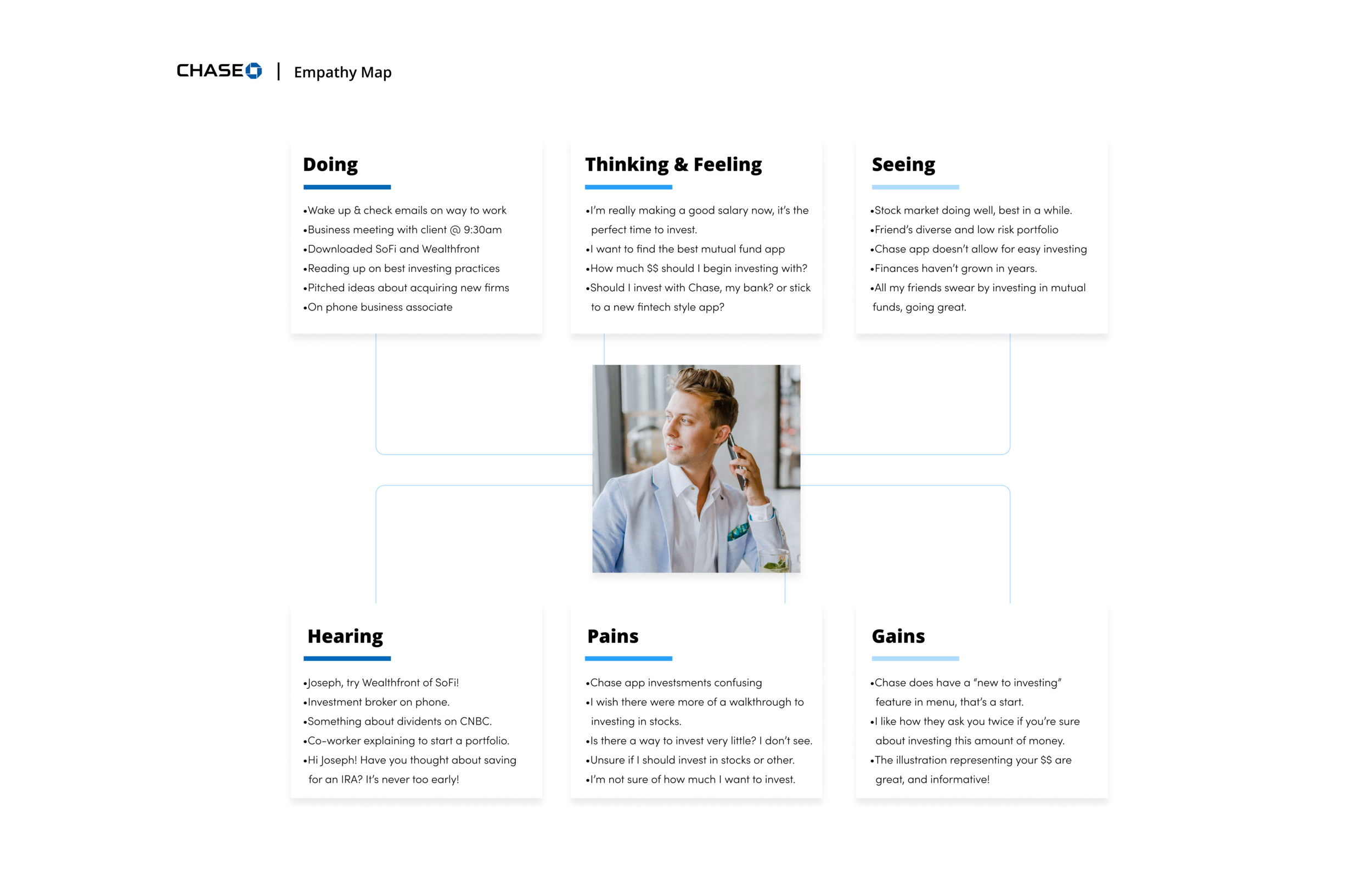
Creating an empathy map was another step in developing my persona. Here is a look at how we synthesized the research so far to map out a typical day for “Joseph”. It was another building block in understanding our user base, and what might be going through their minds on a daily basis. In the end, I also tried to identify certain obstacles Joseph might face investing his money. All of which I address down the line:
A Note: Concentrating on Investing
At this point, after compiling my research, creating my personas/empathy maps, and looking ahead, I decided I wanted to concentrate my feature addition to investing. More specifically, the way we traditionally purchase mutual funds.
With the rise of FinTech, investing in multiple stocks with calculated, low-risk outcomes (mutual funds, traditionally are a way to do this) has become second nature. Rather than going through a third party, and a broker, (which is necessary for beginners, but quite expensive) I wanted to create a simpler way to invest. (any length of time and still very accessible and digestible without a broker or third party)
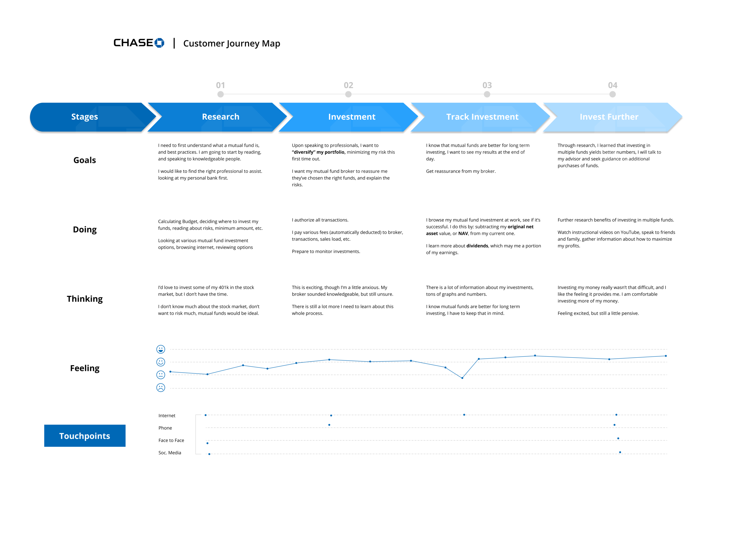
Customer Journey
After gathering both primary and secondary research, I wanted to next create a customer journey map. What this is to creating a visual story to illustrate a customer's interaction with the Chase App, identifying how they feel at each step in the banking process. Specifically, I want to understand what a customer goes through, emotionally, when investing their money. This will help me understand the customer’s perspective much better. See below for details:
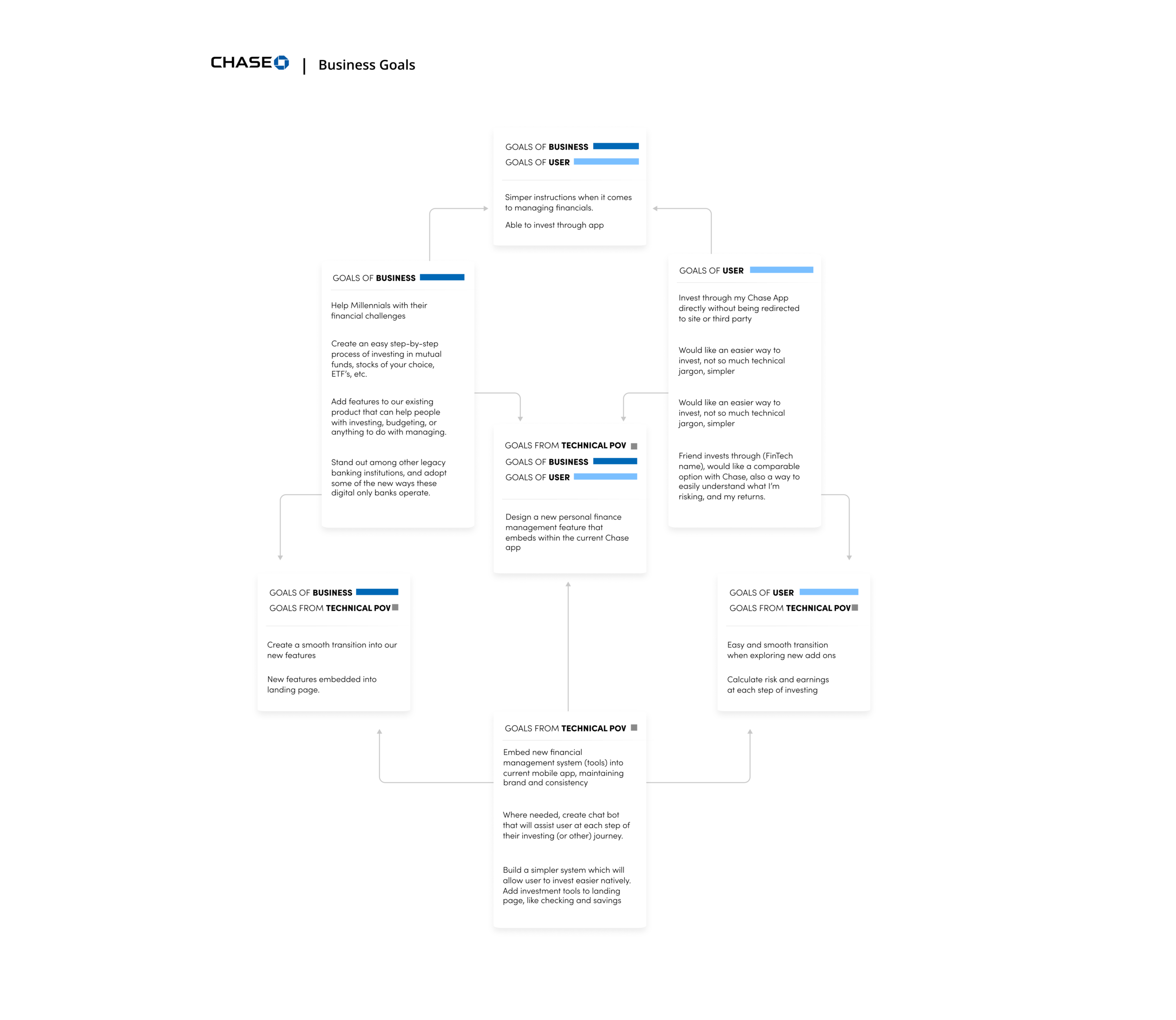
Stage two: Define
This is where we look at our research and begin to synthesize it. We start to understand the framework of our new additions with things like a feature roadmap and define the goals we’d like to achieve from a business and technical standpoint.
The first graphic is a chart that lists the goals Chase has (business goals), goals the user will have (user goals), and what’s possible from a technical point of view (technical POV goals) to create a new investment feature.
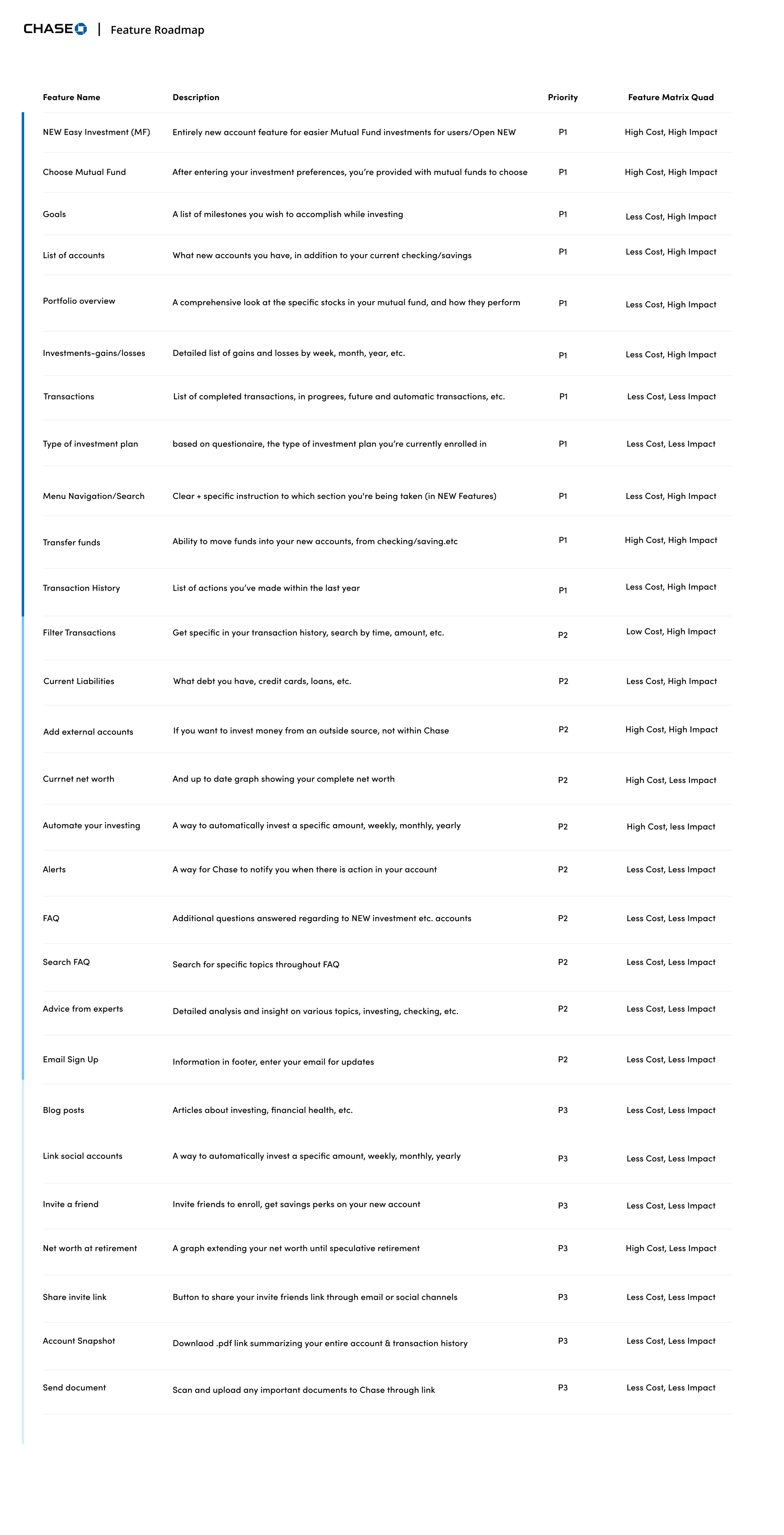
From here, we were able to create what’s called a feature roadmap, which is a checklist of attributes The new investment feature will contain. We’ve also ranked them in their order of importance.
Another facet to this list is estimating the man-power each feature will ultimately use — i.e. time and cost — and label each feature accordingly, P1, P2, etc. (Priority 1, Priority 2, 3…)
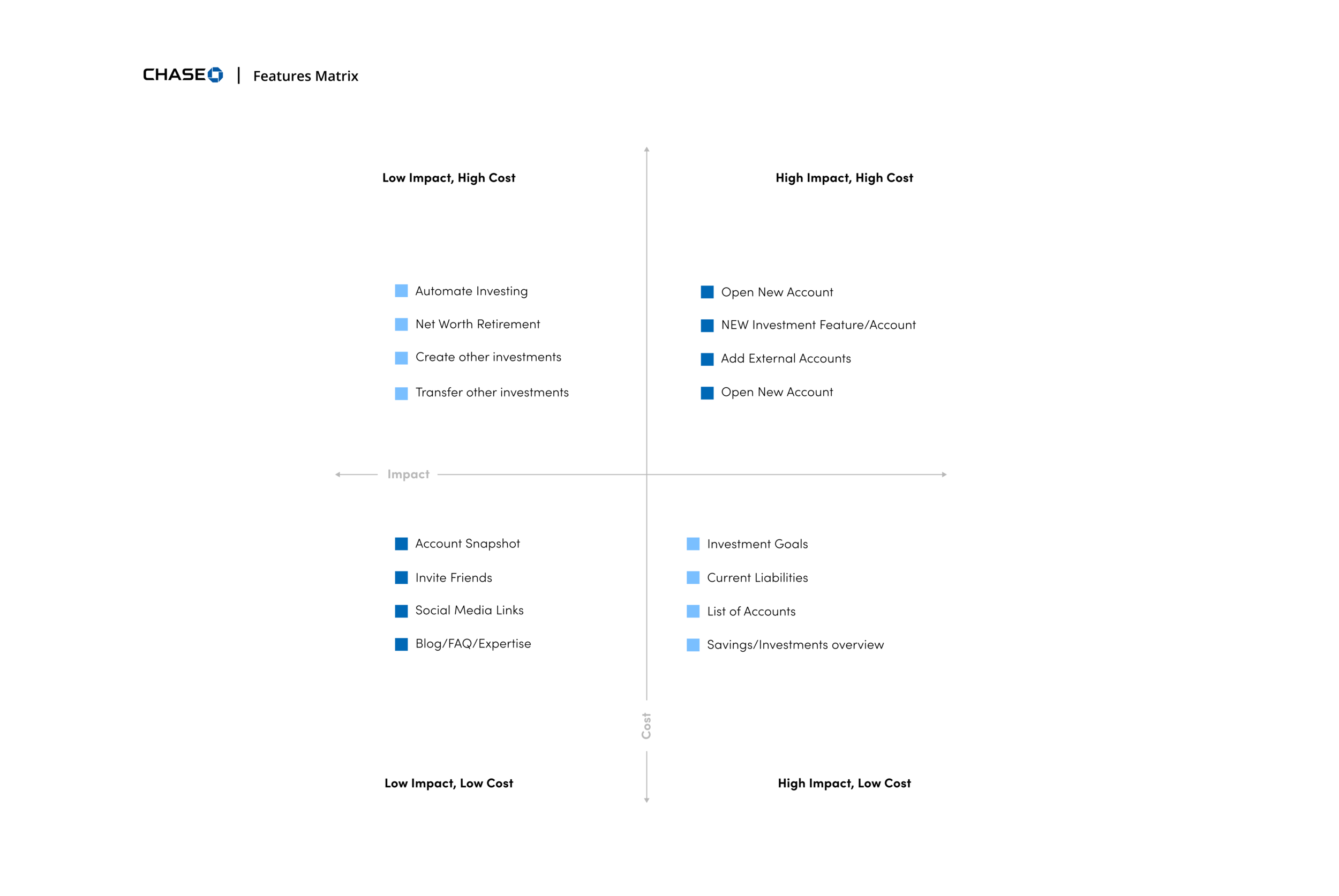
Piggybacking the feature roadmap is the feature matrix. Which is a graphic used to illustrate how important (or of lesser importance) new features are going to be in relation to cost. You can see this in the graphic below:
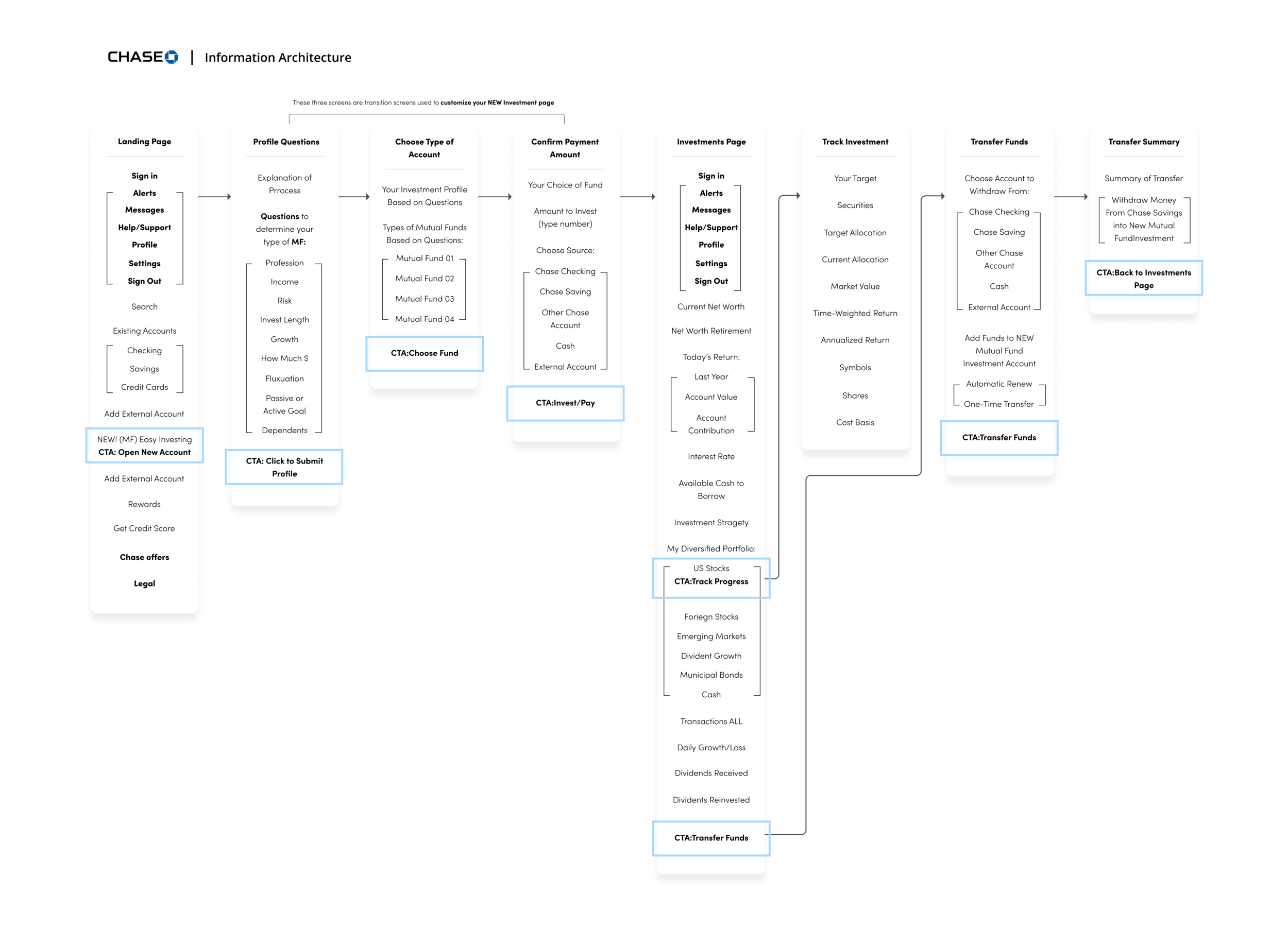
Culminating the definition stage was our sitemap. This is how we organize our additional feature structurally, labeling each component of the new feature and where it exists in relation to everything else. We develop information architecture at this point:
Information architecture (IA) is the structural design of shared environments; the art and science of organizing and labelling websites, intranets, online communities and software to support usability and findability.
My method was to identify all of the items you’d see on a specific page in Chase Mobile, and indicate clear call to actions. The graphic below represents a Chase user and first-time investor, exploring the new feature:
Stage 3: Ideation
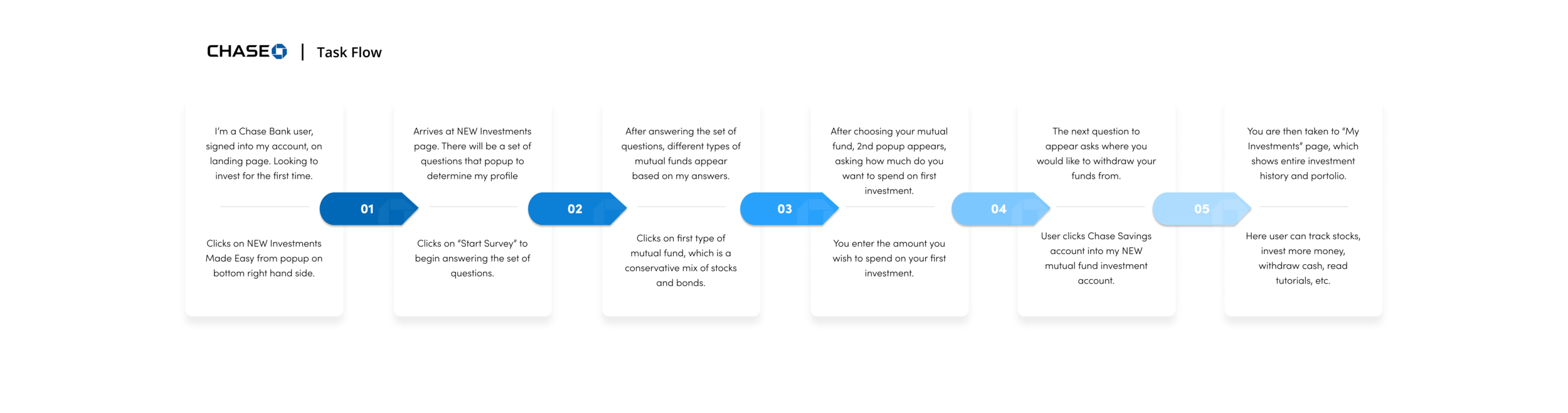
Here we build wireframes, a UI kit, and below we have a detailed task flow. This takes the sitemap and details what the potential user will experience and their decision at each stage of investing their money:
Here we develop our product even further by introducing lo-fidelity wireframes. (Pencil and paper) Our plan here is to give us a couple of solutions based on our research thus far and our IA (information architecture).
Below you can see paper sketches:
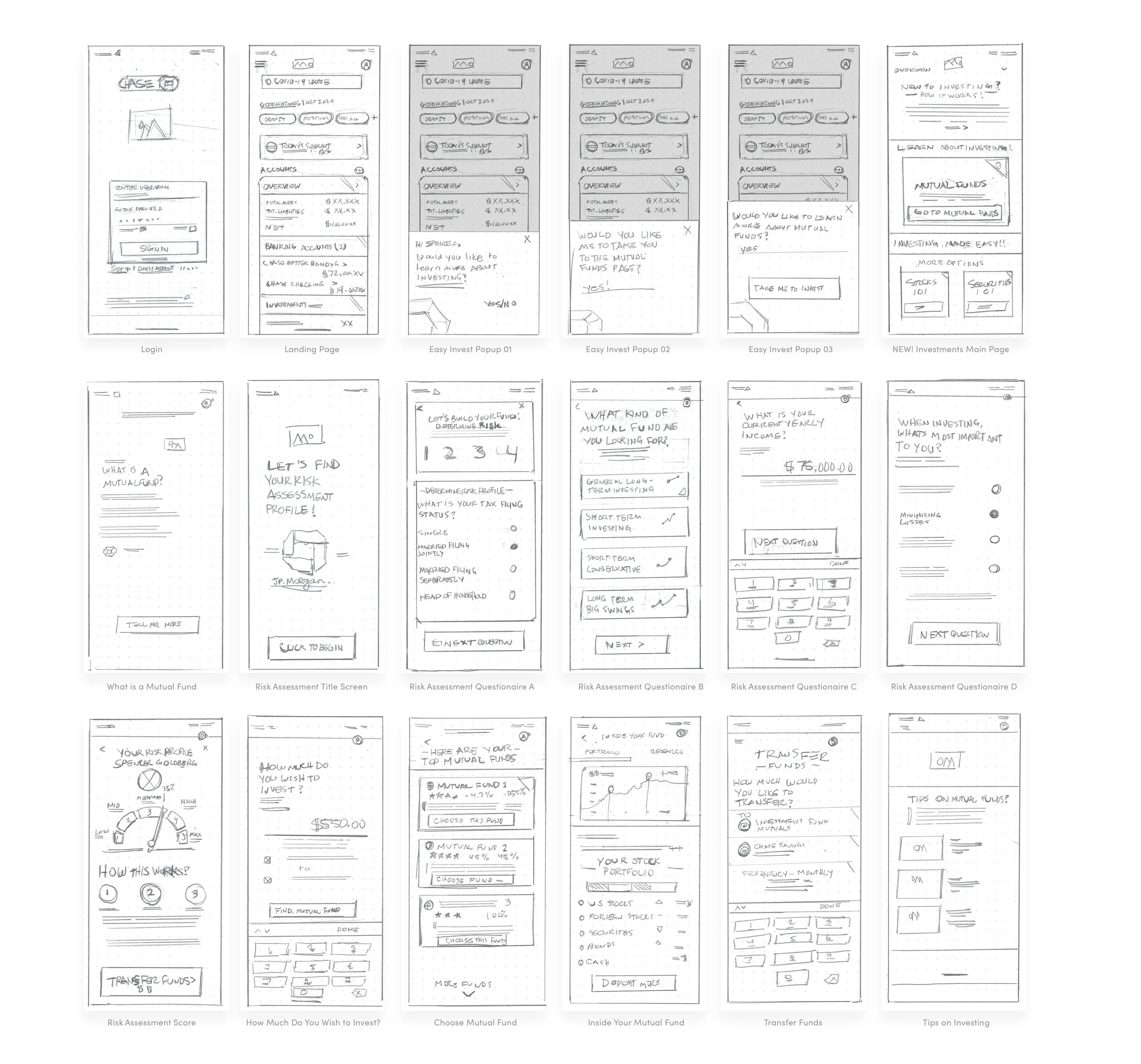
Wireframes
From here, I developed mid-fidelity wireframes. This was to further map out the journey of investing in a mutual fund. I also began to develop some User Interface elements during this process.
The idea was to create enough pages for users to fully complete an online investment. I also included a number of tertiary screens, which describe to the user what a mutual fund is, and how their money will be spread.
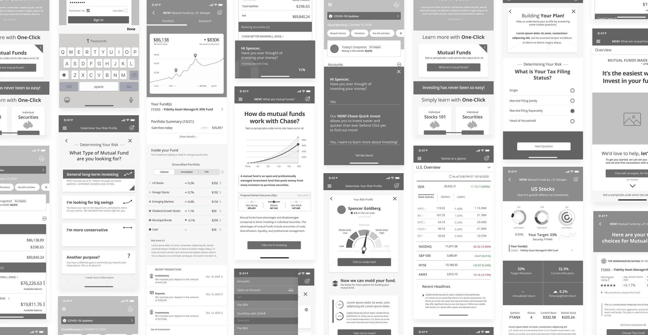
Further Ideation
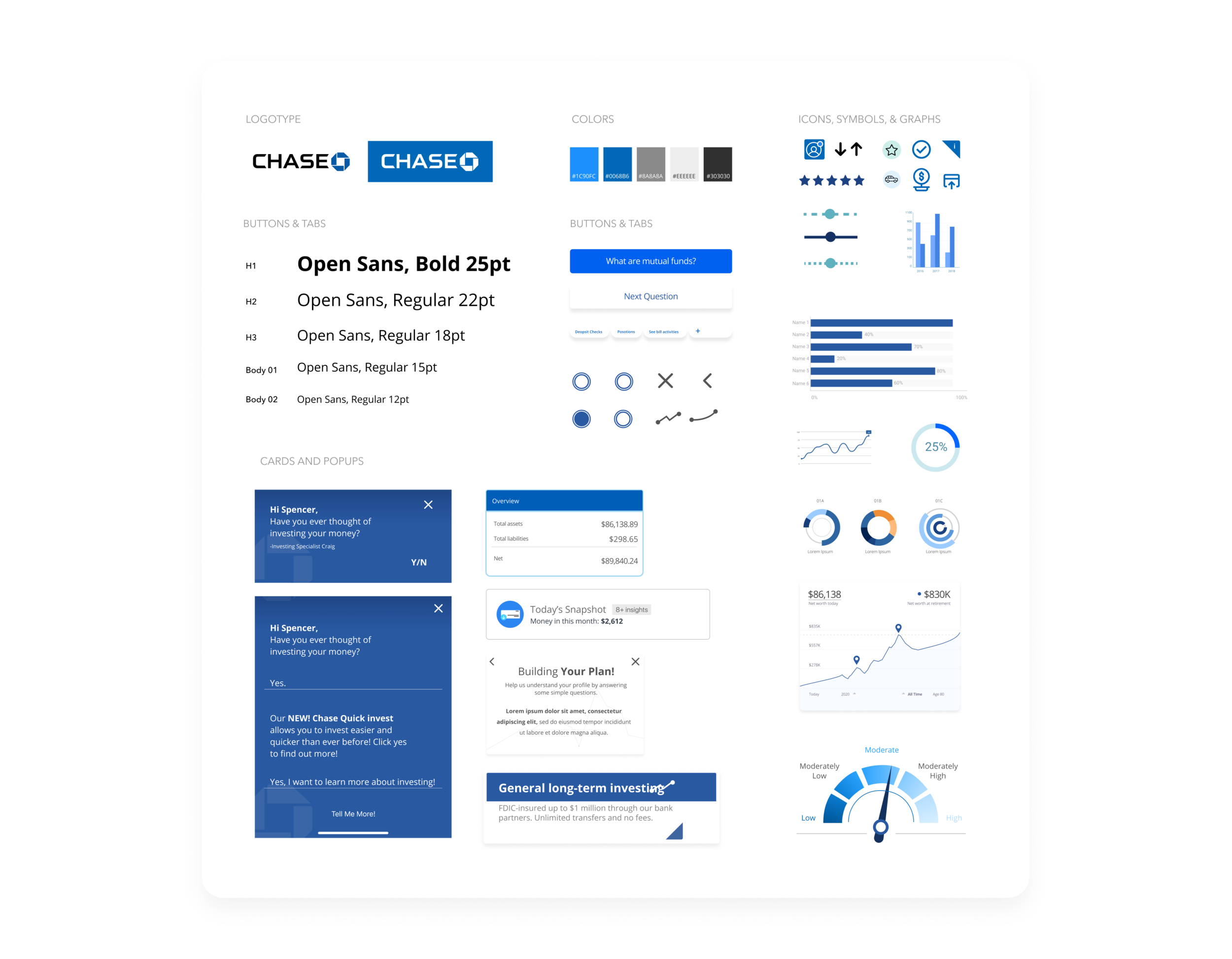
Before jumping into the hi-fidelity prototype, I wanted to identify the Chase brand with a UI kit. Here we have information like color palette, buttons, symbols, forms, tabs, as well as others
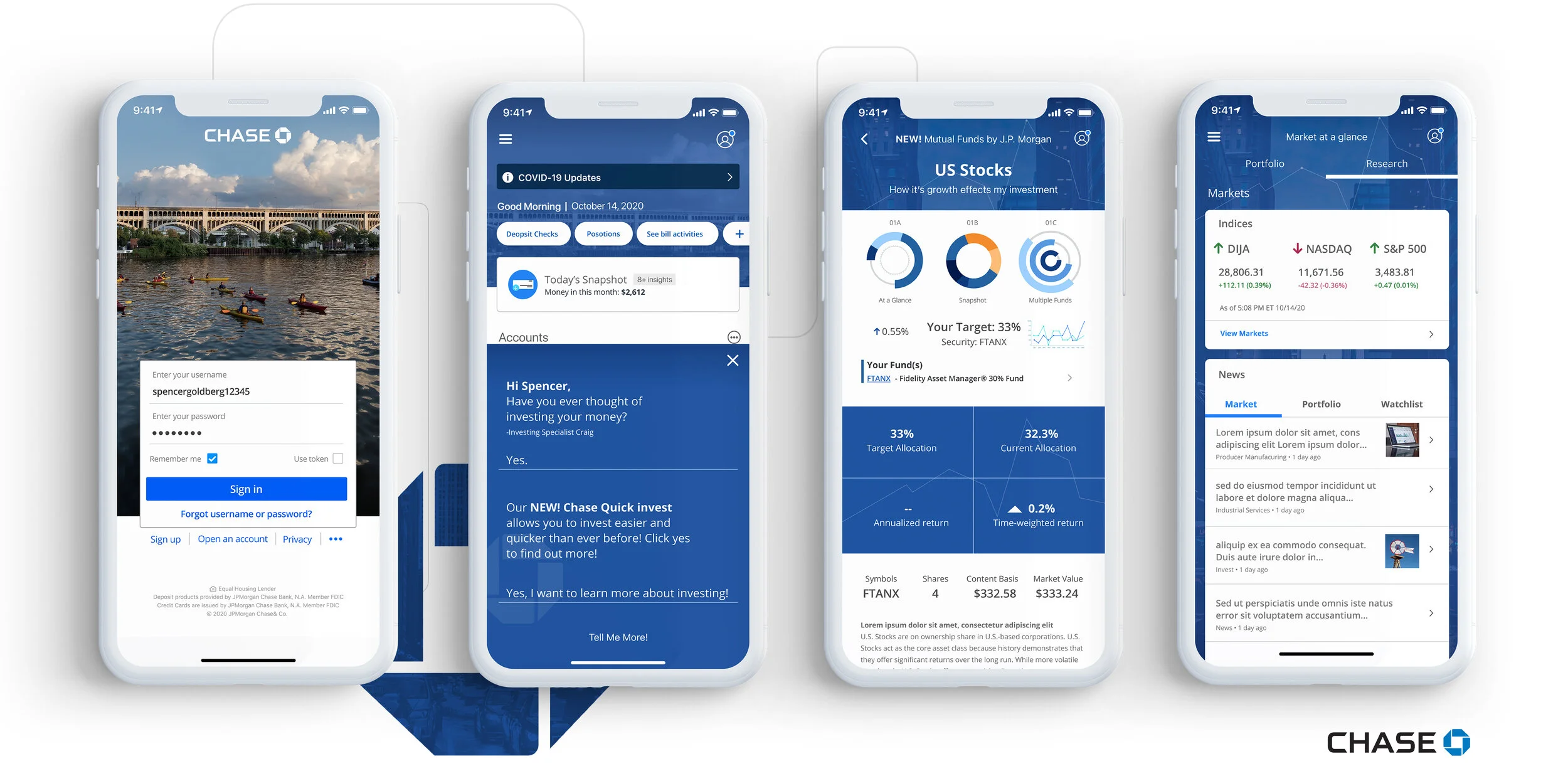
Stage 4 Prototype
After developing a UI kit, it was time to create high-fidelity prototypes. Below are the purchase journey’s created for the user to fulfill purchasing mutual funds: login, questionnaire, and transferring funds.
See below for desktop and mobile high-fidelity mock-ups:
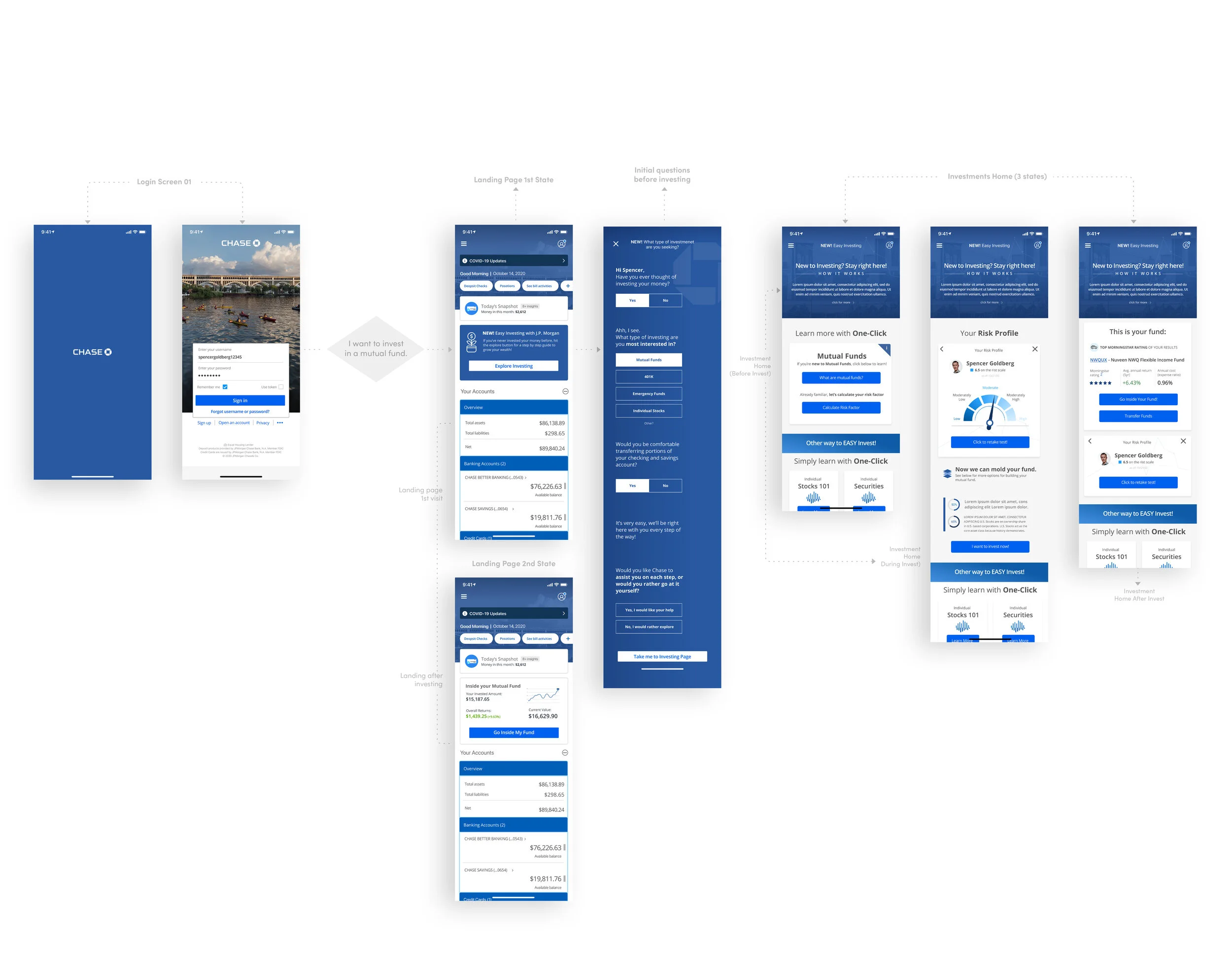
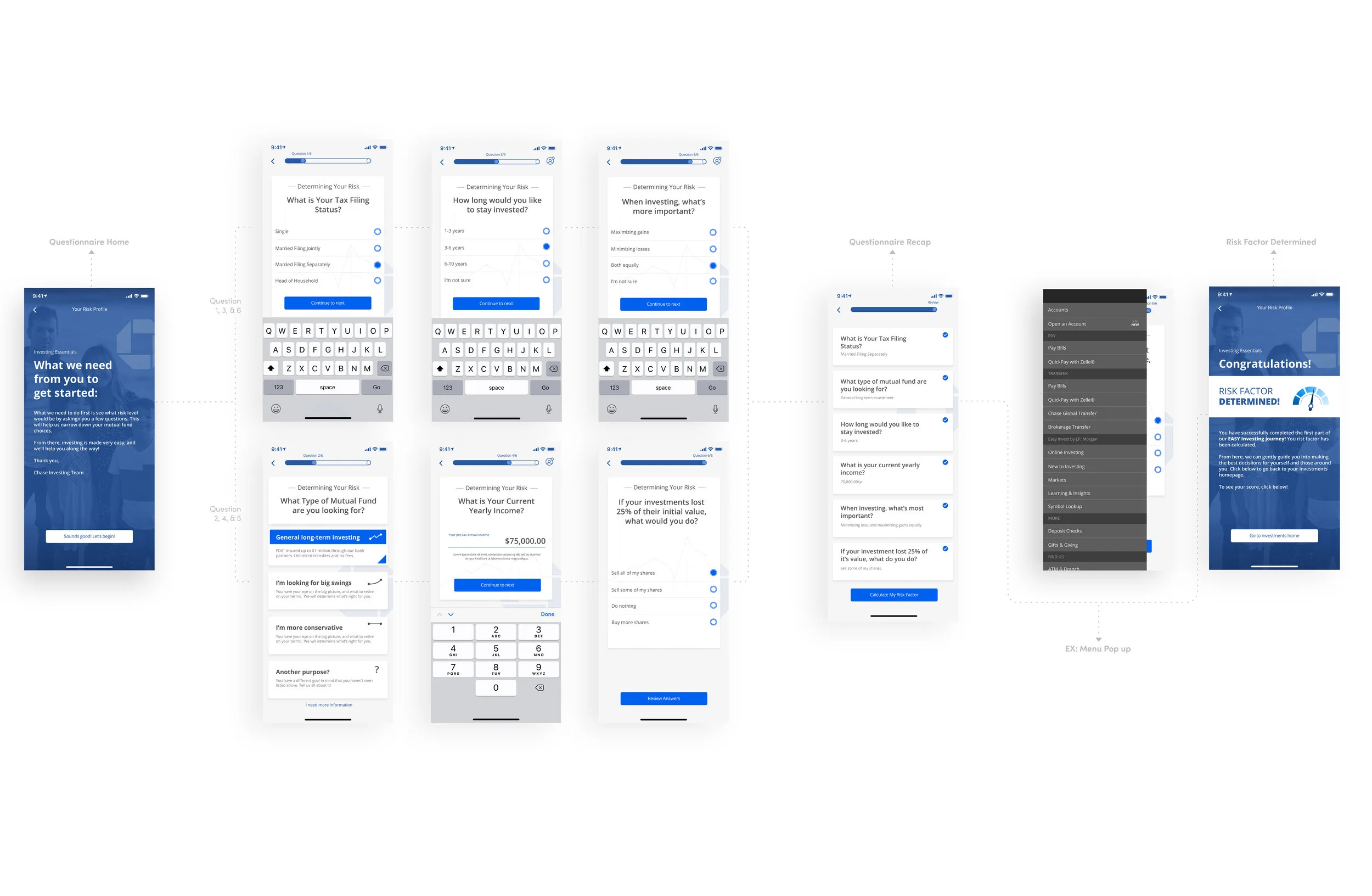
After navigating to investments home, you’ll be taken to a questionnaire so Chase can determine your risk factor:
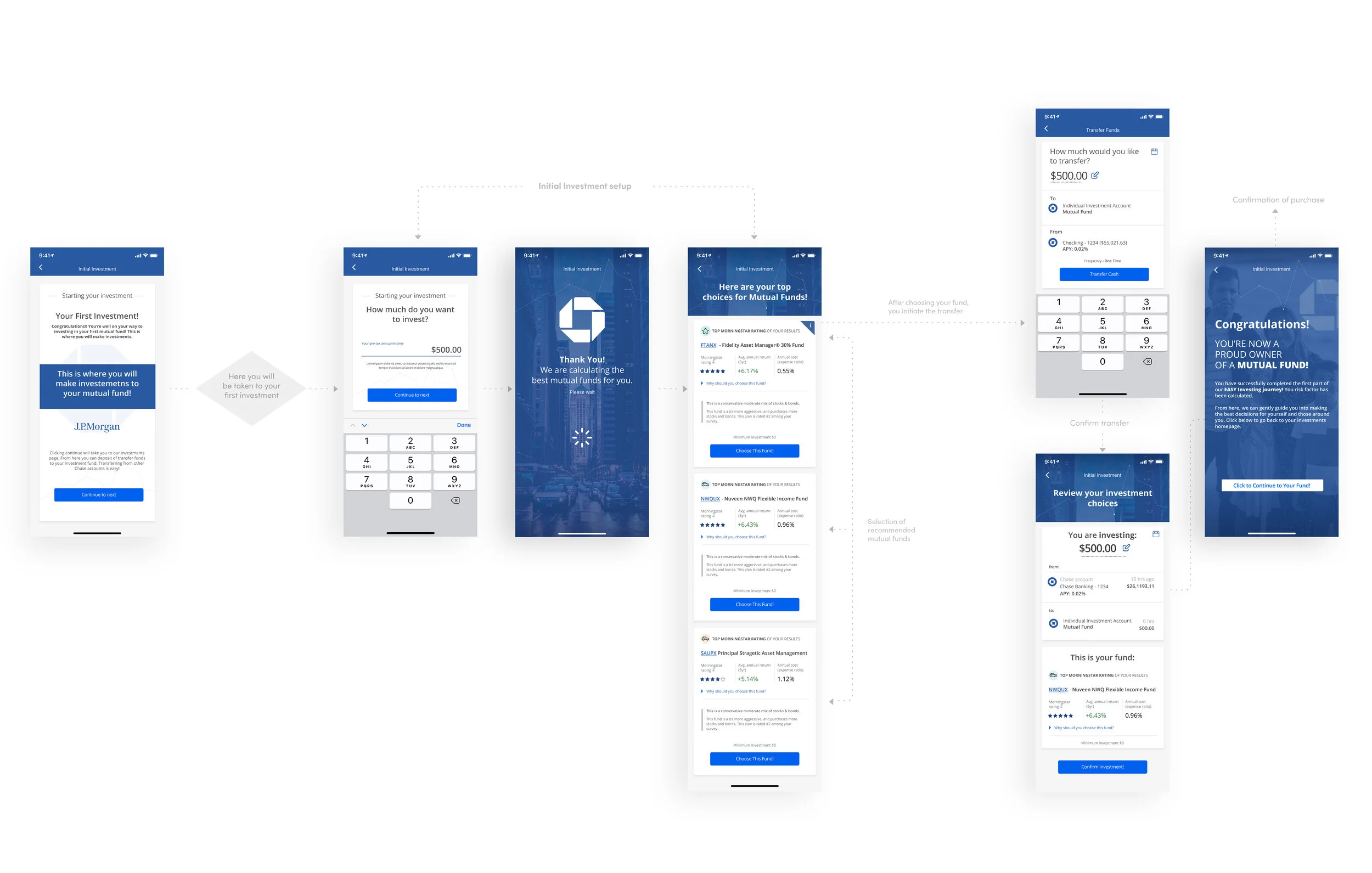
After determining your risk factor, you continue to your initial investment:
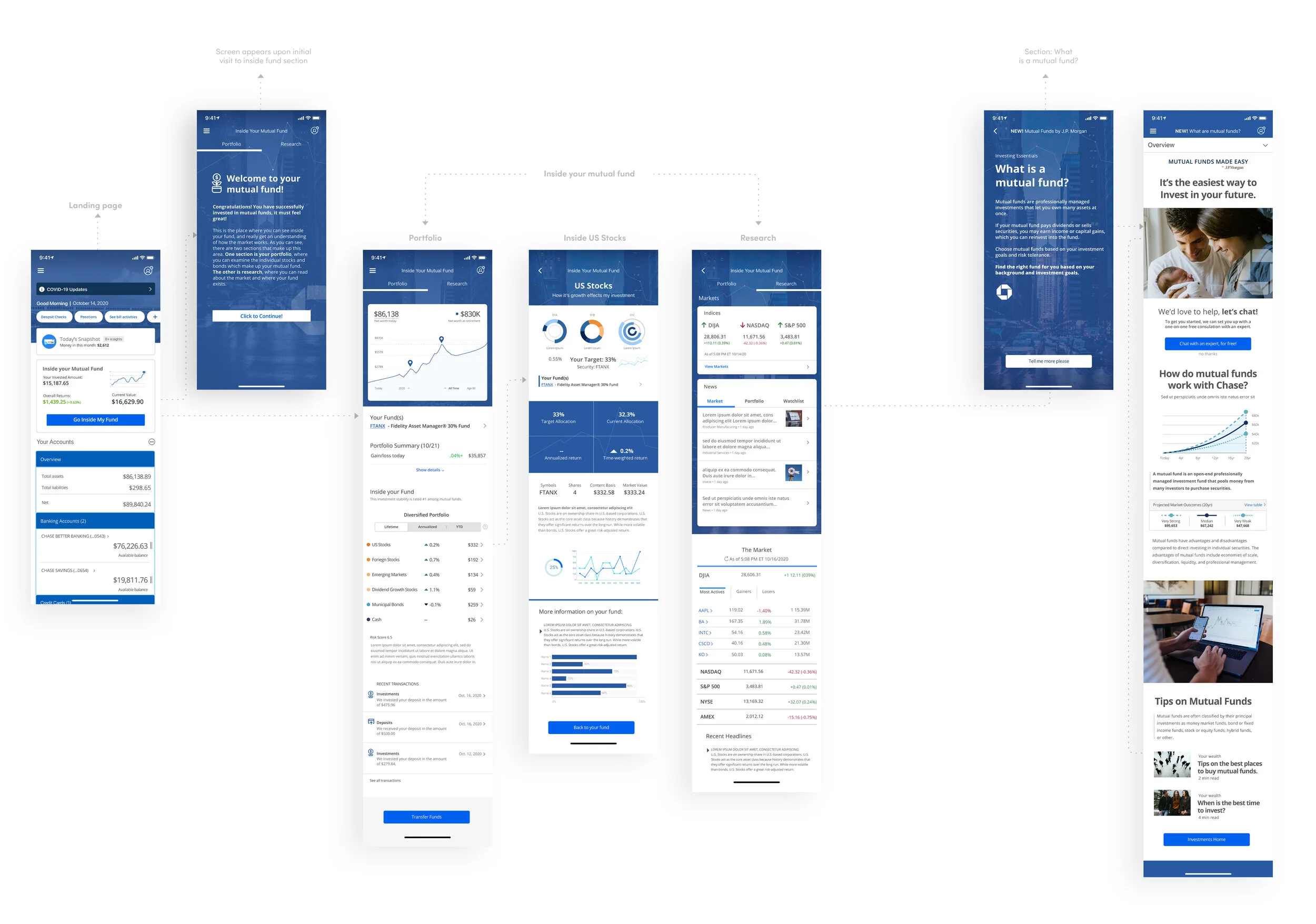
Here we go inside your mutual fund, from the landing page:
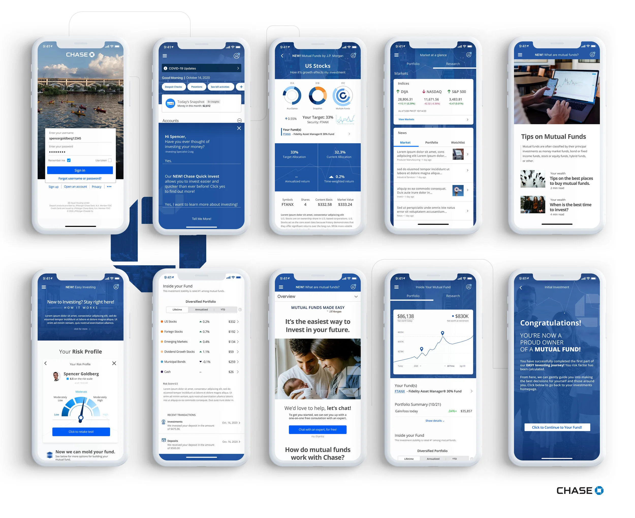
Here is a high-fidelity mockup of the prototype. Here you’re able to really see how the app will act on a mobile device:
Stage 5 Validate
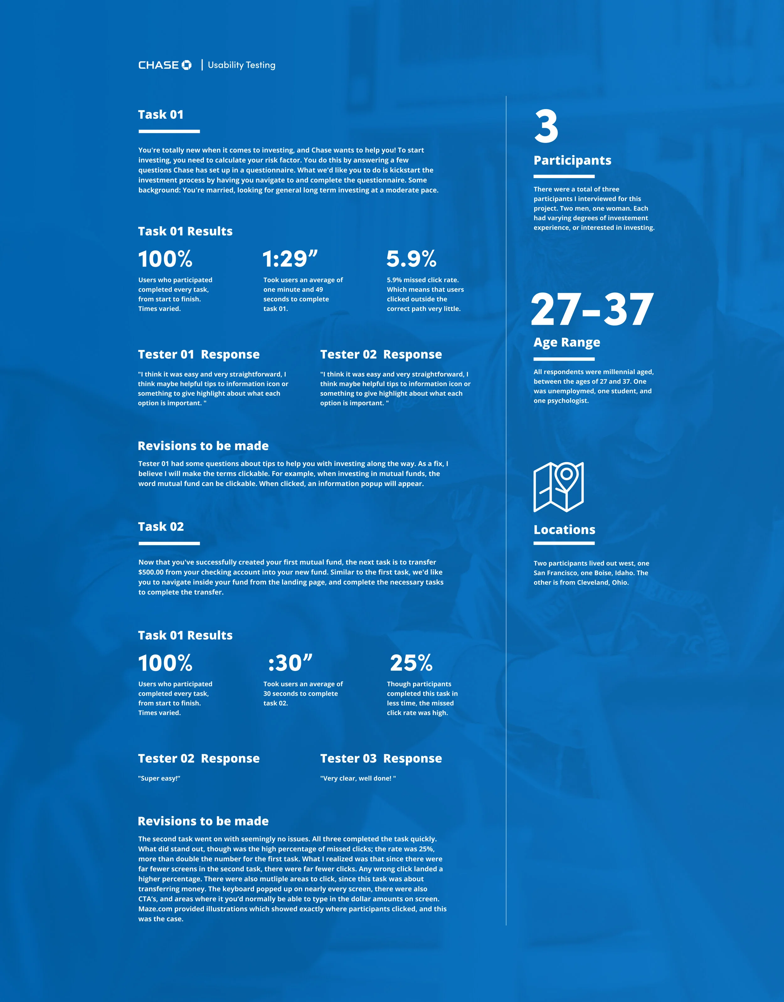
After creating high-resolution mock-ups, it was time to test our product! What I did was create a usability test from my prototype. I chose to create two purchase journeys: one was to navigate and complete the questionnaire that determines your risk factor.
The second task was to transfer funds into your mutual fund account from your Chase checking account. Both tests were successful, with little revision to be done:
Next Steps
This was an amazing experience. I believed I achieved all of what I set out to do. Again, the object of this exercise wasn’t to create an entirely new product but to add a feature to an existing one, while seamlessly weaving their brand and message throughout. It was also a great learning experience! I got to practice my user interface skills creating and recreating the Chase Bank Brand, but I also learned quite a lot about investing.
I am excited to add new features to existing digital products in the future. I am very confident with this ability after creating this case study.
Please feel free to reach out anytime.