
It’s Bhuku time—
the ultimate app for book lovers!
Project Overview
Bring Mirror online and include a brand refresh
Deliverables
Responsive site, Branding
Design Lab
UX Academy Zapf Cohort
UX/UI/Design Lead
Spencer Goldberg
Written by:
Spencer Goldberg
2 weeks/80 hrs.
DesignLab
Project Overview
Bhuku is an app for book lovers that will help users track everything they own, books they have read, what they will read next, and also everything they have loved so far. In essence, it’s quite similar to goodreads.com.
Bhuku has started collecting data on popular books. Inspired by goodreads.com, Bhuku wants to give a more user-centric approach to their app, adding features and flows that make it delightful for people to use. They want to use the full potential that a mobile app has, such as utilizing the camera to register books in a more automated way via optical character recognition (OCR), sending notifications to users to keep them engaged, tracking their progress on reads (potential gamification), etc.
Direction of App
Through extensive research, I was torn between two directions I wanted to take the direction of the Bhuku. I was heartened to find that the printed word is still very popular among book lovers. Although eBooks and books on tape have grown wildly popular over the past decade, the ideal way people like to read is still a physical copy.
I want to understand what readers want to see in a book inventory app, who they are, and if adding an audiobook and/or eReader player would be something people wanted.
How might we: Design an app which aligns with most book inventory products aesthetically, and make it more user-centric?
My job is to thoroughly examine and answer this question through a specific UX design process, and I’m excited to begin!
Let’s Get Started
What I’d like to do now is to identify the UX design process, and define each stage before going into more detail throughout the case study. Take a look at the graphic below to get an idea of the outline I followed throughout this process:
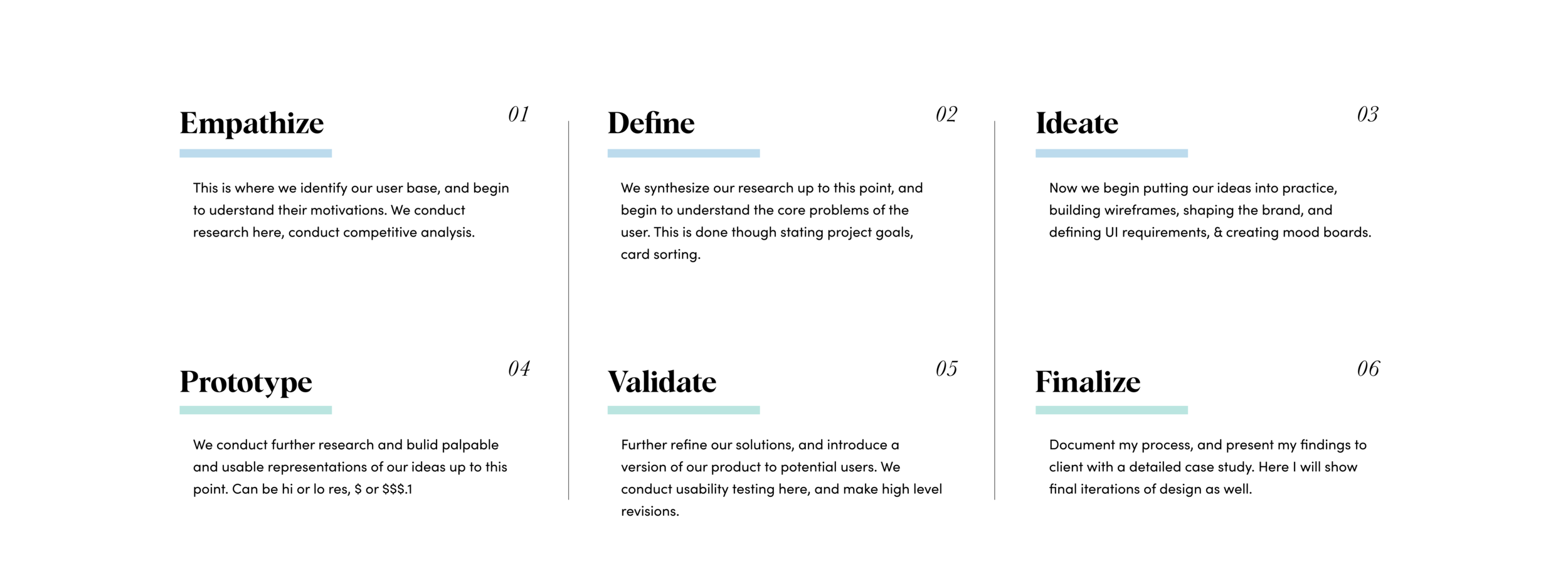
Empathize: Secondary Research
At the very beginning of our quest, perhaps the most VITAL first part of the process is researching. During this stage, we begin to understand our user base (hence empathize) and validate (or invalidate) some of the assumptions I have as UX researcher. Along with creating a detailed research plan, we’ll study available materials online, conduct interviews, create empathy maps, and more.
Some of my initial research goals were: determining the demographics of book lovers, their reading habits, and how they consume what they read. I also want to review the literary landscape and record some important details about the rise of ebooks and audiobooks.
Who is doing the reading?
Millennials accounted for the largest share of printed book readers in the U.S. — 72 percent as of 2016.
a 2016 survey shows about 80 percent of respondents between the ages of 18 to 29 had read at least one book in the previous 12 months, the highest share amongst all age groups. About 73 percent of the respondents aged between 30 to 49 years old said they read at least one book in the last 12 months.
In terms of education level, book readers in the U.S. are more likely to have a college degree, or at least some college education — 86 percent and 81 percent respectively.
Though eBooks have gained tons of momentum, the printed word remains most popular:
Print book sales figures have improved over the last five years and unit sales now amount to over 650 million per year.
Despite the rise of digital book formats, printed books still have their space in the market. After 2012, sales of printed books started to gain momentum, and have slightly increased up until 2015. Sales figures aside, published books are still the preferred format of 65 percent of book readers in the U.S.
Despite the rising popularity of e-books in the U.S. among publishers, forecasts show that the number of e-books readers is expected to slightly drop in the coming years.
Sales figures aside, published books are still the preferred format of 65 percent of book readers in the U.S.
Audiobooks, a possible link between the old and the new:
One medium that bridges the gap between the traditional book market and new forms of technology is the audiobook. Sales revenues have soared in this area, more than doubling between 2010 and 2016.
The growing demand for audiobooks can be seen in the fact that the number of audiobook titles published in the United States has grown from approximately 6,200 to over 50,00 in the same time frame.
One of the major selling points of audiobooks is the capacity for on-the-go listening, allowing consumers to listen to their favorite books in the car, on the commute to work, or while on a run. However, some 52 percent of consumers also listen to audiobooks on a desktop or laptop, suggesting that there is also a big demand for audiobooks in the home.
Competitive Analysis
Another important of our early research was to perform a detailed competitive analysis. I put together a checklist to compare other digital book inventories apps to see what features Bhuku might need. I thought it was important to include at least one digital book app that offers eBook and audiobook options since it’s such a force in the literary industry. Below you can see my detailed results:

I tried to run the gamut when comleting my competitive analysis. From online ebook readers to other book inventory apps, I found some similarities, a lot of differences, and VERY few which combined the two. Still trying to determine whether I will add the audiobook feature, it’s time for primary research to further narrow down my focus.
Primary Research (1 on 1 interview)
The next part of my research included interviewing a group of friends and colleagues about their banking reading and consuming habits.
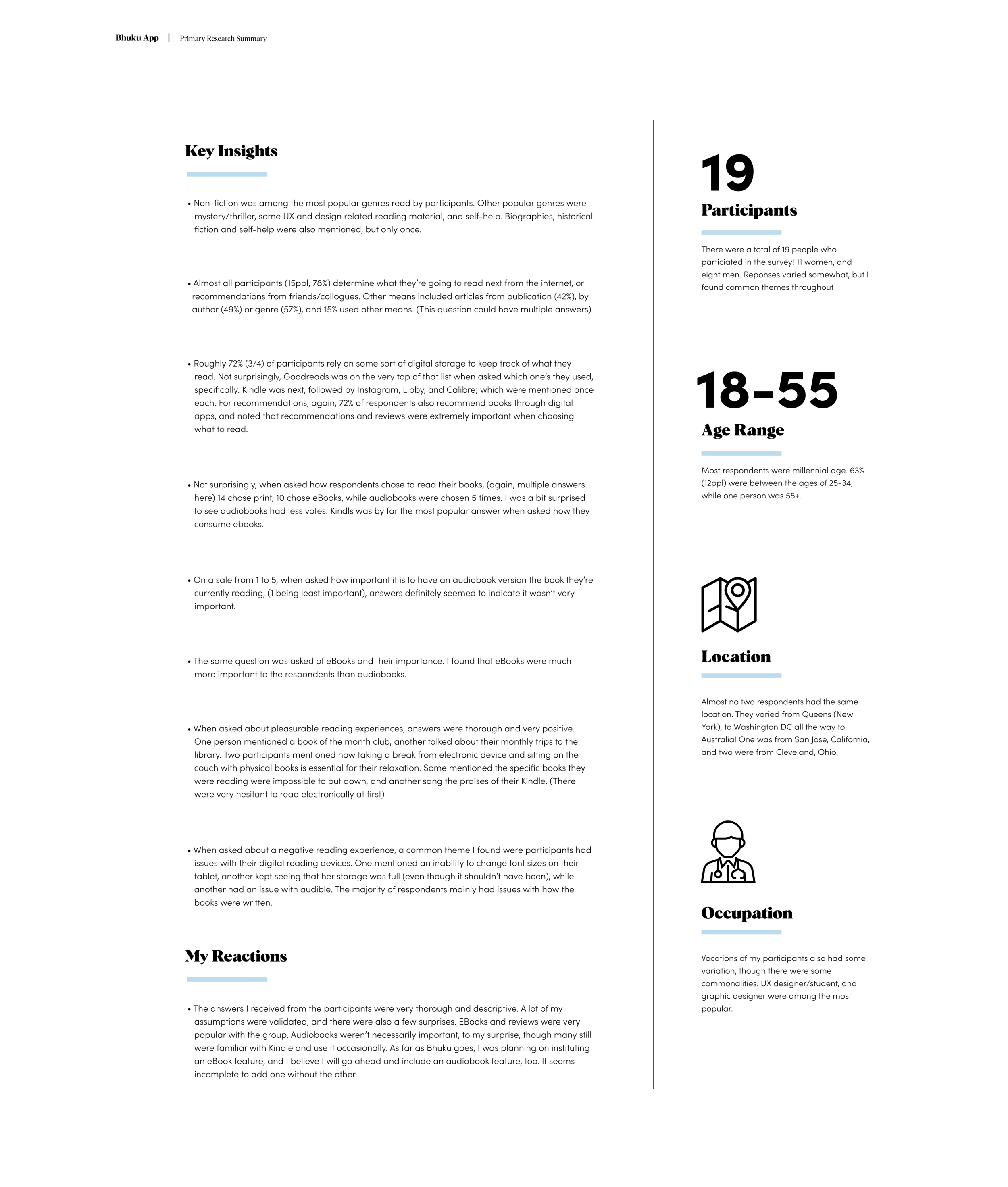
Persona
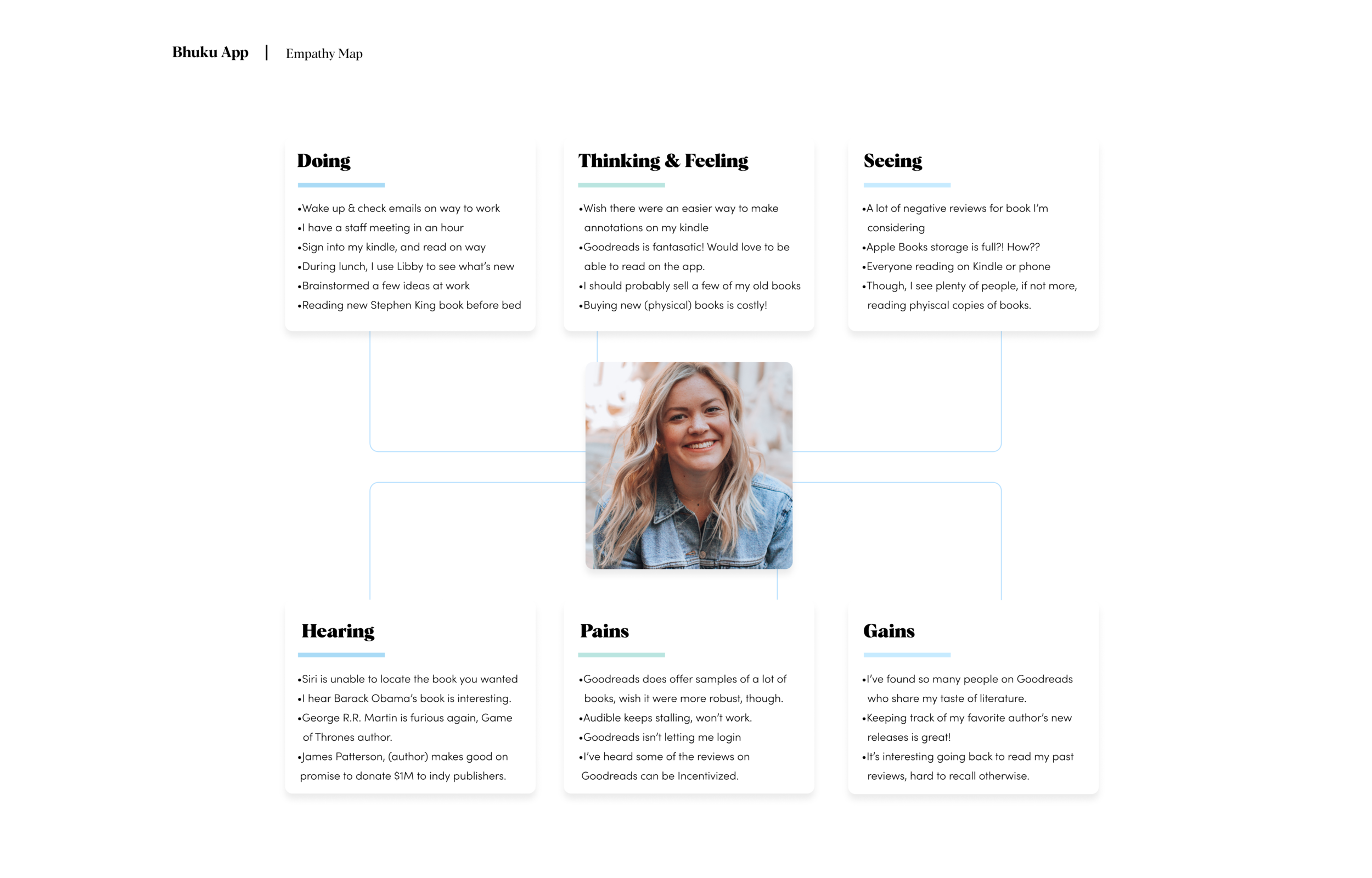
The last part of my research included creating a persona, which is creating an identity based on the information gathered from my interviewees, and sum total of my secondary research. This helps me zero in on the type of person I’m creating this feature for. All design decisions going forward were based around this persona. The person I created is “Kimberly”: a 31-year-old married woman who’s passionate about reading. She’s curious about new and innovative ways to read and review books!
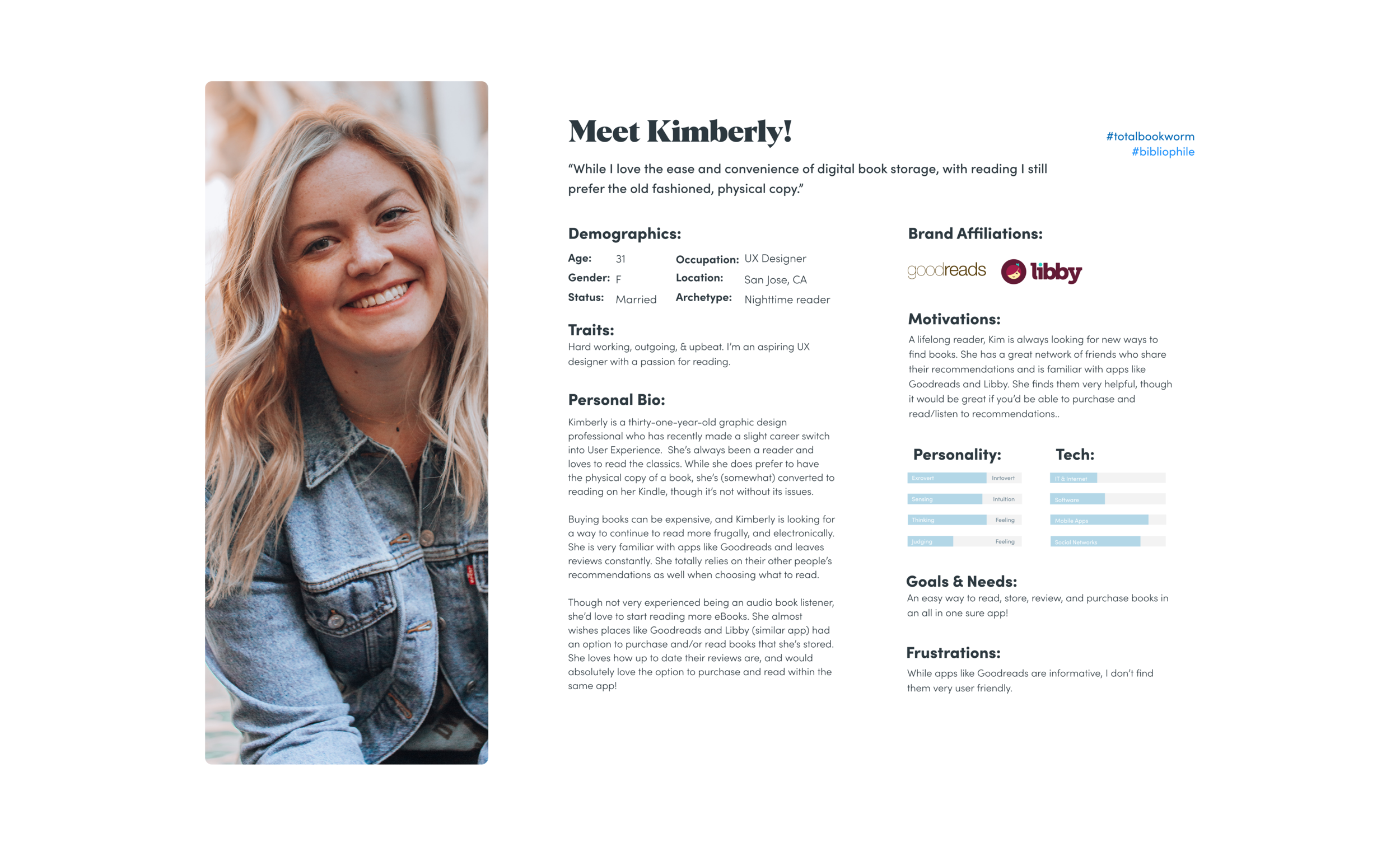
Creating an empathy map was another step in developing my persona. Here is a look at how we synthesized the research so far to map out a typical day for “Kimberly”. It was another building block in understanding our user base, and what might be going through their minds on a daily basis. In the end, I also tried to identify certain obstacles Kimberly might face reading and keeping an inventory of books online. All of which I address down the line:
Stage two: Define
This is where we look at our research and begin to synthesize it. We start to understand the framework of our new additions with things like a feature roadmap and define the goals we’d like to achieve from a business and technical standpoint.
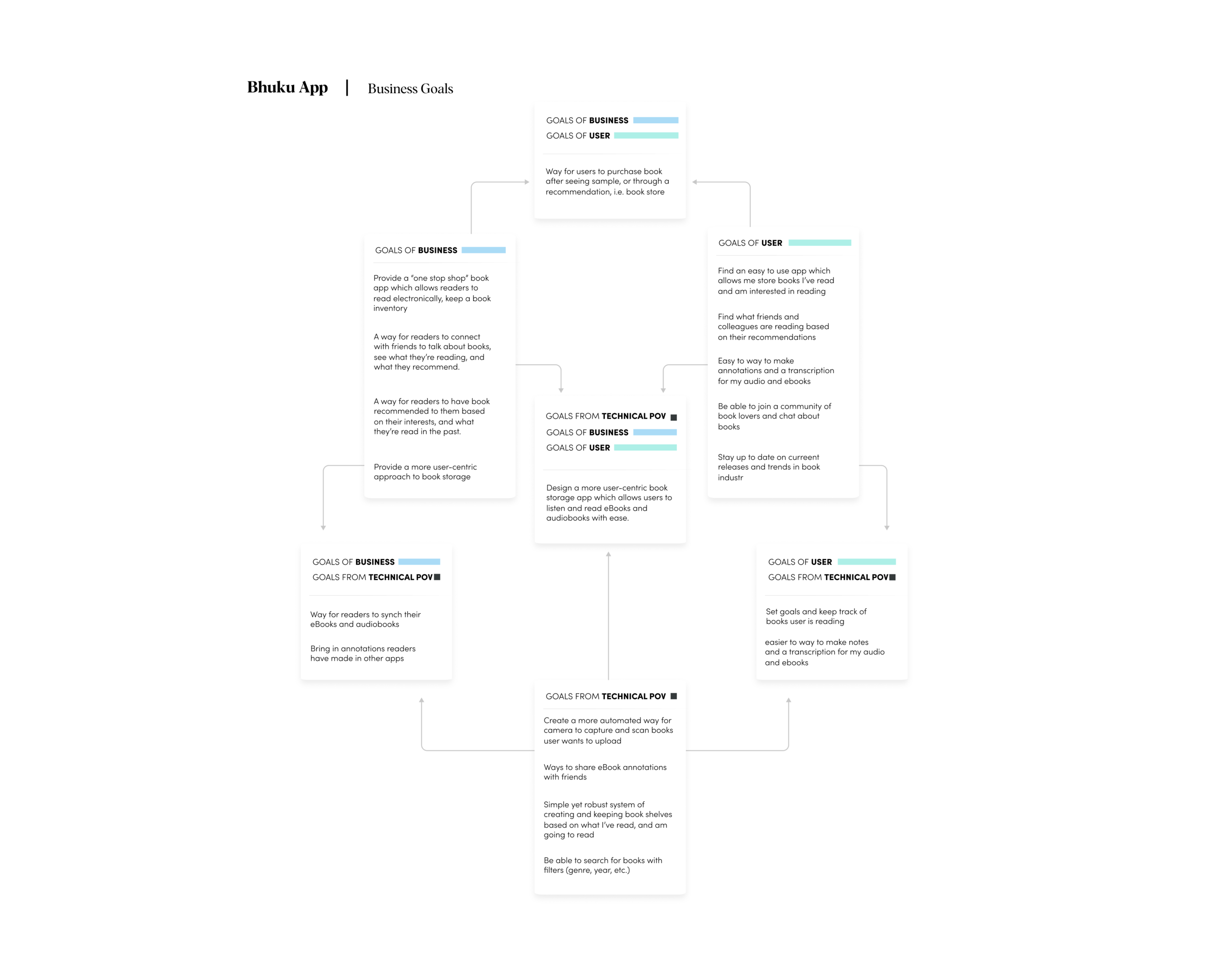
The first graphic is a chart that lists the goals Bhuku has as a business (business goals), goals the user will have (user goals), and what’s possible from a technical point of view (technical POV goals). I will consider all choices moving forward:
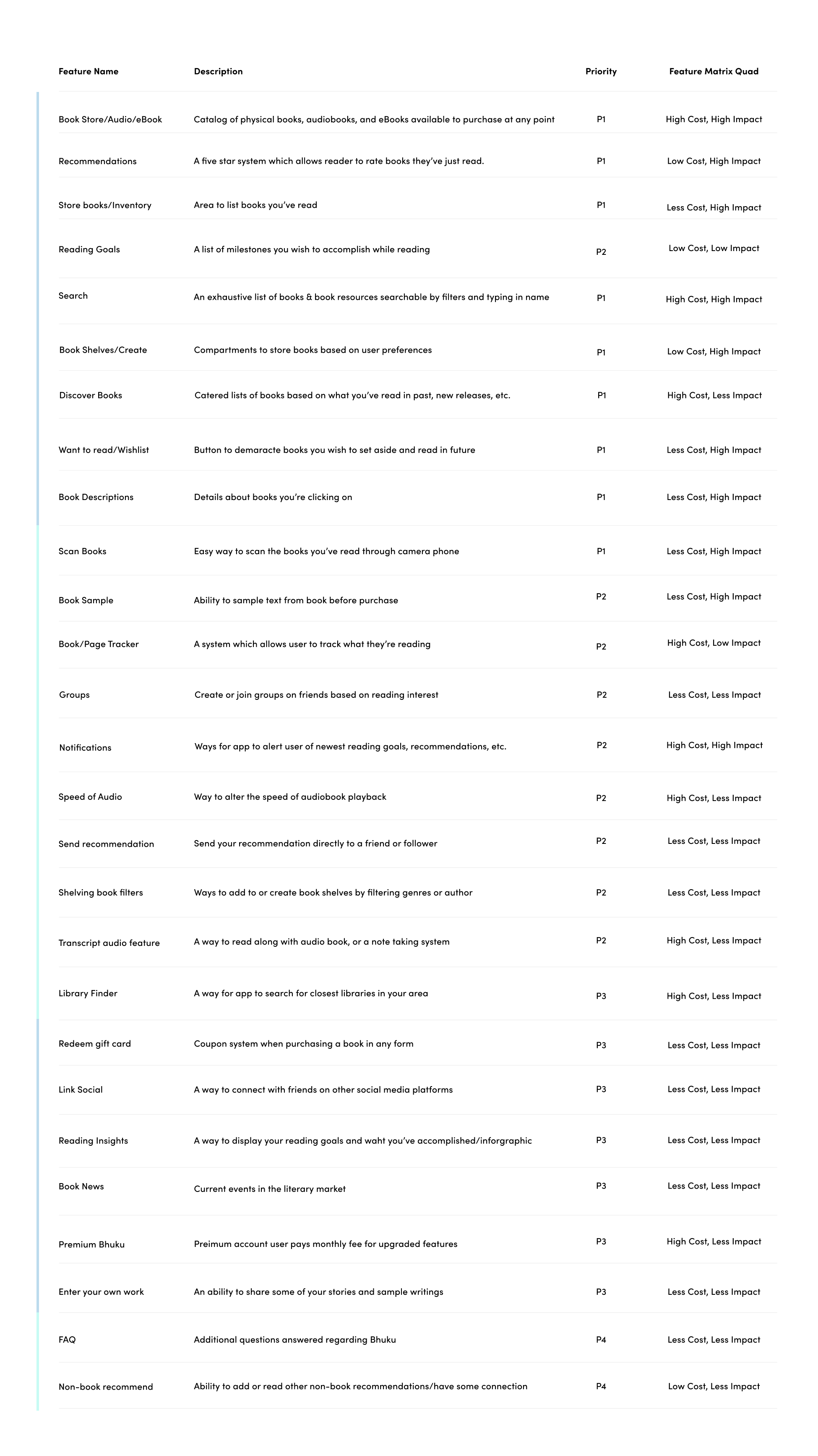
From here, we were able to create what’s called a feature roadmap, which is a checklist of attributes Bhuku’s new app will contain. We’ve also ranked them in their order of importance.
Another facet to this list is estimating the man-power each feature will ultimately use — i.e. time and cost — and label each feature accordingly, P1, P2, etc. (Priority 1, Priority 2, 3…)
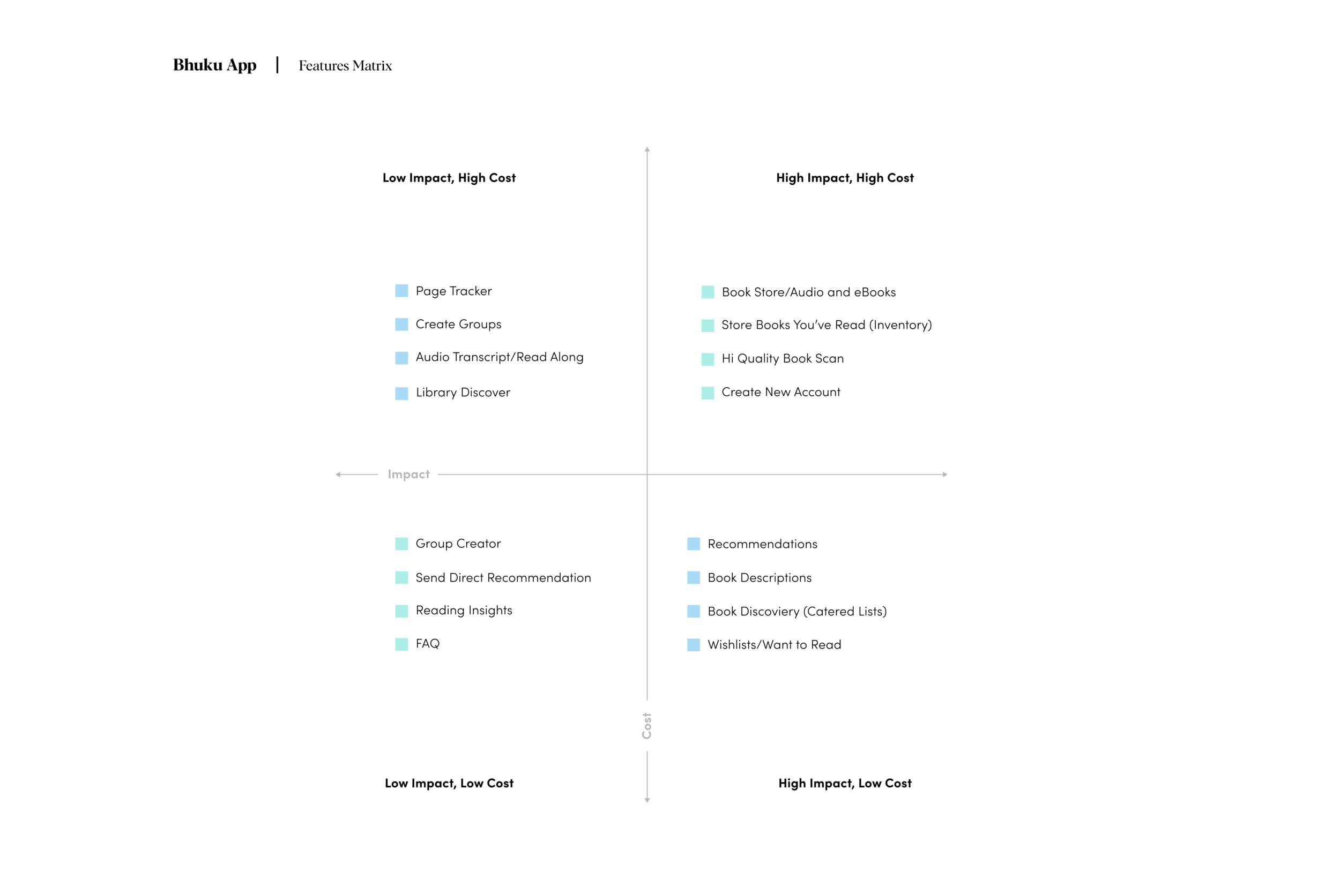
Piggybacking the feature roadmap is the feature matrix. Which is a graphic used to illustrate how important (or of lesser importance) new features are going to be in relation to cost. You can see this in the graphic below:
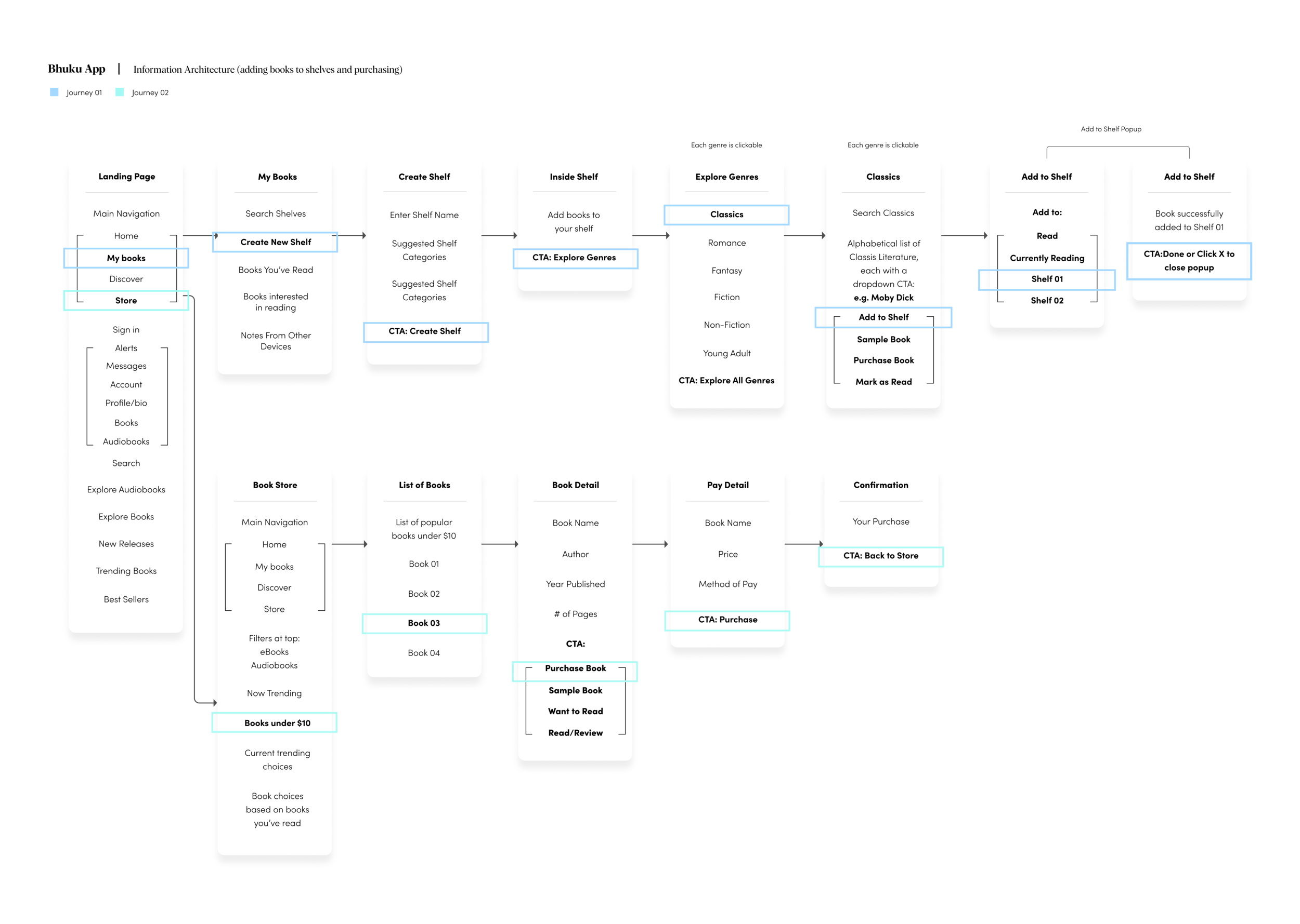
Culminating the definition stage was our sitemap. This is how we organize our additional feature structurally, labeling each component of the new feature and where it exists in relation to everything else. We develop information architecture at this point:
Information architecture (IA) is the structural design of shared environments; the art and science of organizing and labelling websites, intranets, online communities and software to support usability and findability.
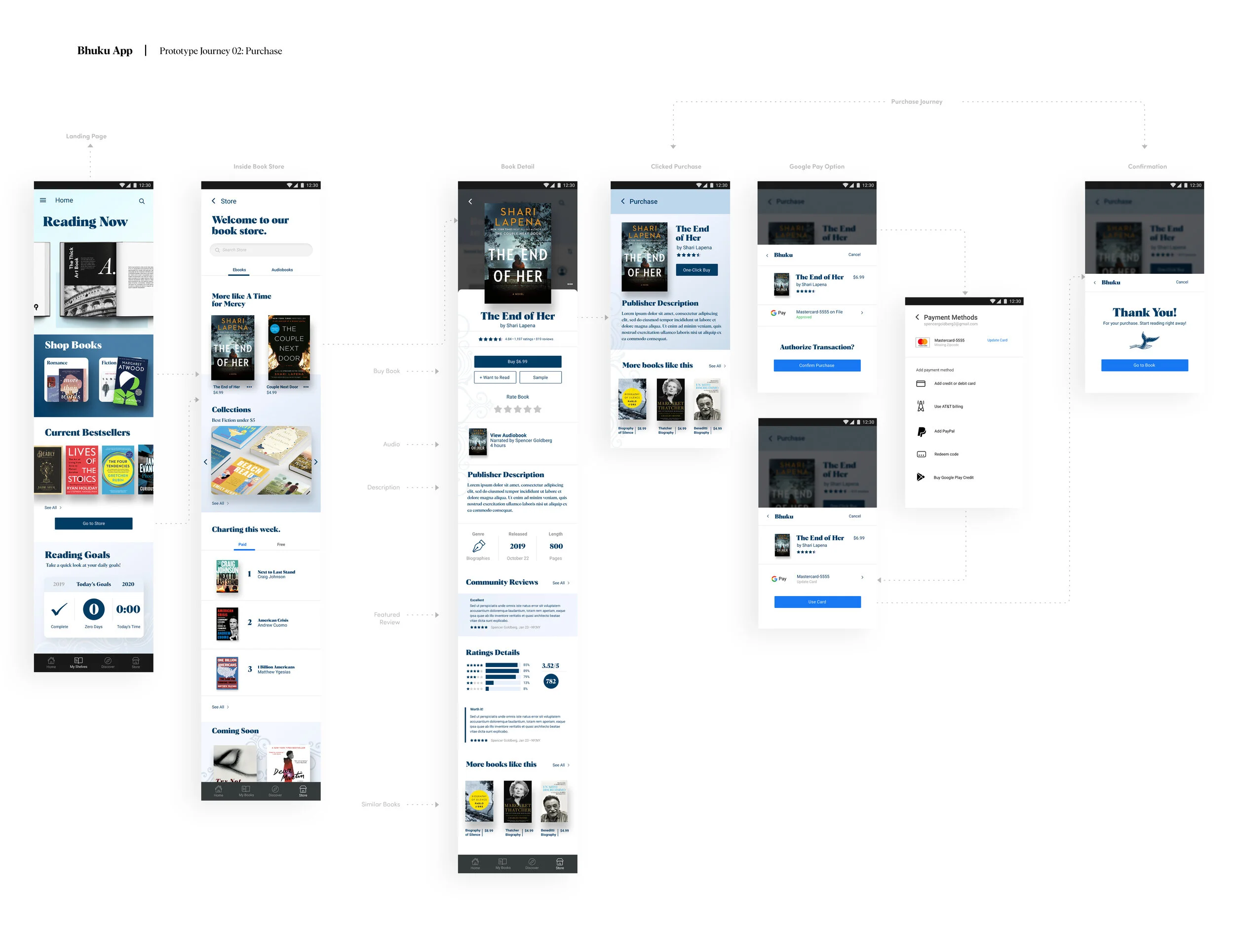
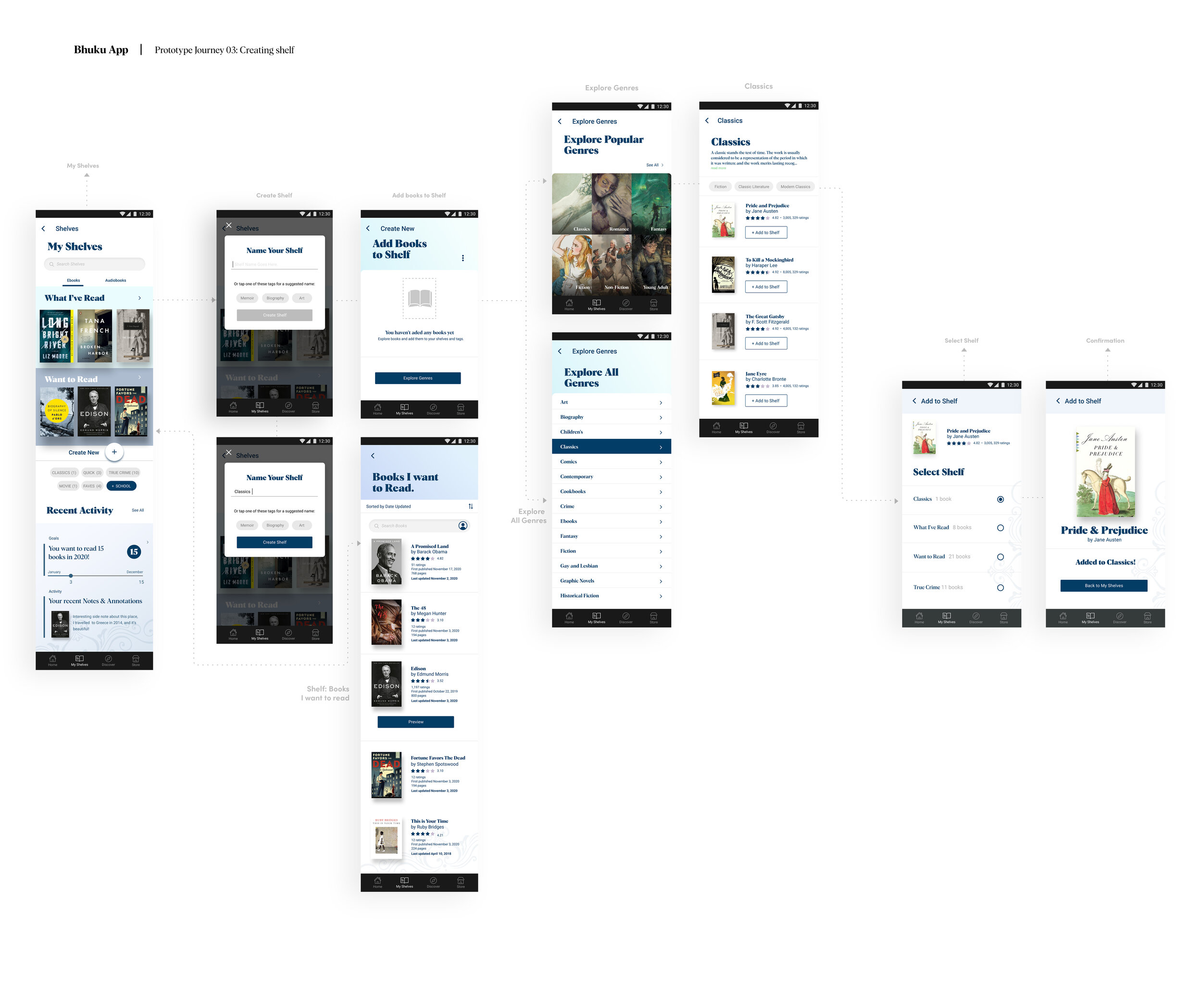
My method was to identify all of the items you’d see on a specific page in The Bhuku App, and indicate clear call to actions. The graphic below represents a typical Bhuku user and two different journey’s: Adding a book to your custom bookshelf, and purchasing an eBook from Bhuku’s boot store:
Stage 3: Ideation
Here we build wireframes, create branding, and build a UI kit.
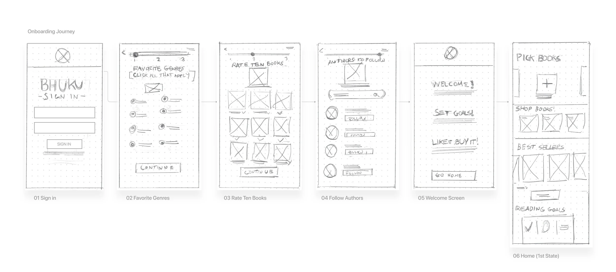
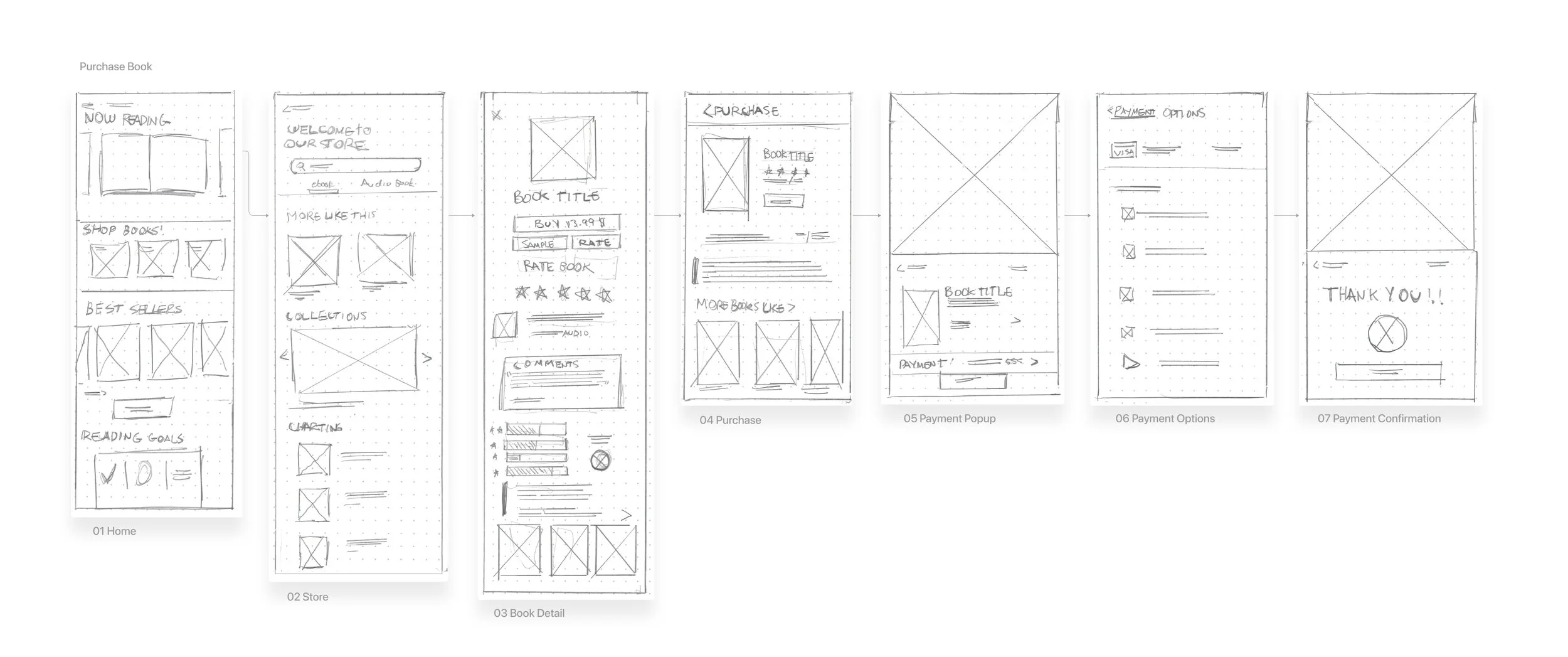
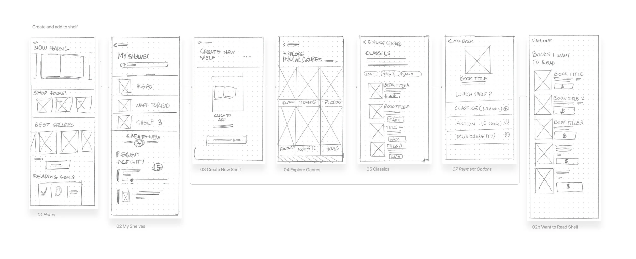
We also develop our product even further by introducing lo-fidelity wireframes. (Pencil and paper) Our plan here is to give us a couple of solution based on our research thus far and our IA (information architecture).
Below you can see paper sketches:
Here you can see a user making a purchase:
Creating a shelf:
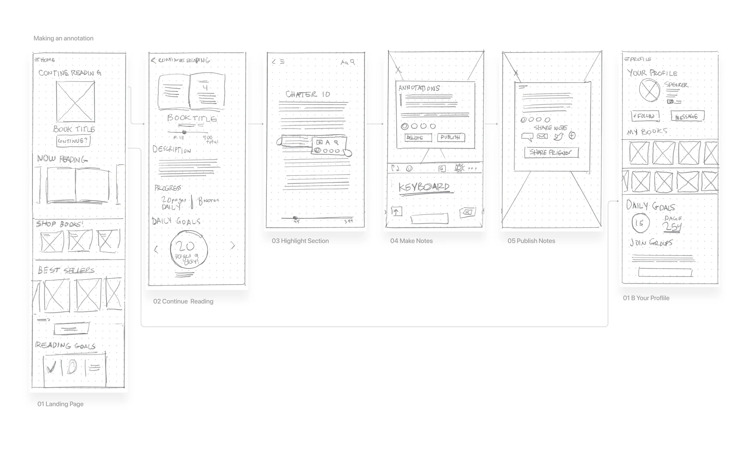
And last, making an annotation from reader:
Wireframes
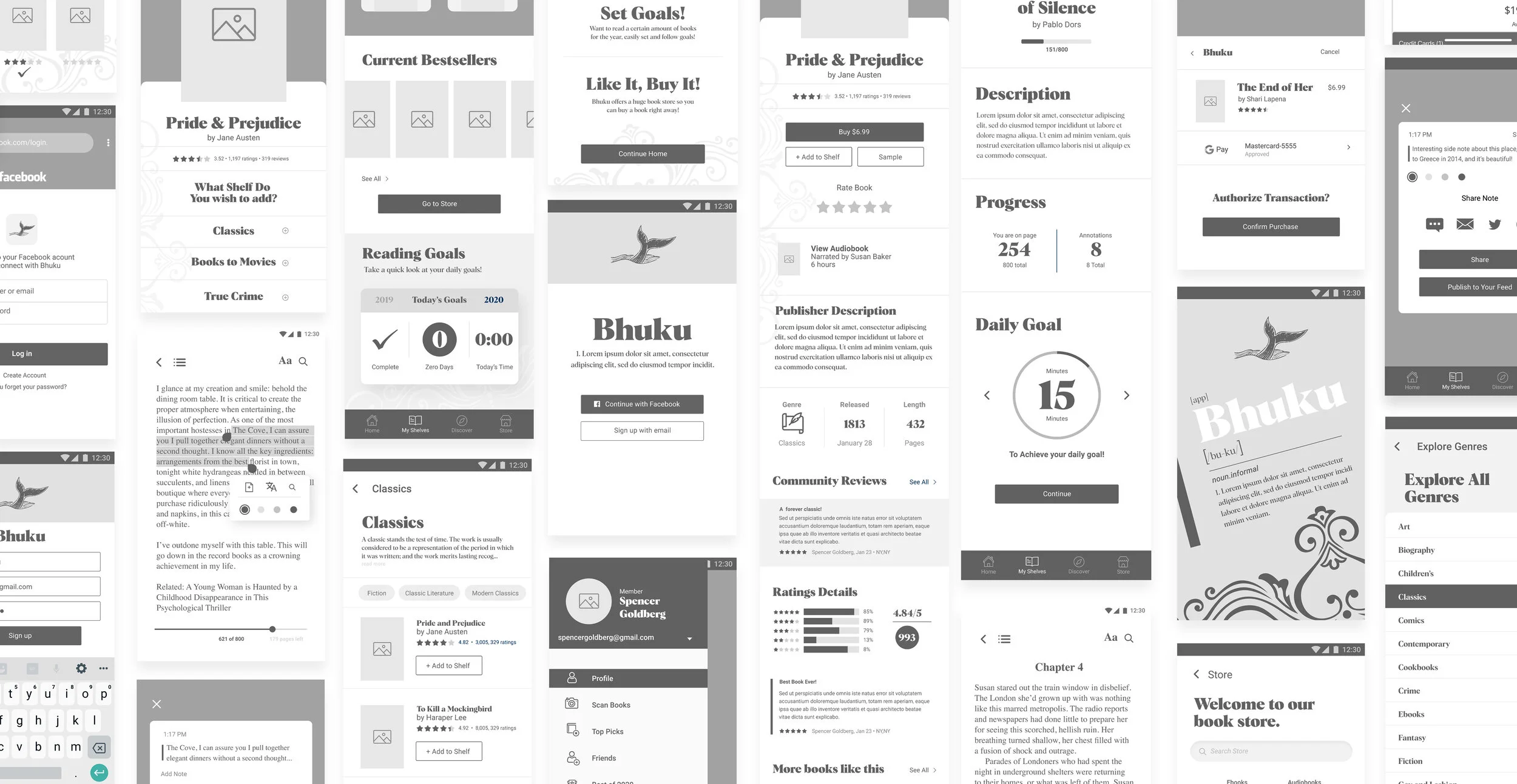
From here, I developed mid-fidelity wireframes. This was to further map out the different journeys one would take with Bhuku. I also began to develop some User Interface elements during this process.
The idea was to create enough pages for users to fully complete buying a book online, reading an eBook (and making annotations), and creating shelves. I also included a number of tertiary screens which will also guide the user:
Further Ideation
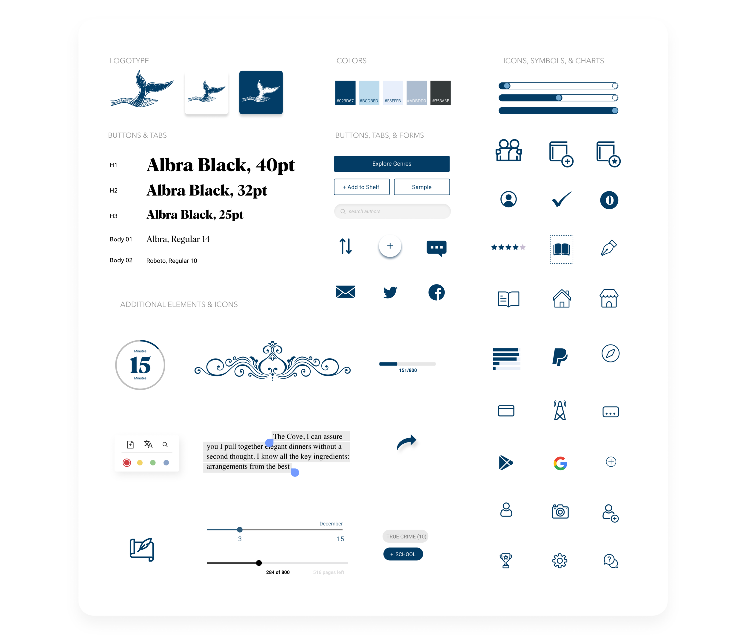
Here we have Bhuku’s UI kit. The branding and logo developed throughout the process, and here’s an image that captures every element used for the app: icons, typeface, popups, charts, etc.
The logo is a call back to Moby Dick:
Stage 4 Prototype
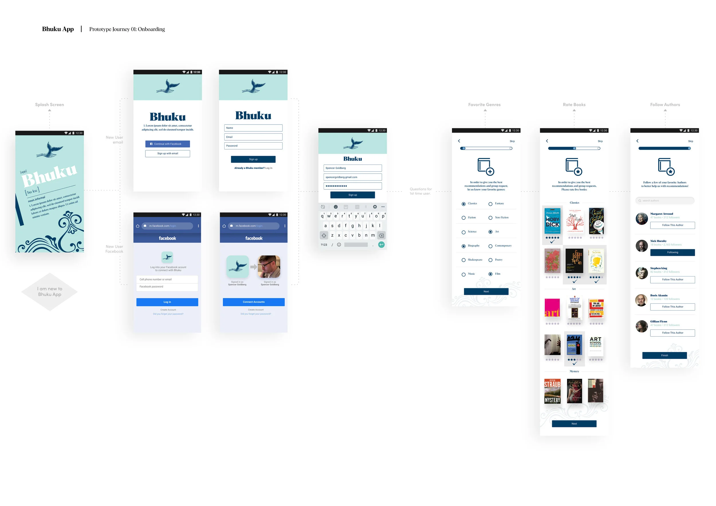
After developing a UI kit, it was time to create high-fidelity prototypes. Below are the various screens I created for doing multiple tasks on the app.
See below for desktop and mobile high-fidelity mock-ups:
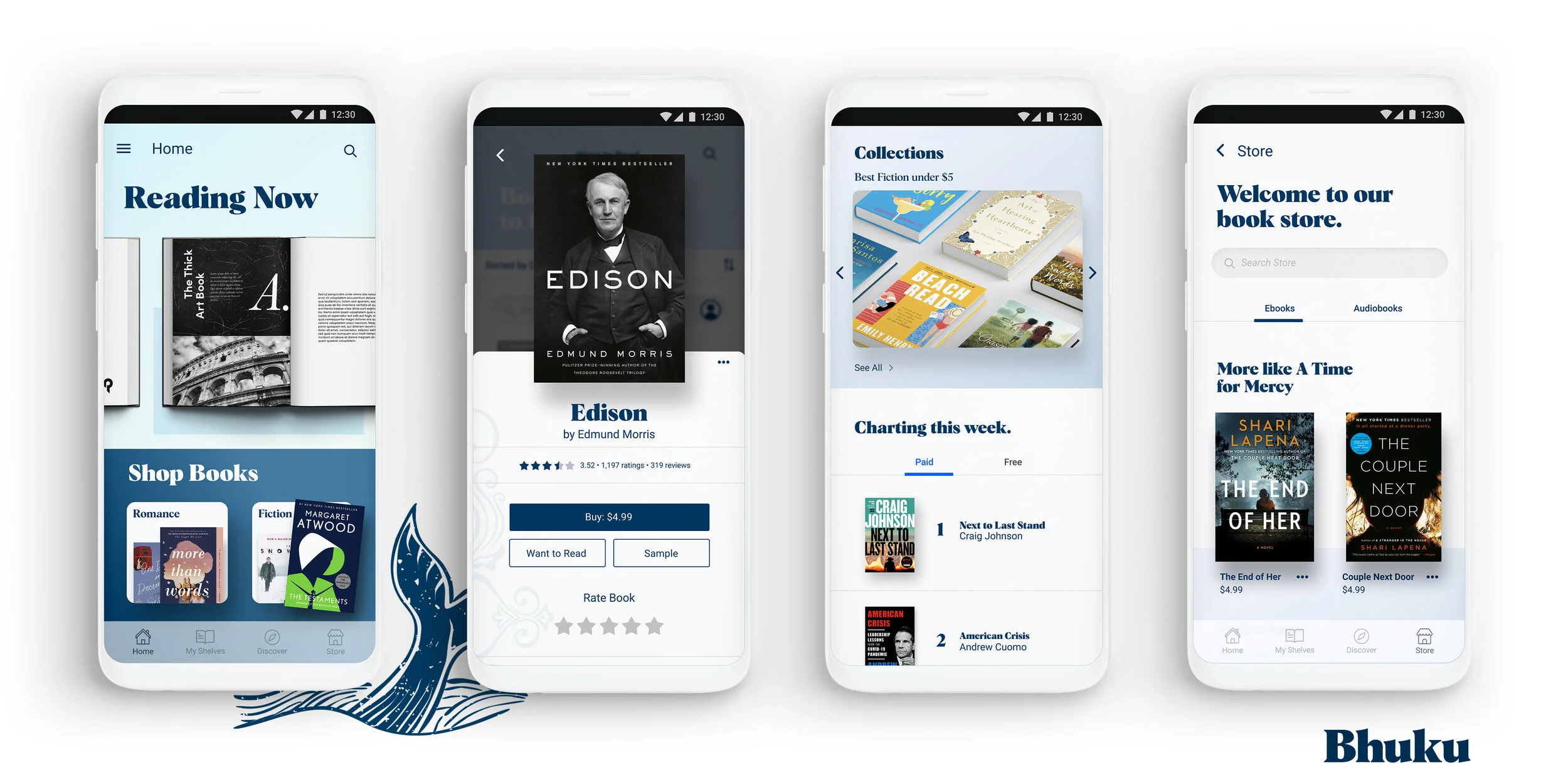
Purchasing a book from the home screen:
The next journey is creating a shelf and adding books to it. Creating shelves are essential in book inventory apps:
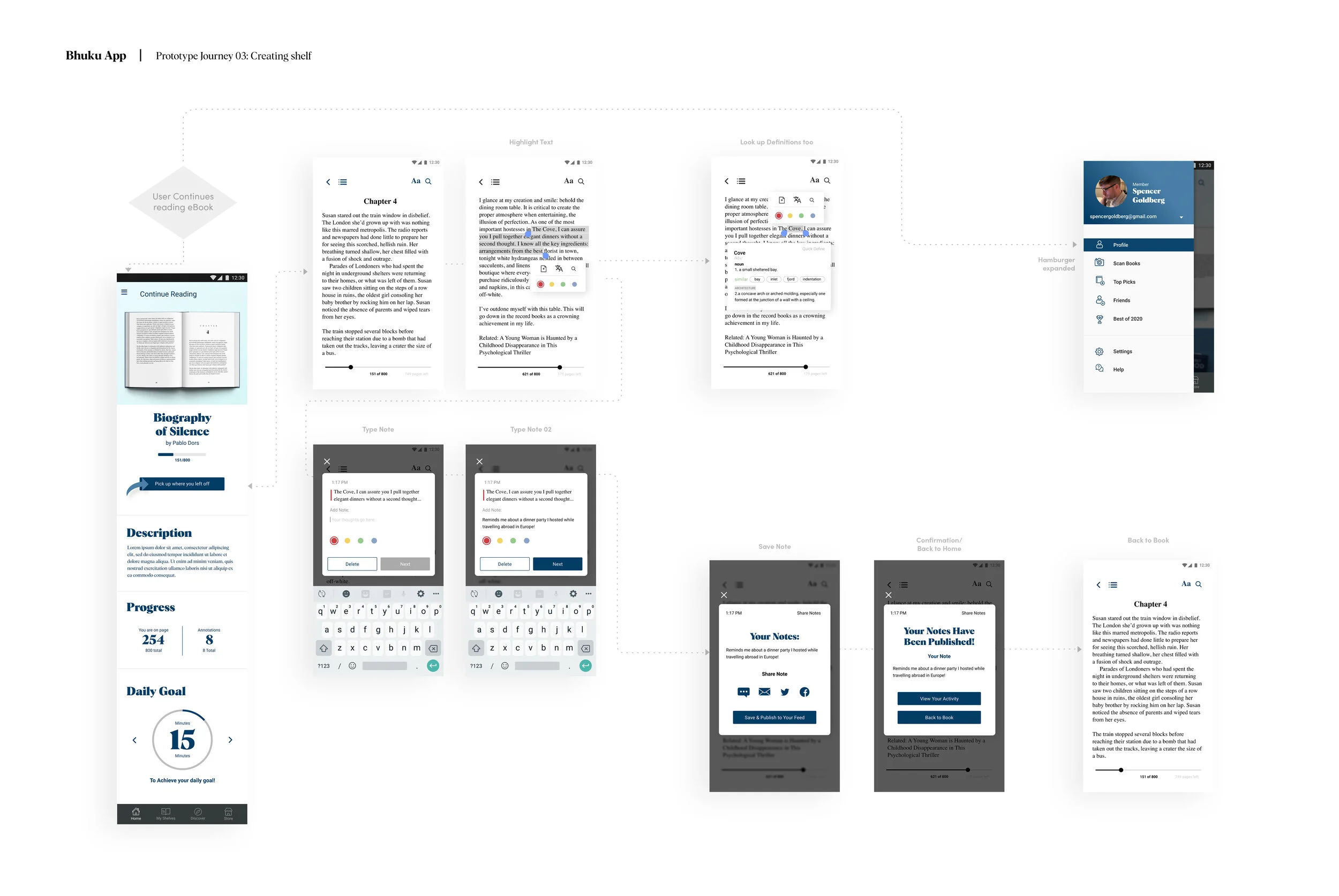
Here you can see what happens when a user continues reading their book and publishes an annotation!
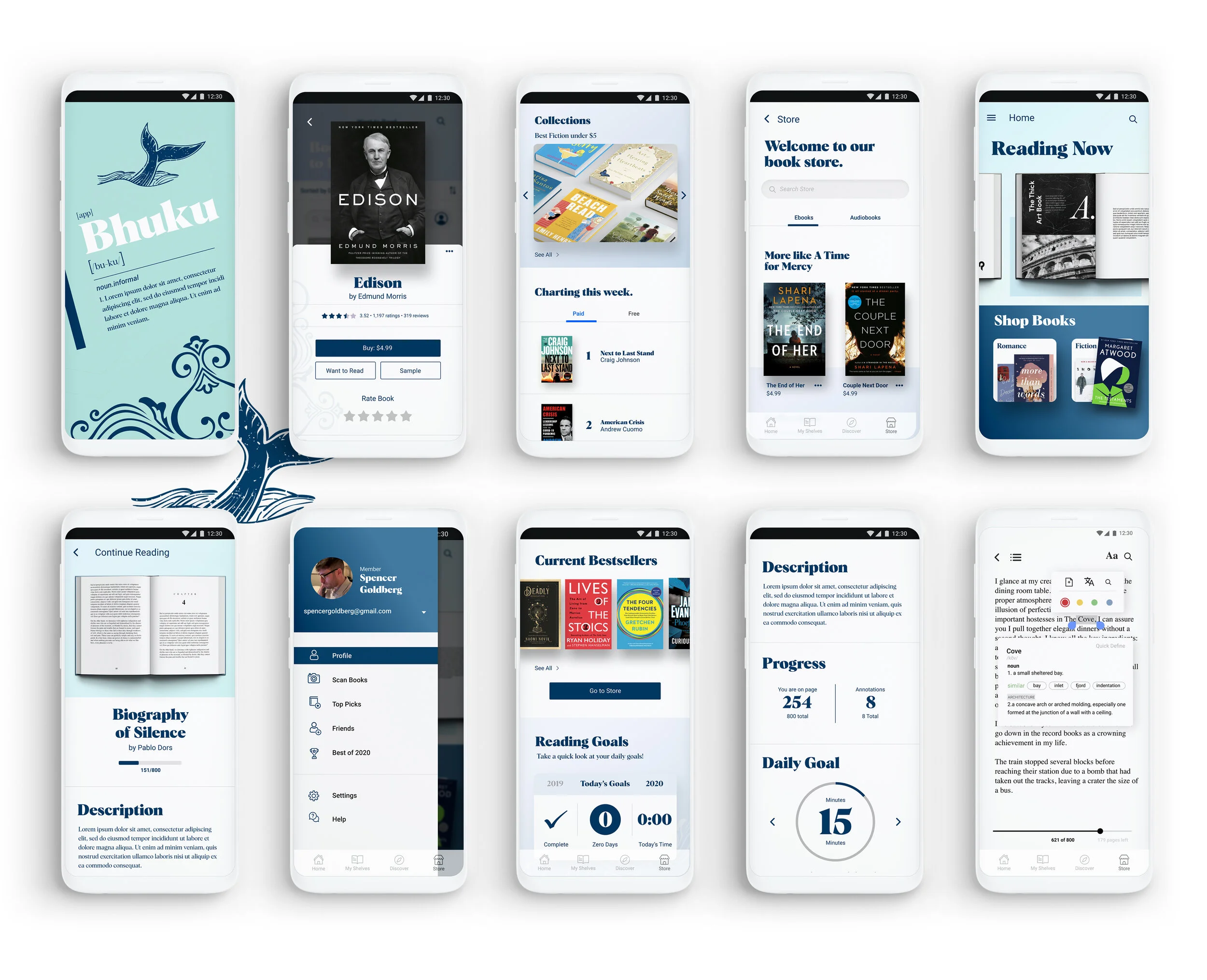
Here is a look at several high-fidelity screens mocked up on a Google Pixel phone, it’s a native android, but available for all platforms:
Stage 5 Validate
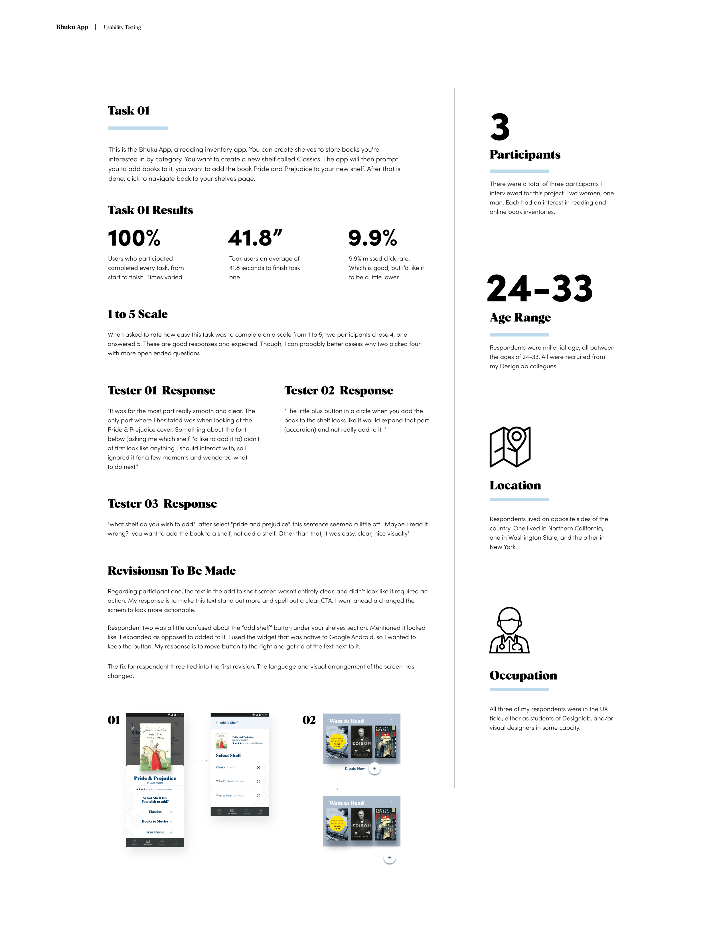
After creating high-resolution mock-ups, it was time to test our product! What I did was create a usability test from my prototype. I chose to test two of the three journeys proposed from the start. First was to have participants create a bookshelf in the app, and add a book to it.
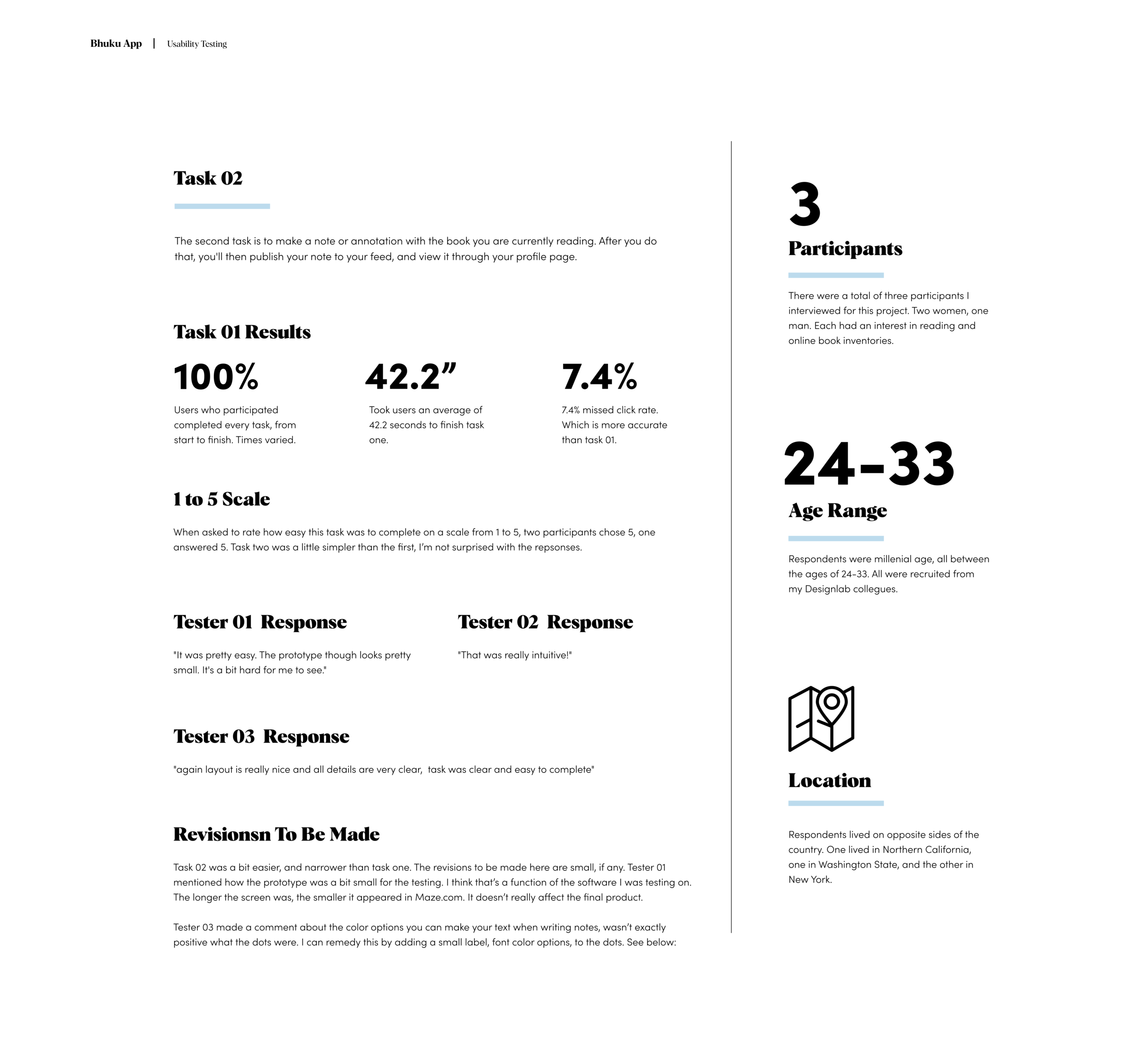
The second task was to continue reading a book from the Bhuku homepage, highlight a section & make notes, and publish the notes to your feed. Both tests were successful, and all revisions were implemented in the prototypes seen above. Below you can view insights from the usability testing:
And here is task 02:
Next Steps
This was an amazing experience. I believed I achieved all of what I set out to do. I feel this is a terrific start to a new and innovative book storage app. I’m pleased with the branding, and was able to flex my details muscle with the subsequent case study!
I’m excited to share this experience, and welcome feedback of any kind. Thank you for reading.
Please feel free to reach out anytime.